Naskh and the Proportioned Pen
1. A Script Named for Copying
Open almost any book printed in Arabic today, a newspaper in Cairo, a school primer in Amman, a legal code in Rabat or a Qur’an handed to a pilgrim in Medina, and the letters on the page belong to one family. They sit on a firm horizontal line, their bowls are round and open, their tall strokes rise to a modest and even height, and every word is legible at a glance even to a child who has only just learned the alphabet. That family is naskh. Its name comes from an Arabic root that means to copy or to transcribe, and for more than a thousand years it was above all the hand of people who copied books for a living. It is the script in which most of the Arabic and Ottoman manuscripts that survive were written, and it is the model on which almost every Arabic typeface designed for reading continuous text has been built[1][2].
This long read follows that script from its obscure beginnings among the clerks and booksellers of the early Islamic cities to the screens on which it is drawn today by fonts with thousands of glyphs. It is a story about beauty, but it is also a story about work. Naskh was never the grandest of the Arabic scripts. Its larger and more theatrical sibling, thuluth, wrapped round the domes and portals of mosques; the stately muḥaqqaq filled the enormous Qur’ans that sultans gave to their foundations; and the hanging Persian nastaʿlīq became the vehicle of lyric poetry. Naskh did the daily labour. It carried law, medicine, grammar, history, theology and, eventually, the Qur’an itself to readers across three continents. Its virtues are the virtues of a working hand, clarity, economy and stamina, raised by a succession of masters into an art.
What the word means
The Turkish scholar M. Uğur Derman, the leading modern historian of Ottoman calligraphy, begins his account of the script by noting that the verbal noun naskh has two senses in Arabic. It can mean to cancel or abrogate a ruling, a sense familiar from Islamic jurisprudence, and it can mean to copy a work. The name of the script comes from the second sense. Medieval writers spoke of the nassākh, the professional copyist, and the script was also called warrāqī, after the warrāqūn, the stationers and copyists of the book market, because it was the hand in which they worked[1].
A popular explanation, repeated in some modern books, holds that the script was called naskh because it abrogated, or replaced, the older angular Kufic in the copying of the Qur’an. Derman dismisses this as historically impossible. The cursive book hand existed, and was called by names related to copying, long before it displaced Kufic in Qur’an manuscripts, and for several centuries after the reforms associated with Ibn Muqla it remained a secondary script in Qur’anic copying, behind rayḥān and muḥaqqaq[1]. The name, in other words, records the social origin of the script rather than its later triumph.
A hand for books
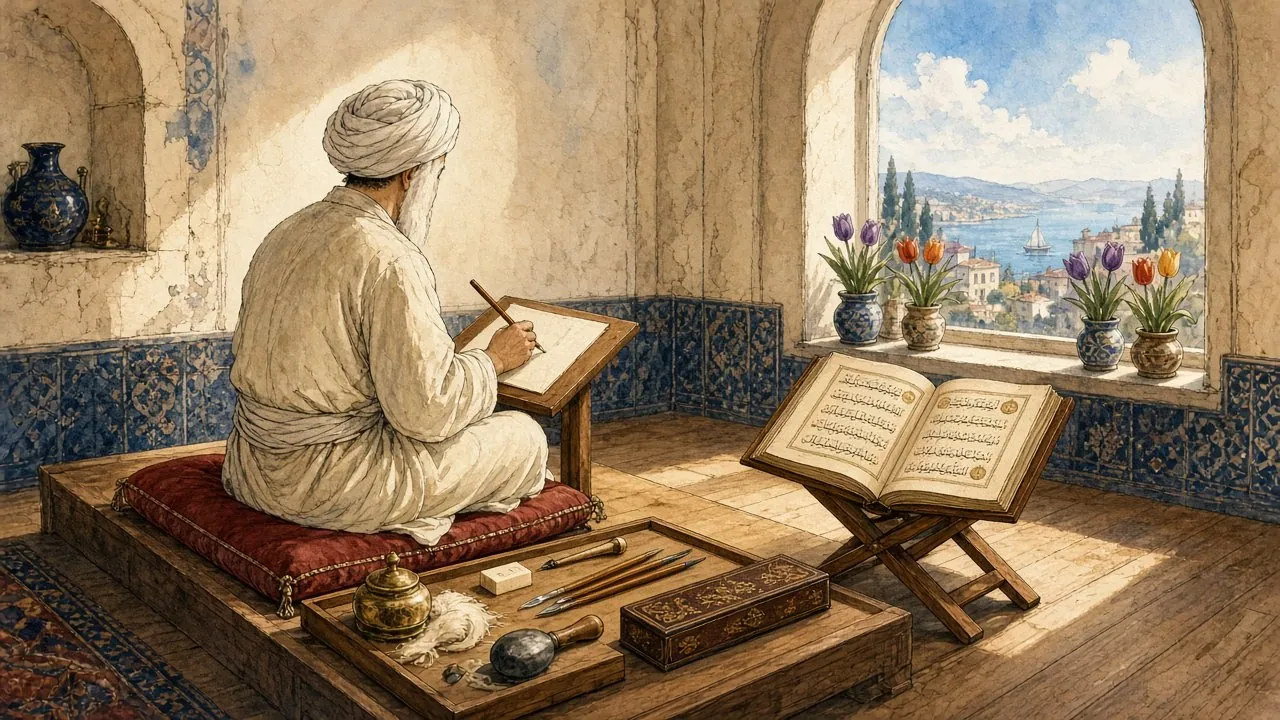
Two features made naskh suitable for books. The first was its size. Derman notes that the natural width of the reed nib used for naskh is about one millimetre, small enough to fit many lines of text on a page of ordinary paper and large enough to remain distinct when copied at speed[1]. The second was its clarity. In naskh the letters are written along a single baseline rather than stacked into compositions, the counters of letters such as ṣād, fāʾ and wāw are kept open, and the vowel signs and other diacritical marks can be added without crowding. Derman stresses that naskh is never written in stacked compositions as thuluth often is, but always in lines[1]. A copyist could fill page after page in it without the reader losing the thread.
That clarity mattered for a civilisation that, from the ninth century onwards, produced books on an enormous scale. The arrival of paper in the Islamic lands, discussed in a later chapter, lowered the cost of writing material so far that a scholar in Baghdad or Cairo could own hundreds of volumes and a ruler’s library could hold tens of thousands[3]. Somebody had to write all those books by hand, and the hand they used, whatever name it went by in a given century, was the cursive book script that became naskh.
Masters and machines
The script’s history is often told as a chain of great names. The Abbasid vizier Ibn Muqla (886–940) is credited with putting the letters under a geometric discipline based on the dot made by the pen and the height of the letter alif. Ibn al-Bawwāb (died 1022), a Baghdad house painter turned calligrapher, gave that discipline grace. Yāqūt al-Mustaʿṣimī (died 1298), the secretary of the last Abbasid caliph, refined the six classical scripts and is said to have introduced the oblique cut of the pen. In Ottoman Istanbul, Şeyh Hamdullah (1436–1520) created a new naskh that became the standard hand of the Qur’an across much of the Islamic world, and Hâfız Osman (1642–1698) refined it again[4][5][6]. This chain is real, and later chapters follow it, but it is also partly a construction of later calligraphers who wished to place themselves in a line of descent from the founders. The historian David Roxburgh has shown how the reputation of Ibn al-Bawwāb was shaped, and in part reconstructed, by the writers and collectors of later centuries[7].
Behind the masters stood the materials and the trades. Reeds cut in the marshes of southern Iraq, soot collected from lamps and pounded with gum, paper sized with starch and egg white and burnished with stone, and knives, blocks and inkwells designed for a single task all shaped the forms of the letters. These materials receive their own chapters here, because naskh cannot be understood without them. Neither can it be understood without the printing press. When Arabic type was cut in Rome in the 1580s, in Istanbul in the 1720s and in Cairo in the 1820s, the model was naskh, and every technical change since, from hot metal to the typewriter, from phototypesetting to Unicode and OpenType, has involved a negotiation between the habits of the reed pen and the constraints of the machine[8].
The shape of this essay
The chapters that follow are arranged roughly in chronological order. The first part describes the scripts that came before naskh, from the Nabataean inscriptions of the Syrian desert to the early Qur’ans on parchment, and the round book hand of the Abbasid copyists. The second part follows the reforms of Ibn Muqla and Ibn al-Bawwāb in tenth- and eleventh-century Baghdad and the codification of the six pens. The third part follows naskh into Mamluk Cairo, Timurid and Safavid Iran and Ottoman Istanbul, where it became the standard script of the Qur’an. The fourth part describes the physical craft of the pen, the ink and the paper, and the system of teaching and licensing by which the craft was handed down. The last part follows naskh into type, from the Medici press in Rome to the Cairo Qur’an of 1924 and the digital fonts of the present.
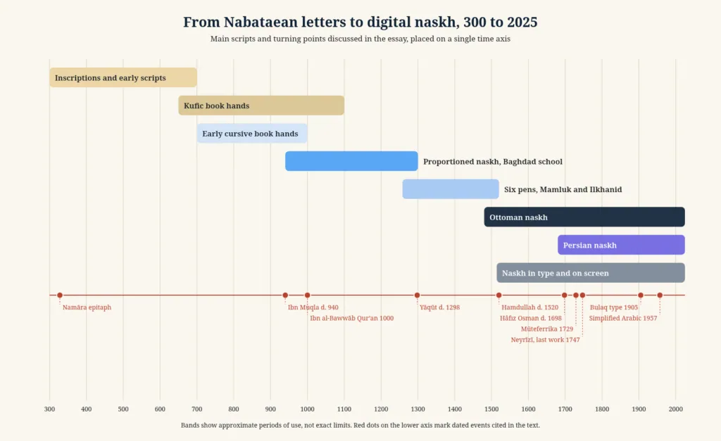
Two cautions apply throughout. The first is that the names of the scripts were used loosely in the past and are used inconsistently by modern scholars. Western historians long called almost any rounded Arabic book hand naskhī, while Ottoman and modern Turkish specialists reserve the term for the mature script of the Ottoman school, and they describe some of the most famous early manuscripts, including the Qur’an copied by Ibn al-Bawwāb in 1000–1001, as rayḥānī rather than naskh[1][10]. The second is that many of the stories told about the early masters come from biographical dictionaries written long after their deaths. Where those stories are repeated here, they are presented as what later writers believed, not as established fact.
2. Before the Measured Pen
The Arabic alphabet did not begin as a script for the Arabic language. Its letters descend from the Aramaic script used by the Nabataeans, the Arab people whose kingdom, centred on Petra, controlled the caravan routes of north-western Arabia and southern Jordan from the fourth century BCE until its annexation by Rome in 106 CE. The Nabataeans spoke a form of Arabic in daily life, but like many peoples of the ancient Near East they wrote in Aramaic, the international language of administration since the Persian empire. Over the following centuries their cursive Aramaic script, written by people whose speech was Arabic, gradually turned into the Arabic alphabet[11].
The American scholar Nabia Abbott set out this derivation in 1939 in The Rise of the North Arabic Script and Its Ḳurʾānic Development, a study of the Qur’an manuscripts in the Oriental Institute in Chicago that remains a standard work. Abbott traced the changes in individual letter forms through the dated inscriptions available to her, showing how the Nabataean letters became more cursive, how their connecting strokes lengthened along a baseline, and how several letters that had been distinct in Aramaic merged into identical shapes[11]. That merging is the reason why Arabic, unlike its Aramaic ancestor, needs dots to tell apart letters such as bāʾ, tāʾ, thāʾ, nūn and yāʾ in their joined forms. The dots, and later the vowel signs, would become an essential part of the page in naskh.
The Namara epitaph
The most famous witness to this transition is a basalt lintel found in 1901 at al-Namāra in the desert south-east of Damascus and now in the Louvre[12]. It carries the epitaph of Imruʾ al-Qays son of ʿAmr, an Arab ruler who died in the year that corresponds to 328 CE and who is described as king of all the Arabs. The researchers of the French project Ancient Arabia describe the text as written in the Arabic language but in the Nabataean Aramaic script[13]. It is a document of two worlds. The words are recognisably Arabic, while the letters are still those of the Nabataean monuments, with some of the joins and simplifications that would lead to the later alphabet.
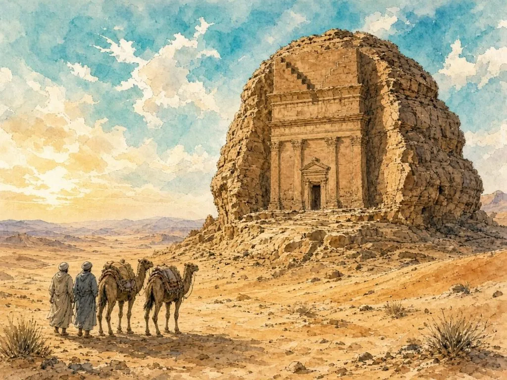
A handful of other inscriptions from the fifth and sixth centuries, found in Syria and northern Arabia, show the letters moving closer to the Arabic forms known from early Islamic documents. By the time of the Prophet Muhammad in the early seventh century, a recognisably Arabic script was in use in the towns of the Hijaz for letters, contracts and commercial records. It was written with a reed pen on whatever materials were to hand. Mehmet Emin Maşalı, writing on the history of the muṣḥaf, lists among the materials used by the Prophet’s scribes thin leather or parchment, wooden tablets, the shoulder blades of camels, the midribs of palm leaves, thin white stones and potsherds[14].
The Hijazi Qur’ans
The earliest surviving manuscripts of the Qur’an are written in a script that modern scholars call Ḥijāzī, after the region of western Arabia. Its tall letters lean to the right, and the alif ends at its foot in a short hook. Maşalı cites examples of this sloping script in the Vatican Library, the British Library and the Bibliothèque nationale de France[14]. The Metropolitan Museum of Art describes the Ḥijāzī script as older than Kufic and characterised by this rightward slant of the tall shafts[15].
In 2015 the University of Birmingham announced that radiocarbon analysis of the parchment of two leaves in its Mingana Collection, containing parts of sūras 18 to 20 in Ḥijāzī script, had dated the animal skin to between 568 and 645 CE with a probability of 95.4 per cent[16]. The date applies to the death of the animal rather than to the act of writing, and parchment could be stored for some years before use, but the result placed the leaves among the oldest Qur’anic fragments known. Such manuscripts were written with few dots and no vowel signs. They assumed a reader who already knew the text by heart and used the written page as an aid to memory rather than as the sole means of transmission.
Letters for the chancery
Alongside the Qur’an manuscripts, the documents of the new Islamic state show a second kind of writing. Papyri from Egypt, where the dry climate preserved administrative paper of the Umayyad period, contain tax receipts, requisitions and letters in a rapid, rounded hand written with a narrower pen. Derman notes that in the Hijaz at the rise of Islam two distinct kinds of writing coexisted, an angular script dominated by straight vertical and horizontal strokes and a rounded script preferred for letters, commercial correspondence and everyday purposes[1]. Under the Umayyads and Abbasids the rounded script spread with the administration, and it became, in Derman’s words, first mawzūn, balanced, and then mansūb, proportioned[1].
This distinction between a formal script for the Qur’an and monuments and a working script for documents runs through the early history of Arabic writing, and it is the key to the origin of naskh. The formal scripts were the business of a small number of specialised copyists working for patrons and mosques. The working script was the business of thousands of clerks, secretaries and copyists. When the working script was disciplined by the secretaries of the Abbasid chancery in the tenth century, and later admitted to the copying of the Qur’an, it brought with it the habits of legibility and speed that it had learned in the offices and the markets.
A script without dots
The early Arabic script was, by modern standards, radically incomplete. It wrote consonants and long vowels but not short vowels, and it often omitted the dots that distinguish letters of the same shape. Maşalı describes the first official copies of the Qur’an as written on parchment in black ink in a regular, geometric, rhythmic script, without dots or vowel signs, with nothing added to the text[14]. Over the following two centuries, grammarians and readers devised systems of marks to fix the reading. Red dots were placed above, below or beside letters to indicate short vowels, and later the system attributed to the grammarian al-Khalīl ibn Aḥmad (died about 786) replaced these dots with small letter-shaped signs written in the same ink as the text, the system still used today[17].
These marks, the fatḥa, ḍamma, kasra, sukūn, shadda and tanwīn, are known together as tashkīl. Naskh would become the script in which tashkīl sits most comfortably, because its letters leave room above and below the line for the marks without crowding. That is one reason why, when Qur’ans came to be written for readers who did not know the text by heart, naskh proved better suited to the task than the heavier scripts that had preceded it.
3. Kufic Majesty and the Round Hand
For roughly three centuries after the Prophet’s death, the most prestigious Qur’ans were written on parchment in a family of angular scripts that later tradition called Kufic, after the city of Kufa in southern Iraq. The name is a convenience. There is little evidence that the style originated in Kufa, and modern scholars, following the classification devised by François Déroche for the Qur’an manuscripts of the Bibliothèque nationale de France, now prefer to speak of the early Abbasid scripts and to sort them into groups by their letter forms[18][15]. Whatever the name, the look is unmistakable. The letters are broad and low, the horizontal strokes are stretched to fill the line, the bowls are often squared, and the page, usually wider than it is tall, holds only a few lines of large script[18].
These manuscripts were objects of great beauty and great cost. A single Qur’an in large Kufic consumed the skins of a great many animals, and its text was so spread out that it had to be bound in many volumes. The script was majestic but slow to write and, for anyone who did not already know the text, slow to read. Muhittin Serin’s entry on Kufic in the Turkish encyclopaedia of Islam describes how the script was used for Qur’ans, inscriptions on buildings, coins and textiles, and how it developed regional varieties from Iraq to the Maghrib[19].
The copyists of the market
While the Kufic Qur’ans were being produced for mosques and patrons, a different kind of writing was spreading through the cities of the Abbasid caliphate. The warrāqūn of Baghdad, Basra and Kufa sold paper, copied books to order and in many cases worked as publishers, keeping master copies of popular works from which they made further copies. The tenth-century bookseller Ibn al-Nadīm, whose catalogue of the books known in his day, the Fihrist, is one of the great documents of Islamic intellectual history, came from this milieu. The books they copied, grammar, poetry, tradition, history, medicine and philosophy translated from Greek, Syriac and Persian, were written not in Kufic but in a rounded cursive hand that Déroche calls a bookish script[20].

That rounded hand had no single canonical form. It varied from copyist to copyist and from city to city, and its letters were often irregular in size and spacing. But it was quick to write and easy to read, and it could be written with a fine pen on a small page. Derman notes that Western scholars have long applied the name naskhī to every small or large script used in this period outside Kufic[1]. In that broad sense, naskh existed long before anybody measured it.
Pens named for their work
The secretaries of the Umayyad and Abbasid chanceries developed a range of styles for different documents, and they named them in an inventive way. Nihad Çetin, in his study of the six pens for the Turkish encyclopaedia of Islam, explains that the early scripts were named after the size of the sheet for which they were intended, after the width of the pen, after the place where they were used or after the subject matter. The largest script, used for the largest sheets, served as the starting point, and smaller pens were defined in relation to it, as two thirds, one half or one third of its width. That is the origin of the name thuluth, meaning one third[22]. The Iranian scholar Ḡolām-Ḥosayn Yūsofī notes that by the end of the ninth century these scripts had multiplied into a bewildering variety, so that later writers attributed to Ibn Muqla and his brother the task of putting a stop to the proliferation[4].
The new style
In the tenth century a new script appeared in Qur’an manuscripts. It was tall and angular, with very upright shafts, sharp angles and a strong contrast between thick and thin strokes, and it was written on paper as well as parchment. Scholars have given it many names, eastern Kufic, broken Kufic, Persian Kufic, Déroche’s New Style and the New Abbasid Style. Sheila Blair, following the art historian Estelle Whelan, calls it broken cursive. Their reasoning is that the script was not an offshoot of Kufic but a deliberate stylisation of the round bookish hand, whose cursive letter shapes it shares[20].
Blair’s account, summarised by the online encyclopaedia islam.museum, makes the development of naskh part of a single story. Early copyists used the round bookish script for non-Qur’anic texts and occasionally for the Qur’an. They then stylised it into the mannered broken cursive for prestigious Qur’ans. The secretaries of the chancery turned it into a flowing round style, which Ibn Muqla is credited with regularising into the well-proportioned script and Ibn al-Bawwāb with giving it grace[20]. In other words, naskh did not replace Kufic by conquest. It grew from below, from the hand of the copyists and secretaries, until it was good enough to be trusted with scripture.
A question of theology
Why should the round hand have entered the Qur’an at this particular moment? The art historian Yasser Tabbaa, in a two-part study published in Ars Orientalis in 1991 and 1994, argued that the change was not only aesthetic. He linked the adoption of legible, proportioned scripts for the Qur’an in the late tenth and eleventh centuries to the theological politics of the Abbasid caliphate in Baghdad. Tabbaa’s abstract describes the conversion of Qur’anic writing from ambiguously majestic Kufic scripts to the elegantly legible scripts developed by Ibn Muqla and Ibn al-Bawwāb as a reflection of an exoteric, ẓāhir view of scripture, consistent with the Sunni theology promoted by the caliphs and opposed to the esoteric readings associated with their Fatimid rivals in Cairo[23].
Tabbaa’s thesis has been debated, and not every scholar accepts so direct a link between script and doctrine. But it draws attention to something real. A script that makes every letter and vowel plain is a statement that the text means what it says and can be read by anyone who has learned to read. That idea would shape the history of naskh until the age of print, when the Cairo Qur’an of 1924 set out to give every Muslim schoolchild a single, legible, vocalised text[17].
4. Paper Comes to Baghdad
No single change did more to make naskh possible than the arrival of paper. Parchment, made from the skins of animals that had been soaked, scraped and dried under tension, could be made almost anywhere, but it was expensive, because, as Jonathan Bloom puts it, the animal had to be killed to get its skin. Papyrus, the traditional writing material of Egypt, was cheaper but grew only in the Nile valley. Paper, invented in China centuries earlier, was made from plant fibres beaten to a pulp, could be manufactured wherever there was water, and could not easily be erased, which made documents written on it more secure against forgery[3].
Bloom, whose book Paper Before Print remains the standard history of the subject, explains that paper reached the Islamic world through Central Asia, where Muslims first encountered it in the eighth century[21]. The eleventh-century writer al-Thaʿālibī told a famous story that Chinese prisoners captured after the battle of Talas in 751 introduced papermaking to Samarkand, whose paper he praised as better looking, more supple and more convenient than papyrus or parchment. Bloom treats the story with caution. Documents on paper found at a fortress near Panjikent, abandoned during the Arab conquest of 722–723, show that paper was already in use in the region three decades before Talas, and the first Arabic word for paper, kāghad, came from Sogdian, the language of the Silk Road merchants[3].
The paper revolution
Bloom calls the result a revolution by the ream, and the English word itself, which reached Europe through Spanish and French from the Arabic rizma, a bundle, is a reminder of the route by which paper travelled west[3]. By the reign of the caliph Hārūn al-Rashīd (786–809) enough paper was available in Baghdad for the bureaucracy to use it for record keeping in place of papyrus and parchment. The fourteenth-century historian Ibn Khaldūn credited the vizier al-Faḍl ibn Yaḥyā with introducing its manufacture to the capital at a time when parchment was scarce[3].

Paper and the book trade grew together. Bloom describes the Sūq al-Warrāqīn, the stationers’ market of Baghdad, as a street lined with more than a hundred shops selling paper and books, where the ninth-century writer, teacher and paper dealer Aḥmad ibn Abī Ṭāhir kept his business. The polymath al-Jāḥiẓ is said to have rented stationers’ shops by the day in order to read their stock, which suggests that they functioned rather like private research libraries[3]. Under al-Maʾmūn (813–833) the caliphal library grew into the institution later remembered as the House of Wisdom, where translators rendered Greek texts into Arabic and copied them on to paper[3].
Paper and the Qur’an
Paper spread first through the offices and the markets, and only later into the copying of scripture. Bloom notes that there seems to have been resistance to using the new material for the Qur’an, which was normally copied on parchment. The oldest surviving dated book in Arabic script on paper is a fragment of Abū ʿUbayd al-Qāsim ibn Sallām’s work on unusual words in the traditions of the Prophet, dated 866 and preserved in Leiden, on dark brown, stiff paper that had been polished on both sides[3]. The oldest surviving dated Qur’an on paper was copied a century later, in 971–972, by the calligrapher ʿAlī ibn Shādān al-Rāzī. Its remains, divided between Ardabil, Istanbul University Library and the Chester Beatty Library in Dublin, come from a four-volume manuscript in vertical format[3].
That last detail matters. Bloom observes that as paper triumphed, the majestic Kufic scripts developed for parchment gave way first to the angular new style and then to more flowing cursive styles, and that the typical format of the book changed from horizontal to vertical[3]. The vertical page of the paper codex, taller than it is wide and holding many lines, became the natural home of a compact cursive script. In the western Islamic lands the change came later. Bloom notes that in North Africa and Spain paper Qur’ans began to appear only in the thirteenth century and parchment ones were still being produced in the fourteenth[3].
Chinese and Samarkand papers
The medieval sources speak of different kinds of paper with the reverence that later ages reserved for fine wines. Paper from Samarkand was famous, and papers named after Egypt, Syria and Baghdad followed. A story told about Ibn al-Bawwāb, recorded in his biography in the Turkish encyclopaedia of Islam, gives a sense of the value of the best sheets. When he was serving as librarian to the Buyid ruler Bahāʾ al-Dawla in Shiraz, he is said to have completed a missing section of a Qur’an copied by Ibn Muqla so skilfully that nobody could tell the two hands apart. Offered a hundred dinars as a reward, he asked instead to be given the Chinese papers from among the old Samarkand and Chinese sheets kept in the library[24].
The story may be embellished, but it reflects a real taste. Calligraphers valued paper that was old, well aged and stable, and the most prized sheets were those that had been sized and burnished until they shone. In Ottoman practice, Derman notes, freshly sized and burnished sheets were left to rest for a long time before anyone wrote on them, and paper treated this way was believed to improve as it aged[25].
Rags, rope and starch
Papermaking in the Islamic lands developed its own methods. Bloom explains that papermakers there used waste rags and old rope as their main source of fibre and formed their sheets by dipping a mould into a large vat of pulp suspended in water. The Zirid prince al-Muʿizz ibn Bādīs, who ruled in what is now Tunisia and eastern Algeria from 1016 to 1062, included a brief account of papermaking in a book on the crafts of the scribe, which describes sizing paper with equal quantities of chalk and starch, or with rice starch, and dyeing it in different colours[3]. Early sheets were small, about the size that a papermaker could hold comfortably in the mould. Long scrolls for decrees were made by pasting sheets together, and only from the thirteenth century did larger and finer papers allow the great luxury volumes of the Mamluk and Ilkhanid periods[3].
These finishing processes, which are described in more detail in a later chapter, mattered because a pen moving at speed over an uneven, absorbent surface cannot make the fine, regular strokes that a proportioned script demands. Naskh as a measured script depended on paper as a prepared surface. Its geometry could only be as precise as the page that received it.
A new kind of reader
Paper also changed who read. A Kufic Qur’an on parchment was an object for a mosque or a palace. A paper book in a cursive hand could be bought in the market, carried in a saddlebag, lent to a friend and read alone. Bloom points to an early paper fragment from Egypt, now in the collection of the Oriental Institute in Chicago, which carries the title and opening of the earliest known copy of the Thousand and One Nights and which had become scrap by 879, when someone practised legal formulas in its margins[3]. Paper encouraged new kinds of literature, and new readers for it, merchants, physicians, judges, students and officials who needed to read quickly and accurately rather than to contemplate a page.
The rounded book hand served this new readership. It was not yet a canonical script with fixed proportions, but it was already the working hand of a civilisation of readers. The task of the reformers of the tenth century was to give that working hand a discipline worthy of its importance.
5. The Vizier Who Measured Letters
Abū ʿAlī Muḥammad ibn ʿAlī ibn Muqla was born in Baghdad on 31 March 886, into a family of secretaries and calligraphers. The Turkish historian Abdülkerim Özaydın, whose entry on him in the Turkish encyclopaedia of Islam draws on the Arabic chronicles of al-Ṣūlī, Miskawayh, Ibn al-Jawzī and Ibn Khallikān, records two explanations of his name. According to Ibn al-Nadīm, Muqla was his father’s nickname. According to Yāqūt al-Ḥamawī, it came from his father’s habit of addressing his wife Muqla as the apple of her father’s eye[26]. Muqla means the pupil of the eye.
His career is one of the most dramatic in Abbasid history. Because of the beauty of his handwriting he began working in the government offices as a child, and he later served as secretary to Ibn al-Furāt before the latter became vizier. Under Ibn al-Furāt he rose to direct the office of the seal and then the office of the palace, and he was entrusted with drafting correspondence to neighbouring rulers. His fortunes rose and fell with his patrons. During Ibn al-Furāt’s third vizierate he was exiled to Shiraz, and Ibn al-Furāt is said to have written to the governor asking that he be killed[26].
Three caliphs and three vizierates
Ibn Muqla became vizier for the first time on 7 June 928, under the caliph al-Muqtadir, after paying, according to the sources, five hundred thousand dinars for the appointment. He inherited an empty treasury and an army in turmoil. Within months the commander Mūnis al-Muẓaffar briefly deposed al-Muqtadir. When the caliph was restored, Ibn Muqla was reappointed, but al-Muqtadir soon suspected him of collusion with Mūnis, had him arrested, burned his house and exiled him to Fārs in 930[26].
After al-Muqtadir was killed in 932, his successor al-Qāhir recalled Ibn Muqla and made him vizier a second time. He punished his enemies and confiscated the property of several leading families, but he soon quarrelled with the caliph, plotted to depose him and was forced into hiding. In 934 he helped to overthrow al-Qāhir, whose successor al-Rāḍī appointed him vizier for the third time after Ibn Muqla once again paid a large sum. This third vizierate ended in 936, when rival factions in the army arrested him[26].
The punishment of a thief
The end was terrible. By 936 real power in Baghdad had passed to the commander Ibn Rāʾiq, who held the title of amīr al-umarāʾ and whose name was read in the Friday sermon alongside the caliph’s. Ibn Muqla, seeking to recover property that Ibn Rāʾiq had confiscated, offered the caliph three million dinars to arrest his rival and restore him to office. When he went to the palace at night in July 938 to discuss the plan, he was seized and imprisoned. Ibn Rāʾiq demanded that the right hand with which Ibn Muqla had written against him be cut off, and a judge issued a ruling that allowed it[26].
Ibn Khallikān reports that Ibn Muqla lamented that he had served three caliphs as vizier, had twice copied the Qur’an and had written down many traditions of the Prophet, and yet had been given a punishment reserved for thieves. From prison he continued to write to the caliph asking to be restored, and the caliph, on the advice of those around him, had his tongue cut out as well. He died in prison on 19 July 940[26]. Ibn Khallikān, writing three centuries later, preserved a further story, repeated by Rice, that Ibn Muqla was undaunted by the mutilation, tied a reed pen to his forearm and went on writing[10]. It is the kind of detail that biographers loved, and it cannot be checked, but it says something about the reputation he left behind.
A family of scribes
Ibn Muqla’s reputation as a calligrapher was shared with his brother, Abū ʿAbd Allāh al-Ḥasan, who died in 949 or 950. Özaydın notes that the sources credit Ibn Muqla with special skill in the chancery scripts tawqīʿ and riqāʿ and his brother with the naskhī book hand, and that the two together are said to have sorted and classified the many balanced scripts named after paper sizes, pen widths and places of use, so laying the foundation of the six pens[26]. Yūsofī, writing for the Encyclopaedia Iranica, describes the brothers as having selected fourteen styles from the many in use and, by improving the pens, defining the geometric shapes of the letters and setting down twelve essential rules, having brought the art under discipline[4].
Not one authenticated example of the brothers’ writing survives. Özaydın states plainly that no specimen of their hand has come down to the present[26]. The tenth-century bookseller Ibn al-Nadīm wrote that he had seen a Qur’an copied by their father, and later sources say that the writing materials of Ibn Muqla and Ibn al-Bawwāb were preserved as relics in the Dār al-Ḥikma, the House of Wisdom founded by the Fatimids in Cairo[26]. What survives of Ibn Muqla is a reputation and a set of principles, transmitted through the writings of later authors, among them a treatise on writing and the pen attributed to him and published by the Iraqi scholar Hilāl Nājī in Baghdad in 1989[26].
Why a vizier
It is no accident that the reform of the Arabic script was attributed to a vizier. The secretaries of the Abbasid chancery were the professional writers of the empire. They drafted decrees, letters to foreign rulers, tax registers and appointments, and the appearance of these documents mattered. A decree had to look authoritative and be impossible to forge, and it had to be legible to officials across a vast territory. The secretarial class prided itself on its literary culture and on the beauty of its handwriting, and handbooks for secretaries discussed the qualities of good writing, the choice of pens and the preparation of ink.
In that world, a set of rules that defined the shapes of letters by measurement served practical as well as aesthetic purposes. It allowed a skilled secretary to train others to a common standard, so that documents produced in different offices looked alike. It made it easier to judge the quality of handwriting and to detect imitation. And it gave the working script of the chancery a dignity that allowed it to be used for prestigious books. The system that later writers called al-khaṭṭ al-mansūb, proportioned writing, was the product of a bureaucracy that valued order.
6. Dot, Alif and Circle
The principle behind proportioned writing is easy to state. Every letter is measured by units derived from the pen itself. Press the full width of a reed nib on the paper and draw it briefly along the diagonal, and it leaves a small square mark turned on its corner, a rhombus. This rhombic dot, the nuqṭa, is the basic unit. The height of the letter alif, a single vertical stroke, is fixed as a number of these dots stacked on their points. A circle whose diameter equals the height of the alif then becomes the frame within which the curves of the other letters are drawn. Because the dot is made by the pen, the whole system scales automatically. A wider pen makes a larger dot, a taller alif and a bigger circle, and the proportions of every letter stay the same[27][28].
Derman describes the method in the terms used by Ottoman calligraphers. The letters are measured with rhombic or square dots made by the pen, with two corners vertical and two horizontal, and with the whole width of the nib in contact with the paper. The size of the dot is measured from one corner to the opposite corner. The heights of letters, their curves and slopes and the spaces between them are all measured in this unit, and so are the lines and the spaces between lines, which are ruled with a tool called a misṭar[28].
The alif as measure
The alif is the measure of everything else because it is the simplest letter. The Ottoman manuals describe it with similes. In thuluth, Serin records, the alif should be straight and upright like a cypress, smooth and seven dots tall, and it should descend from its head like a snake hanging from a branch, beginning from a dot and formed from a short head stroke, a breast of two dots, a body of two dots and a tail of two dots[29]. In the smaller naskh the alif is shorter in relation to the pen, and the letter is written with a slight leftward lean. Derman notes that naskh is written leaning slightly to the left, with the pen moving thinly in the vertical direction and thickly in the horizontal, and that the degree of this lean is about one dot in relation to the pen[1].
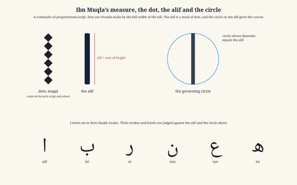
The circle with the alif as its diameter gave a framework for the round letters. The bowl of nūn, the tail of yāʾ, the loop of ʿayn and the sweep of the final qāf could all be described as arcs of this circle or of circles in fixed proportion to it. Later teachers broke the letters down into their elements, straight strokes, curves and dots, and taught pupils to build every letter from these parts. Yūsofī, summarising the four principles attributed to Ibn Muqla, describes respect for the elements, giving each letter its proper boldness or faintness and proper shape; proportion, meaning that identically shaped letters should be the same size in every context; composition, the arrangement of letters, words and lines into a beautiful layout; and seating, the placing of letters on and in relation to the line[9].
Twelve rules
The rules attributed to Ibn Muqla survive in later sources, notably in the encyclopaedia for secretaries compiled by the Mamluk official al-Qalqashandī in the early fifteenth century. Yūsofī divides them into two groups. The first, good shaping, ḥusn al-tashkīl, concerned the relative sizes of letters, roundness and straightness, tallness and shortness, thinness and thickness of strokes and the different kinds of straightness, vertical, horizontal and oblique. The second, good placing, ḥusn al-waḍʿ, concerned the joining of letters, the positions of separate letters, the gaps between words, the spaces between lines and the use of elongations to justify the margins[4].
Some of these terms are worth dwelling on, because they describe qualities that a reader of naskh still sees. Tarkīb, composition, is the art of arranging letters and words so that the line looks balanced. Kursī, the seat, refers to the vertical position of each letter in relation to the baseline, for in Arabic some letters sit on the line, some descend below it and some begin above it. Madd, elongation, is the stretching of certain connecting strokes, which allowed scribes to fill a line exactly without breaking words. Yūsofī notes that in composition the vowel signs, diacritical marks, pointing and ornaments must all be suitably placed, and that elongations are of great importance because they relieve monotony and impart symmetry[9].
The dot as a measure
Ibn al-Bawwāb is credited with extending the system. Yūsofī writes that he paid special attention to the cutting of the nib and the choice of ink, improved thuluth, naskh and riqāʿ, and initiated the practice of measuring letters in dots to set standards for the heights of tall letters, the length of an elongation in a given context or the size of a semicircle. Modern teachers, Yūsofī adds, often draw these dots hollow to avoid confusing them with the dots of the letters[4].
The result is a system that can be taught. A pupil copies a model, measures each letter with dots, and corrects it until the proportions match. The master checks the pupil’s work against the same standard. Because the measurements are relative to the pen, the same rules apply whether the script is written small, as in a book of naskh, or enormous, as in a mosque inscription in thuluth. That portability was one of the reasons for the system’s success. It gave every calligrapher, from Baghdad to Delhi, a shared grammar of form.
Measurement and judgement
It would be wrong, however, to imagine that the masters wrote with a ruler in one hand. The dot system is a teaching device and a way of describing proportions, not a recipe that produces beauty by itself. Derman insists that letter measurements were the result of a long process of seeking beauty and that calligraphers, when they had to, would depart from the measurements without forcing the aesthetic rules[28]. The great masters were admired precisely for the life they gave to letters that were nominally identical. The geometry was the skeleton. What later writers praised in Ibn al-Bawwāb, Yāqūt or Şeyh Hamdullah was the flesh that they put on it.
That tension between rule and freedom runs through the history of naskh. Each generation learned the proportions from its teachers, and each great master adjusted them. The changes were often small, the depth of a bowl, the angle of a join, the length of a tail, but they were visible to trained eyes, and they were enough to define schools and styles that lasted for centuries.
7. The Doorkeeper’s Son
Abū al-Ḥasan ʿAlī ibn Hilāl was known as Ibn al-Bawwāb, the son of the doorkeeper, because his father had kept a door at the court of the Buyid amirs who ruled Baghdad in the name of the Abbasid caliphs. He was also called Ibn al-Sitrī, the son of the curtain-keeper, for the same reason[24]. Nothing about his origins promised fame. D. S. Rice, who published the first full study of his only authenticated Qur’an in 1955, summarised the sources on his early life in a single sentence. He began his career as a house decorator, then illuminated books, and finally took to calligraphy, in which, as a medieval biographer put it, he excelled all those who had preceded him and confounded all those who came after him[10].
Muhittin Serin, his biographer in the Turkish encyclopaedia of Islam, adds that he studied religious sciences with Ibn Samʿūn, Qur’an reading with ʿUbayd Allāh al-Marzubānī and literature with the grammarian Ibn Jinnī, and that he earned his living as a preacher at the Mosque of al-Manṣūr in Baghdad and as a painter, illuminator, bookbinder and calligrapher[24]. His teachers in calligraphy were Muḥammad ibn Asad and Muḥammad al-Simsimānī, who were themselves pupils in the line of Ibn Muqla. One later account says that he was taught by Ibn Muqla’s daughter[10].
A court and a library
The decisive connection of his career was with the Buyid vizier Fakhr al-Mulk Abū Ghālib Muḥammad ibn Khalaf. When Fakhr al-Mulk became governor of Iraq in 1010, he made Ibn al-Bawwāb one of his companions, and through him the calligrapher was appointed to direct the library of the Buyid ruler Bahāʾ al-Dawla in Shiraz[24][10]. The Buyid libraries were among the richest of the age, and the position gave Ibn al-Bawwāb access to the work of earlier masters, including Ibn Muqla, which he studied closely.

That access produced the most famous story about him, which Rice translated from Ibn al-Bawwāb’s own account. In the library at Shiraz he found twenty-nine of the thirty parts of a Qur’an written by Ibn Muqla, scattered among other manuscripts. When a long search failed to turn up the thirtieth, he reproached the prince for allowing so precious a manuscript to be neglected. Bahāʾ al-Dawla told him to write the missing part in Ibn Muqla’s hand and promised him a hundred dinars and a robe of honour if the prince could not identify the forgery[10].
The forged volume
Ibn al-Bawwāb described what he did in detail. He went to the library and searched among the old paper for sheets resembling those of the Qur’an, choosing from several sorts of old Samarkand and Chinese paper. He wrote out the missing part, illuminated it and gave the gold an antique appearance. Then he removed the binding from one of the genuine parts, bound his own part in it, and made a new binding for the genuine volume, which he also made to look old[10]. Nearly a year passed before the prince remembered the wager. Shown the complete set of thirty parts, he examined each one and could not point to the new one. He kept the set but was slow to pay, and in the end Ibn al-Bawwāb asked instead for the sheets of Chinese paper kept in the library, which, Rice notes, kept him in paper for years[10].
Rice drew two conclusions from the story. It shows that Ibn al-Bawwāb could produce a convincing imitation of Ibn Muqla’s writing, and that he was an illuminator and bookbinder as well as a calligrapher[10]. It also shows how much calligraphers prized the materials of their art. The reward that mattered to Ibn al-Bawwāb was not gold but paper.
Poverty and posthumous fame
Ibn al-Bawwāb does not seem to have been wealthy. Rice cites the geographer Yāqūt al-Ḥamawī, who saw a seventy-line petition written by Ibn al-Bawwāb asking for help for a friend and for payment of two dinars that the addressee had promised. If Ibn al-Bawwāb had been rich, Rice observes, he would not have troubled to ask for so small a sum, or would have done so in a short note[10]. He died in Baghdad in 1022 and was buried near the tomb of Aḥmad ibn Ḥanbal. Rice preferred this date, given by the contemporary historian Hilāl al-Ṣābiʾ, to the later variant of 1031 or 1032[10][24].
His fame grew after his death. He is said to have known the Qur’an by heart and to have copied it sixty-four times, though Rice could identify only one surviving copy[10]. Serin adds a Dīwān of the pre-Islamic poet Salāma ibn Jandal in the Topkapı Palace Library, dated February 1018 and signed by him, written in alternating lines of rayḥānī, thuluth and tawqīʿ[24]. Later collectors paid large sums for anything in his hand, and forgers obliged them. Rice tells of a later scholar of Aleppo who bought a sheet in the master’s hand for forty dirhams, made a copy and sold it to a bookseller who passed it off as genuine for sixty[10]. David Roxburgh has shown how this market in specimens and attributions shaped what later generations believed about Ibn al-Bawwāb’s art[7].
The poem on the pen
Ibn al-Bawwāb also wrote about his craft. An epistle on penmanship survives only in its introduction, but a didactic poem rhyming in rāʾ, known as the Rāʾiyya, survives in many manuscripts and was quoted by the historian Ibn Khaldūn in his Muqaddima. Serin gives its length as twenty-eight couplets, of which Ibn Khaldūn quoted twenty-two, and notes that it attracted many commentaries[24]. Rice, less impressed, judged that it contained only vague generalities and offered no information about the master’s personal method[10].
An anonymous treatise summarised by Rice gives a more vivid picture of what later writers thought he had achieved. Its author argued that proportioned script gives the eye the same pleasure that harmonious music gives the ear, because its letters are proportioned in a natural way, like the parts of plants and the limbs of animals. Perfect writing, he insisted, could not be obtained by drawing the straight letters with a ruler and the round ones with a compass. He credited Ibn al-Bawwāb with completing the work of the Banū Muqla, who had improved the tawqīʿ and naskh scripts, and with mastering an unusual range of styles, including the gold script, the small hawāshī, thuluth, riqāʿ and rayḥān[10]. The same author concluded that later imitators had mastered only one or two scripts, while Ibn al-Bawwāb excelled in many.
Grace over geometry
The distinction later writers drew between Ibn Muqla and Ibn al-Bawwāb is captured in a phrase from the English orientalist Edward Robertson, quoted by Rice. Ibn Muqla, Robertson wrote, no doubt beautified writing, but the beauty lay in geometric design and in mathematical accuracy of reproduction, the art of the mechanical draughtsman[10]. Ibn al-Bawwāb gave the same system life. Serin puts it in more technical terms. Ibn Muqla classified the balanced scripts and set out the geometric rules of the letters on the basis of the circle, and Ibn al-Bawwāb bound those rules to finer geometric proportions, beautified the style and reduced the number of pens to eight[24]. His manner, Serin writes, dominated the Islamic world for nearly three centuries, until Yāqūt[24].
8. A Small Qur’an from Baghdad
In the Chester Beatty Library in Dublin there is a small book, about seventeen and a half centimetres tall and thirteen and a half wide, of 286 leaves of paper that have mellowed with age to a warm brown. Its colophon states that it was written by ʿAlī ibn Hilāl in Baghdad in the year 391 of the Hijra, which corresponds to 1000–1001 CE[10][30]. It is the only Qur’an that scholars accept as the work of Ibn al-Bawwāb, and it is one of the most famous manuscripts in the history of Arabic script. Rice called it the earliest surviving Qur’an in naskhī, and he published a complete facsimile of it in 1955[10].
Each page carries fifteen lines of text in a written area of about thirteen and a half by nine centimetres[10]. The ink is dark brown and has spread slightly into the paper around the letters, producing faint halos. The binding is modern and European, and the margins were trimmed before the manuscript reached the library, cutting away parts of the marginal ornaments. Rice compared it with three other dated manuscripts of the same period whose paper, format and ink are strikingly similar, including a Dīwān of al-Mutanabbī in the British Library dated 1002, and concluded that its authenticity was not in doubt[10].
Clarity without ostentation
What makes the manuscript remarkable is the combination of density and legibility. Rice described the letters as closely set, with the intervals between words and lines reduced to a minimum without any loss of clarity. Clarity and unostentatious virtuosity, he wrote, are the outstanding features of the book[10]. He went on to show how the script met the requirements of fine writing set out by Ibn al-Bawwāb’s contemporary Abū Ḥayyān al-Tawḥīdī, whose treatise on penmanship had been translated by Franz Rosenthal. The letters are arranged so that they look as if they smiled and showed their front teeth. The letters ḥāʾ, khāʾ and jīm are balanced against the others like wide-open eyes. Wāw, fāʾ and qāf are elegantly rounded, the loops of ʿayn and ghayn are clearly defined, and the nūn and yāʾ in short words seem woven on a single loom[10].
Rice pointed out one more detail that is easy to miss. The lines are perfectly straight from beginning to end, and yet there are no traces of the blind ruling that later calligraphers pressed into the paper to guide their hand[10]. Page after page of fifteen regular lines was written by eye. Rice concluded that despite the regularity of the letters there is nothing mechanical about them, and that this was the essence of Ibn al-Bawwāb’s contribution. He achieved a gracefully flowing script while preserving a systematised and proportioned alphabet[10].
Naskh or rayḥānī
Not everyone agrees on what to call the script. Rice and most Western scholars describe it as naskh. Ottoman and modern Turkish specialists, judging it by the standards of the mature Ottoman naskh, see in it the features of rayḥānī, the smaller partner of muḥaqqaq. Derman states that no work in naskh by Ibn al-Bawwāb has survived and that the Chester Beatty Qur’an is in rayḥānī[1]. Serin and Maşalı describe it in the same terms, adding that the sūra headings and explanatory notes are in tawqīʿ[24][14].
The disagreement is partly about words and partly about history. In the tenth and eleventh centuries the six pens had not yet settled into the distinct forms that later teachers codified, and a single hand could combine features that were later assigned to different scripts. Bloom, writing for a general audience, called it a rounded naskhī hand, the type of script that made Ibn al-Bawwāb famous[3]. Whatever label one prefers, the manuscript stands at the head of the tradition of small, legible Qur’ans in a proportioned cursive script, and it was in that tradition that naskh later triumphed.
Pages of gold and counts
The manuscript is also a masterpiece of illumination, probably by Ibn al-Bawwāb himself, who had begun his working life as a decorator. Discover Islamic Art, the online museum of the Museum With No Frontiers, notes that only the first two sūras begin with an illuminated heading, while the beginning of every other sūra is marked by a line of gold thuluth stating the title of the sūra and the number of its verses, with a stylised palmette extending into the margin. The book also contains five double pages of illumination[30]. Smarthistory describes how two of the frontispieces contain calligraphy giving the number of chapters, verses, words, letters, vowel signs and diacritical points in the text, according to a count attributed to ʿAlī ibn Abī Ṭālib. These counts were a certificate that the copyist had reproduced a particular reading of the text in full and without error[31].
The divisions of the text are marked with equal care. According to Serin, the ends of verses are marked with three blue dots, every fifth verse with a teardrop shape representing the letter hāʾ, whose numerical value is five, and every tenth verse with a medallion marking the ʿashr, sometimes in the text and sometimes in the outer margin[24][14]. In this small book, then, the elements of the later muṣḥaf page are already present. A legible cursive text, marks for every verse, a hierarchy of illuminated signs for larger divisions and headings in a contrasting script are all there.
A book for the market
Who was it for? There is no dedication. Bloom suggests that the absence of a dedication, combined with the small size and single-volume format, means that Ibn al-Bawwāb copied the manuscript not for a specific commission but in the hope of selling it on the market[3]. If so, the most celebrated Qur’an of its age was a commercial product, made by a professional for a buyer he did not know. That would fit the social history of naskh well. The proportioned cursive was born among the clerks and copyists, and its first great Qur’an was a handsome, portable, readable book of the kind that a prosperous Baghdad reader might want to own.
Tabbaa saw in manuscripts of this kind the visible sign of a changing attitude to scripture, in which the Qur’an was to be read plainly by anyone who could read[23]. Whether one accepts his theological argument or not, the Chester Beatty Qur’an shows that by the year 1000 a cursive script could carry the sacred text with dignity. It would take several more centuries, and the work of Ottoman calligraphers, for naskh to become the normal script of the muṣḥaf. But the possibility had been demonstrated in Baghdad.
9. Six Pens and Their Uses
Medieval writers on calligraphy used the word qalam, pen, in two senses. It meant the reed itself, and it meant a script, because each script was defined by the width of the pen with which it was written. The phrase al-aqlām al-sitta, the six pens, therefore names six scripts. In the form in which later teachers knew them they were thuluth and naskh, muḥaqqaq and rayḥān, tawqīʿ and riqāʿ[22][27]. They were often presented as three pairs of a larger and a smaller script, and each pair had its characteristic uses. Naskh served for ordinary books and small Qur’ans, muḥaqqaq and thuluth for large Qur’ans, and thuluth also for objects and buildings, while rayḥān, tawqīʿ and riqāʿ served chancery documents, colophons, book covers and the decorated opening pages of manuscripts[27].
The six pens did not spring into existence at once. Nihad Çetin traces their prehistory through a series of names preserved by Ibn al-Nadīm. Quṭba al-Muḥarrir, who died in 771, is said to have devised four pens, the first of them the qalam al-jalīl, the great pen. Isḥāq ibn Ḥammād, a famous secretary of the early Abbasid period, had many pupils, one of whom, Ibrāhīm al-Sijzī, devised two pens called thuluthayn and thuluth, two thirds and one third, measured against the ṭūmār, the largest pen used for the largest sheets. The secretary al-Aḥwal al-Muḥarrir, the most important figure between Quṭba and Ibn Muqla, is credited with eleven pens and scripts[22].
Pens measured against pens
This system of naming explains much about the early history of Arabic script. Çetin notes that a pen was first fixed for the largest sheets used in the chancery, and that smaller pens were then defined by their width in relation to it, two thirds, one half, one third and so on, each suited to a particular size of sheet. Some pens were named by their ratio to the standard, like the qalam al-thuluth, some by the office in which they were used, and some by their subject[22]. A secretary choosing a pen was choosing a scale and a register at the same time. A decree from the caliph required a larger, statelier pen than a note between officials.
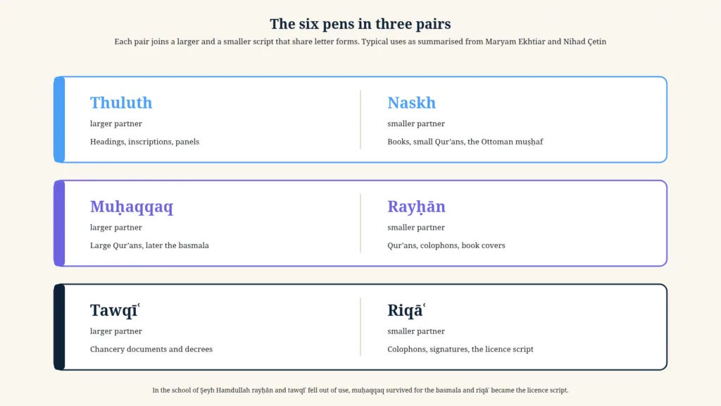
In this system the name naskh did not originally refer to a pen size at all. It described a use, copying, and the hand that copyists wrote. That is one reason why its history is harder to trace than that of thuluth or tawqīʿ. It was not a chancery pen with a defined place in a hierarchy of widths, but the working hand of the book trade, and it entered the canon of proportioned scripts as the small partner of thuluth, sharing many of its letter forms in a reduced and simplified version.
Qalqashandī’s catalogue
By the early fifteenth century the system had settled. The Mamluk official Aḥmad al-Qalqashandī (died 1418), whose vast manual for chancery secretaries, Ṣubḥ al-aʿshā, is one of the richest sources for the history of Arabic script, listed the pens of his time. Çetin notes that al-Qalqashandī named thuluth, tawqīʿ, riqāʿ, muḥaqqaq, rayḥānī, naskh, musalsal and waḍḍāḥ among other forms, and explains that several of these were really different sizes of the same style written with different pens. Musalsal, a script in which every letter was joined to the next, had grown out of tawqīʿ. Waḍḍāḥ was a large form of naskh, and ḥawāshī was naskh written small in sloping lines, typically in margins, while rayḥānī was regarded as a branch of muḥaqqaq of half its size[22].
Derman gives the same picture for Mamluk Cairo. Surviving examples show that a larger, more widely spaced naskh was called naskh al-waḍḍāḥ, a finer naskh written in slanting lines was called ḥawāshī or hidden naskh, and the finest of all was called ghubārī, the dust script[1]. Derman adds that the natural width of a naskh pen is about one millimetre, and that naskh written with a broader pen was once called jalī naskh[1]. The naskh family, in other words, covered a range of sizes from the bold to the microscopic, each suited to a particular task.
The pairs in practice
The pairing of scripts had a practical logic. Thuluth and naskh share a basic repertoire of rounded forms, with deep bowls and curving tails. Muḥaqqaq and rayḥān share long, straight horizontals and tails that extend flat along the line, giving a sense of breadth. Tawqīʿ and riqāʿ, the chancery scripts, share a tendency to join letters that would normally be separate and to write quickly with a pen cut closer to the straight. A calligrapher trained in one member of a pair could move easily to the other, changing the size of the pen and adapting the proportions.
Pages written in more than one script exploited these relationships. From the time of Yāqūt onwards, Derman notes, Qur’ans were increasingly written with lines of different sizes of script in alternation, naskh with the thicker thuluth or muḥaqqaq, according to a fixed page layout, and the practice continued, gradually diminishing, until the sixteenth century[1]. The Ottoman habit of writing exercise sheets with a line of thuluth above and below and two shorter lines of naskh in the middle, which Derman describes as the most common way of teaching the two scripts together, preserves the same pairing in the classroom[1].
The decline of four pens
Of the six, two eventually came to dominate. Serin observes that in the school of Şeyh Hamdullah, which mainly practised thuluth and naskh, rayḥānī and tawqīʿ were in time abandoned, muḥaqqaq survived for writing the basmala, and riqāʿ survived under the name of the licence script, khaṭṭ al-ijāza, for calligraphers’ signatures, scholarly licences and the colophons of books[5]. Muḥaqqaq, the script of the vast Mamluk and Ilkhanid Qur’ans, had been the grandest of all, but its broad forms did not suit the smaller formats and denser texts that later patrons wanted.
Naskh’s survival was not inevitable. Until the sixteenth century, as Derman points out, muḥaqqaq and rayḥānī were frequently preferred for copying the Qur’an, and naskh often appeared only as one script among several on the page[1]. Its rise to dominance was the work of particular masters and particular patrons, above all in Ottoman Istanbul. But it had one advantage that its rivals lacked. It was the hand in which everything else was already being written. When readers came to want a Qur’an that looked like the other books they read, naskh was ready.
The name of a style
A last point about terminology. When medieval and Ottoman writers wanted to speak of a style rather than a pen size, Çetin notes, they often used the word ṭarīqa, way or method, as in the way of thuluth or the way of muḥaqqaq[22]. The same word was used for the personal manner of a master, the ṭarīqa of Ibn al-Bawwāb or of Yāqūt. Rice uses it in this sense when he writes that the method of Ibn al-Bawwāb was incontestably the most celebrated for two centuries before Yāqūt’s ṭarīqa became fashionable[10]. A script, in this way of thinking, was not a fixed alphabet but a path that a master opened and his pupils followed.
10. Yāqūt and the Oblique Cut
The third founder of the classical tradition was a slave. According to the sources summarised by Serin, Jamāl al-Dīn Abū al-Majd Yāqūt was brought to Baghdad as a small child among captives from the lands of Rūm, the former Byzantine territories of Anatolia, and was bought by al-Mustaʿṣim, the last Abbasid caliph, from whom he took his name al-Mustaʿṣimī. Some writers have claimed that he was a Turk or a Greek from Amasya, and others that he was Ethiopian, but Serin finds no solid evidence for any of these claims[32]. As a eunuch in the palace, he received a disciplined education under the caliph’s personal attention, studying Arabic language and literature along with the other sciences of his day.
Yāqūt learned calligraphy from Ṣafī al-Dīn al-Urmawī, the celebrated musician and theorist of music who was one of the caliph’s companions and the director of his library, and then studied with a calligrapher named Ibn Ḥabīb. Some later works make him a pupil of Shuhda bint al-Ibarī, the famous woman scholar and calligrapher of twelfth-century Baghdad, but Serin notes that researchers have shown this to be chronologically impossible[32]. After completing his training, he studied the work of Ibn Muqla and especially Ibn al-Bawwāb for many years before developing a style of his own[32].
The angle of the nib
Yāqūt’s most famous innovation concerned the pen. Serin writes that he redefined the angle of the nib for each script and established the classical proportions of the six scripts, so that in each the height and width of letters in relation to the pen’s dot, the depth and width of bowls, the length and depth of the strokes of nūn, kāf and yāʾ, the spacing of letters and words on the line and the way letters joined one another were fixed in their most beautiful form[32]. The Iranian historian Qāḍī Aḥmad, writing at the end of the sixteenth century, credited Yāqūt with first cutting the nib at an angle, which gave the letters refinement and variety of line[27]. Derman, in his account of the reed pen, repeats that the sources attribute the oblique cut to Yāqūt[33].
The importance of the oblique cut is easy to understand once one has handled a reed pen. A nib cut straight across makes strokes of a fixed width that depend only on the direction of movement. A nib cut at an angle, with one side longer than the other, sits naturally on the paper when the pen is held in the hand, and its contact with the paper changes subtly as it moves, producing sharper thins, fuller thicks and more delicate transitions. Derman records the old saying that writing done with a straight-cut pen is strong, writing done with a sharply angled pen weak but sweet, and that the best lies between[33]. Rice described Yāqūt’s writing as thin and delicate and traced with an obliquely cut nib, the manner that future generations strove to imitate[10].
The minaret in 1258
In February 1258 the Mongol army of Hülegü took Baghdad. The caliph al-Mustaʿṣim was killed, much of the city was sacked, and the Abbasid caliphate, which had lasted five centuries, came to an end in its capital. Serin records that Yāqūt passed those terrible days hiding in a minaret[32]. He survived, and his career flourished under the new rulers.
Serin notes that Yāqūt won the favour of Hülegü and his successor Abaqa, and especially of the brothers ʿAṭāʾ Malik Juwaynī and Shams al-Dīn Juwaynī, the great Persian administrators of the Ilkhanid state, who gave him their respect and support. He spent the longest and most productive years of his life in Baghdad, training pupils and copying the Qur’an[32]. He died in Baghdad at a great age and was buried beside the tomb of Aḥmad ibn Ḥanbal, as Ibn al-Bawwāb had been. Later sources give various dates for his death, but his pupil Ibn al-Fuwaṭī and contemporary historians give 698, corresponding to 1298–1299[32]. Rice gives the same year[10].
The cynosure of scribes
Yāqūt’s style was adopted throughout the Islamic world, and he became known as qiblat al-kuttāb, the qibla of the scribes, the direction towards which all calligraphers turned. He trained many pupils from different countries, and six of them, together with their master, were known as the seven masters, each a specialist in one script but accomplished in the others[32]. Serin lists among them Arghūn ibn ʿAbd Allāh al-Kāmilī, a specialist in muḥaqqaq who wrote twenty-nine Qur’ans, Aḥmad al-Suhrawardī, considered a leading master of large scripts and of naskh, Mubārakshāh al-Suyūfī, Mubārakshāh ibn Quṭb, a naskh specialist, ʿAbd Allāh al-Ṣayrafī, known for his thuluth, and Naṣr Allāh al-Ṭabīb[32].
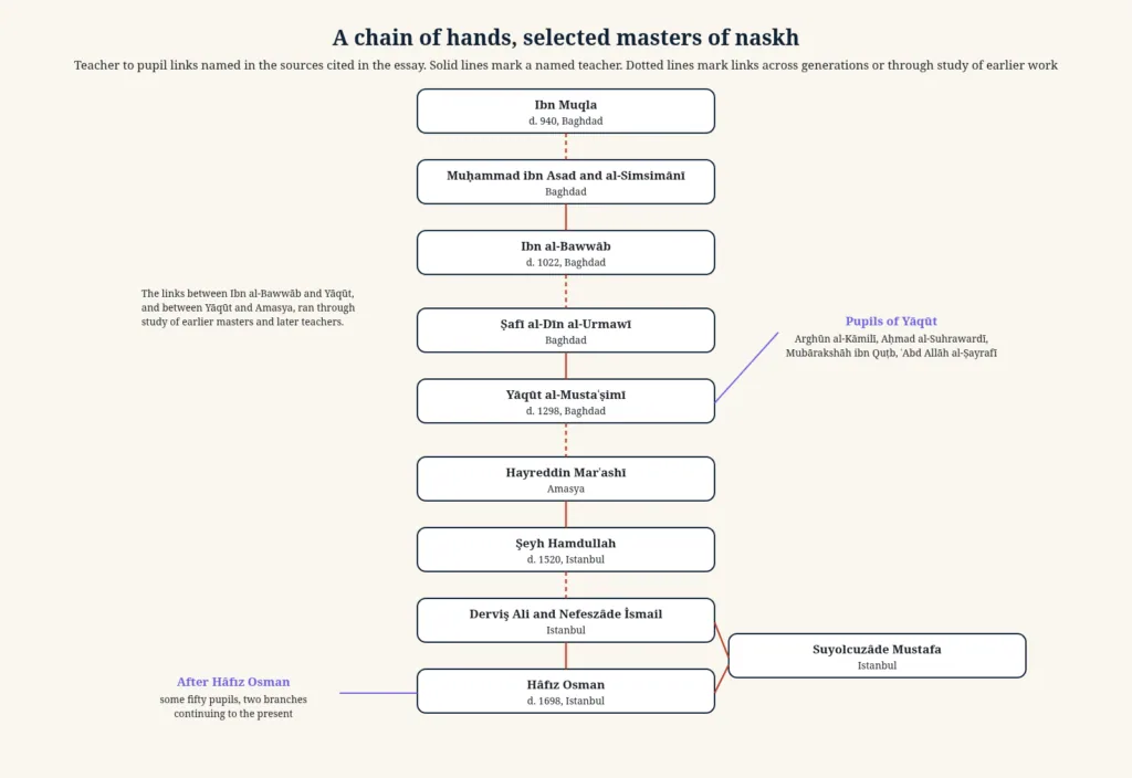
His output was enormous, or at least his reputation was. He is said, with obvious exaggeration, to have copied the Qur’an a thousand and one times. Serin notes that, on the evidence of manuscripts bearing his signature, he can be regarded as the calligrapher who wrote more Qur’ans than any other, but that among the works signed with his name there are many imitations whose signatures were added by others, and that sorting them out is very difficult[32]. Rice put it more bluntly. Many of the manuscripts ascribed to Yāqūt are palpably spurious[10]. Roxburgh’s essay on Yāqūt’s legacy traces how Persian and Ottoman writers made him the third great master of the six scripts and how his name became a byword for excellence[34].
Yāqūt and naskh
For the history of naskh, Yāqūt’s contribution was double. On the one hand he established classical forms for the script. Derman notes that Yāqūt left several Qur’ans in both naskh and rayḥānī, among them one in Istanbul University Library[1]. Serin notes that if the early works of Şeyh Hamdullah are compared with this manuscript, the resemblance of their naskh is plain to see, which shows how directly Yāqūt’s model was transmitted[5]. On the other hand, Serin judges that while the classical forms of thuluth and naskh were fixed in Yāqūt’s style, it was muḥaqqaq and rayḥānī above all that reached their classical form and beauty in his hand[32]. The perfection of naskh would come later, in the Ottoman school.
His influence lasted for nearly two centuries. In Iran it lasted longer. Serin notes that while the Ottoman school, under Şeyh Hamdullah, moved away from Yāqūt’s model, Iranian calligraphers continued to follow it and produced work in his manner. Even in Istanbul, Aḥmed Şemseddin Karahisârî, regarded as the sun of calligraphy in the reign of Süleyman the Magnificent, carried Yāqūt’s style to its peak and tried to revive it in naskh against the manner of Şeyh Hamdullah, though, as Derman notes, the effort lasted only a single generation of calligraphers[32][5][1].
11. Cairo, Damascus and Tabriz
The Mongol conquest of Baghdad in 1258 scattered the city’s calligraphers, but it did not end the tradition they carried. For the next two and a half centuries the proportioned scripts flourished in two great political worlds. In the east, the Ilkhanid rulers of Iran and Iraq and their Timurid successors patronised the pupils of Yāqūt. In the west, the Mamluk sultans of Egypt and Syria, former slave soldiers who had halted the Mongol advance in 1260, made Cairo and Damascus the richest centres of book production in the Arabic-speaking world. Çetin describes the period as one of selection and settling, in which the proportioned scripts developed in two directions at once, one in the conservative milieu of the official chanceries and the other in the circles of calligraphers who were refining the six pens for their own sake[22].
A pupil of Yāqūt in Cairo
The movement of people between these worlds is illustrated by the career of Sharaf al-Dīn Muḥammad ibn Sharīf, known as Ibn al-Waḥīd. Born around Damascus, he travelled to Baghdad, where he learned the six scripts from Yāqūt, and then moved to Cairo, entering the service of the amir Baybars al-Jāshnagīr, who later briefly became sultan. He served as a legal secretary at the Mosque of al-Ḥākim, was known as a linguist and poet, and died in 1311 at the age of sixty-one[35]. His most famous work is a seven-volume Qur’an written in gold for Baybars between 1304 and 1306, now in the British Library. Summarising Sheila Blair’s analysis, the Islam Museum notes that he followed many of the traditions of Yāqūt’s followers in Iran and Iraq, using the large half-Baghdadi sheet, but departed from them in dividing the text into seven parts and writing an even number of lines, six to the page, perhaps following a Syrian tradition[35].
The script of the Baybars Qur’an is a reminder that the boundaries between the six pens were not always fixed. Its rounded letters, with many upturned tails and crowded words that do not sit on a firm baseline, were described by Mamluk sources as thuluth ashʿār, a hybrid said to combine muḥaqqaq, thuluth and naskh[35]. Ibn al-Waḥīd worked with a team of illuminators and outliners larger than those of his Baghdad contemporaries[35]. The great Mamluk Qur’ans, made for sultans and amirs and endowed to their mosques, madrasas and tombs, were collaborative works on a monumental scale.
The naskh of Mamluk books
The monumental Qur’ans were mostly written in muḥaqqaq and thuluth. The ordinary books of Mamluk Cairo and Damascus were written in naskh. The cities were full of madrasas, each with its library, and of scholars who needed copies of legal manuals, collections of ḥadīth, grammars, commentaries and histories. Derman’s account of the varieties of naskh used in Mamluk Cairo, with its broad naskh al-waḍḍāḥ, slanting ḥawāshī and microscopic ghubārī, reflects a book culture in which the same script served for main text, marginal commentary and the smallest notes[1]. The Islamic codicology manual edited by François Déroche shows how such books combined text, commentary and glosses on the same page, often in different sizes of the same hand, and how copyists recorded their names and the date and place of their work in colophons[18].
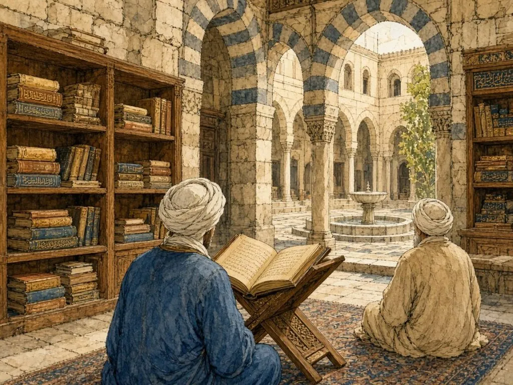
Naskh in this period had not yet acquired the polish of the later Ottoman script. The earlier tradition of Ibn al-Bawwāb continued to influence it. Derman cites a Qur’an written in naskh by Muḥammad ibn Altuntaş in 1186, now in the Topkapı Palace Museum, as representative of Ibn al-Bawwāb’s naskh style[1]. By this time, as Jonathan Bloom’s history of paper in the Islamic lands makes clear, paper had long since become the normal material of books from Iran to Egypt, and the burnished sheet was the surface on which these hands were formed[21].
The chancery manual
The most detailed Mamluk testimony about scripts comes from a bureaucrat. Shihāb al-Dīn Aḥmad al-Qalqashandī, who died in 1418, worked in the chancery of the Mamluk sultans in Cairo and wrote Ṣubḥ al-aʿshā, a vast manual of the secretary’s craft, which includes long chapters on pens, ink, paper and the forms of letters[22][9]. Çetin notes that al-Qalqashandī lists the scripts of his time, among them thuluth, tawqīʿ, riqāʿ, muḥaqqaq, rayḥānī, naskh, musalsal and waḍḍāḥ, and that by the early fifteenth century the phrase al-aqlām al-sitta in the chancery referred to the pens listed above, with various styles derived from them[22]. The manual is a record of a system at its fullest extent, just before the Ottoman school simplified it.
For al-Qalqashandī, script was part of the secretary’s competence and of the state’s dignity. Different sizes of pen and sheet were prescribed for different ranks of correspondent, and the choice of script itself carried meaning. Naskh appears in this world as the script of books rather than of decrees. It was the hand in which the secretary had learned his grammar and law, rather than the hand in which he wrote to a foreign king.
The pupils in the east
Meanwhile, in the east, Yāqūt’s pupils carried his method into Iran. Yūsofī notes in the Encyclopaedia Iranica that after Yāqūt the style he and his pupils had developed was for a long time accepted in the six scripts, that several of his leading pupils were Persian, and that Khorasan, Fārs and Azerbaijan were the main centres of the art in the fourteenth to sixteenth centuries[9]. Aḥmad al-Suhrawardī, perhaps the most famous of the six pupils, copied thirty-three Qur’ans according to the tradition summarised by Serin[32]. Under the Ilkhanids, who converted to Islam at the end of the thirteenth century, the vizier Rashīd al-Dīn founded a scholarly quarter outside Tabriz with a scriptorium where copies of his own works and of the Qur’an were produced on a lavish scale[37].
The great Ilkhanid and Timurid Qur’ans were mostly written in muḥaqqaq. For other books, however, Persian calligraphers were creating new scripts. Yūsofī explains that the Persian way of writing naskh underwent gradual changes from the eleventh century onwards, and that from these changes, together with improvements in Persian pens, a script called taʿlīq, the hanging script, emerged in the thirteenth century, combining elements from naskh, tawqīʿ and riqāʿ[9]. It was the first step on a path that would lead Persian calligraphy away from naskh for most purposes.
Two traditions diverge
By the end of the fifteenth century the tradition of the proportioned scripts had divided. In the Mamluk lands, the six pens continued to be practised in a manner close to Yāqūt’s and to the older traditions of Ibn al-Bawwāb. In Iran, the six pens remained the scripts of the Qur’an, but poetry and literature were increasingly written in the new Persian scripts. And in Anatolia, in the small city of Amasya, a young calligrapher was learning the six pens from a master in the line of Yāqūt. The next chapters follow the eastern and Ottoman stories in turn. The Mamluk tradition ended, at least as an independent school, when the Ottoman sultan Selim I conquered Syria and Egypt in 1516 and 1517. From then on, Cairo and Damascus belonged to the Ottoman world, and their calligraphers gradually adopted the Ottoman manner. Derman notes that while naskh continued to evolve in Istanbul, the Ottoman style was adopted and spread in the other Islamic countries[1].
12. Naskh beside Nastaʿlīq
In the second half of the fourteenth century a new script took shape in Iran. Yūsofī writes that it was called nastaʿlīq, from naskh and taʿlīq, and that it combined the well-balanced and handsome naskh with the hanging taʿlīq. It did not have to be written slowly like naskh, and it was free from the shortcomings of taʿlīq[9]. Its letters lean and sweep, with long horizontal curves descending from right to left, and its rhythm suits the couplets of Persian poetry perfectly. In the fifteenth and sixteenth centuries, under the Timurids and the early Safavids, nastaʿlīq became the dominant script of Persian literature, of album pages, of illustrated manuscripts and of much of the Persianate world as far as Mughal India and Ottoman Istanbul.
Naskh did not disappear in Iran, but its role changed. Yūsofī’s judgement of the two scripts is revealing. In terms of regularity, clarity and balance nastaʿlīq equals naskh, and in speed of writing it equals taʿlīq, but in beauty and grace, he writes, it is superior to both[9]. For Persian calligraphers, naskh became the script of the Qur’an, of Arabic texts, of prayers and of scholarly works, while nastaʿlīq became the script of their own language and literature. The division of labour still holds in much of the Persian-speaking world.
The measure of a round hand
Yūsofī’s description of naskh in the Iranica summarises what Persian calligraphers valued in it. Its great merit is its respect for proportions. The sizes of identically or similarly shaped letters are uniform and consistent. The letters and words are not large, but they are well balanced, and it is this proportionality and balance that give the script its beauty. It is full, neat and clear, and easy to read correctly, and when the vowel signs are added the reading is unmistakable[9]. He adds a precise observation about its balance, which is obtained by an equal distribution of flat and circular forms, roughly half straight and half round, and by heavy and light movements of the pen[9].
The comparison with nastaʿlīq makes the point clearer. In nastaʿlīq, according to Yūsofī, roundness predominates, with only a third to a sixth of the strokes straight, and the pen moves more freely and more easily than in naskh[9]. Naskh is a script of equilibrium, in which horizontals and curves, thicks and thins, are held in balance. Nastaʿlīq is a script of movement. The difference corresponds to the uses each served. A Qur’an or a legal text needed equilibrium and clarity. A lyric poem could afford to dance.
The naskh of Isfahan
At the end of the Safavid period, a calligrapher from the small town of Neyriz in Fārs gave Persian naskh its definitive form. Aḥmad Neyrīzī travelled to the Safavid capital Isfahan, where he studied first with Muḥammad Ṣādiq Tabrīzī and then with Muḥammad Ibrāhīm Qummī[38]. He wrote thuluth, riqāʿ, nastaʿlīq and shikasta, but he made his mark by fashioning his own style of naskh. According to the Reed College anthology of Iranian calligraphers, naskh had slowly been coming into its own at this time, and Neyrīzī significantly developed and structured it, so that under his influence Iranian naskh gained formal recognition and he became its most famous master[38].
Neyrīzī was not only a court artist producing album pages. He also worked, like calligraphers who had to support themselves, by copying long and difficult texts, and thirty copies of the Qur’an bearing his signature survive. The anthology notes that because of his fame some of these may have been written by students or contemporaries who forged his signature[38]. His dated works run from 1683 to 1747, a career of more than six decades. Yūsofī records that he made experiments with naskh and adopted the style known as Persian naskh, which remains current today[9]. The Metropolitan Museum of Art holds a leaf of Arabic prayers in his hand, dated 1714[39].
A rounder naskh
The Persian naskh of Neyrīzī and his successors differs visibly from the Ottoman naskh that was developing at the same time in Istanbul. It is rounder and more generous, with a slight lean and with letter forms influenced by the long practice of nastaʿlīq. Words tend to be spaced more widely, and the bowls of the final letters are fuller.
Derman observes that the Islamic states of the Iranian world followed the way of Yāqūt for a long time, but that calligraphers after the sixteenth century moved away from Yāqūt’s manner and continued to write in a different style[1]. Persian naskh is thus an independent development of the tradition, parallel to the Ottoman one and not derived from it. Both looked back to Yāqūt, and both transformed his model, but in different directions.
Naskh as the printed norm
Yūsofī ends his account of naskh with a statement about the present. Modern naskh, he writes, has been further developed to meet the requirements of printing, and is the script in which the Qur’an and all kinds of books, newspapers and periodicals are now printed in Iran, Afghanistan and the Arab countries. The vowel signs and other marks are not inserted, he notes, except in printed Qur’ans, in which a slightly different variety of naskh is used, in texts of ḥadīth and in prayers[9]. He also points out that the script used in the Arab countries for handwritten letters and quick notes, ruqʿa, originated in Ottoman Turkey and is itself a simplified form of naskh[9].
The observation is a useful corrective to the image of naskh as purely a calligraphic art. In Iran, as elsewhere, naskh was the script of everyday reading, and the transition from manuscript to print turned it into the norm for an entire civilisation’s books. Persian literature might be written by hand in nastaʿlīq, but when it came to be set in movable type the type was usually modelled on naskh, because naskh, with its regular forms and horizontal baseline, was far easier to cut, cast and compose. The script of copying became the script of printing.
13. The Shaykh of Amasya
Amasya is a small city in northern Anatolia, built along a gorge of the Yeşilırmak river beneath cliffs cut with the rock tombs of the kings of Pontus. In the fifteenth century it was the seat of an Ottoman prince, where heirs to the throne were sent to learn the art of government, and it was famous for its calligraphers. Muhittin Serin calls it the cradle of calligraphy[5]. Here, around 1436, Hamdullah was born, the son of Mustafa Dede, a shaykh of the Suhrawardī Sufi order whose family had come to Amasya from Bukhara. Müstakimzâde, the great eighteenth-century biographer of Ottoman calligraphers, gives the year 1436, while other writers place his birth a few years earlier[5].
Hamdullah studied religious sciences, language and literature, and learned the six pens from Hayreddin Marʿashī, one of the leading masters of the city, from whom he received his licence. He also completed his Sufi training under his father and received authority to guide disciples in his turn[5]. Through his father’s gatherings, Serin suggests, he probably came to know the young prince Bayezid, the son of Mehmed the Conqueror, who was governor of Amasya. Bayezid, a cultivated man who knew music well enough to compose and was well read in Turkish, Arabic and Persian literature, made Hamdullah his teacher of calligraphy and received a licence from him[5].
A calligrapher at court
Already in Amasya, Hamdullah was copying books for the private library of Mehmed the Conqueror. Two of them survive, a medical treatise attributed to Ḥunayn ibn Isḥāq in the Topkapı Palace Library and a work on the health of bodies and souls in the Süleymaniye Library[5]. When Bayezid became sultan in 1481, he invited his teacher to Istanbul. Hamdullah came with his family and was appointed to teach the palace secretaries and servants. He was given a writing room near the harem and another in the palace at Edirne, and the revenues of two villages at Üsküdar, with the income of one village assigned to the burnishers who polished the paper on which he wrote[5].
From then on he signed his works as kātib al-sulṭān Bāyezīd Khān, the scribe of Sultan Bayezid. Serin notes that according to the register of gifts that Bayezid made to scholars and artists between 1503 and 1512, the largest sums of all were paid to Hamdullah for the Qur’ans he copied[5]. No calligrapher before him had been rewarded so lavishly by an Ottoman ruler.
Seven pieces from the treasury
The turning point in Hamdullah’s art is attributed to a suggestion by the sultan. All the sources, Serin writes, agree that Bayezid took seven pieces of Yāqūt’s writing from the treasury and gave them to Hamdullah, remarking that if a new manner other than this one were invented, it would be good[5]. Hamdullah studied the pieces, interpreted what he found in them and produced a style of his own. Serin describes its qualities in detail. By harmonising the proportions of the letters and their arrangement, by adding slanting strokes, regular verticals and extended strokes, his style gave writing a fluency, suppleness, charm and liveliness that relieved the stiffness of Yāqūt’s letters sitting on their line[5].
The change can be seen by comparing his early and late works. Serin notes that if his early works from the Amasya period are set beside a Qur’an signed by Yāqūt in Istanbul University Library, the similarity of their naskh is evident, while his mature works, above all a Qur’an now in the same library, show the innovations he introduced[5]. Derman adds that although the movement of renewal encouraged by Bayezid touched all six pens, it was in naskh that Hamdullah’s style achieved its greatest aesthetic value[1].
The naskh Qur’an
Hamdullah’s most consequential achievement was to make naskh the script of the Qur’an. Serin writes that naskh, made admirably beautiful and easy to read in his school, came to be preferred as the script of books and Qur’ans. By writing the whole text in naskh, he gave it continuity and ease of reading, and the older manner, in which muḥaqqaq, rayḥānī or several of the six pens were combined according to Yāqūt’s layout, was gradually abandoned. In its place, throughout the Islamic world, the tradition of writing the Qur’an in Hamdullah’s naskh prevailed[5]. Serin adds that page layout and the spacing of lines also found their finest proportions with Hamdullah, and that his style brought elegance, simplicity, continuity and charm to the writing of the muṣḥaf[5].
Derman makes the same point from the perspective of the script. From Hamdullah onwards, he writes, the Qur’an was written in naskh among the Ottomans, and for this reason Müstakimzâde described naskh as the servant of the noble Book. Thousands of calligraphers devoted their lives to copying the Qur’an in naskh, and among those whose copies have artistic value, Ramazan ibn İsmail with four hundred and Çemşir Hâfız with four hundred and fifty-four stand at the head of the list[1]. Hamdullah himself is credited with forty-seven Qur’ans[5].
Archer, swimmer and tailor
Hamdullah was a man of many skills. He was one of the famous archers of his day, and Bayezid appointed him shaykh of the archers’ lodge at Okmeydanı in Istanbul. According to archery treatises, he broke the record of a champion with a shot of 1,105.5 gez, about 730 metres, and set up a marker stone near the lodge in memory of the feat. The stone, the oldest of its kind still standing at Okmeydanı, is about one and a half metres tall and bears the inscription “Hamdullah son of the shaykh, chief of calligraphers, shaykh of the archers, year 911”, corresponding to 1505–1506[5]. The sources also say that he was a strong enough swimmer to cross from Üsküdar to Sarayburnu, and that he once sewed a kaftan for Bayezid so skilfully that its seams could not be seen[5].
After Bayezid’s death in 1512, Hamdullah withdrew from court for eight years, spending the reign of Selim I teaching pupils and guiding disciples. Süleyman the Magnificent invited him to the palace and asked him to copy a Qur’an. Hamdullah excused himself on account of his age and recommended a younger relative, Celâlzâde Muhyiddin Amâsî. Süleyman, Serin writes, dressed him in a sable fur and received his blessing[5]. He died a few months later, in 1520, in his eighties, and was buried in the Karacaahmet cemetery at Üsküdar. Many calligraphers were later buried near him, and the place came to be called Şeyh Sofası, the shaykh’s terrace[5].
The longest-lived school
Of all the schools of calligraphy, Serin concludes, that of Şeyh Hamdullah lived the longest. Its classical forms were refined by the masters who followed him, who improved the proportions, posture and composition of the letters and divided into many branches and manners, but it has continued down to the present as the dominant school of calligraphy throughout the Islamic world. Those who succeeded in his manner were praised with the words “he wrote like the Shaykh”[5]. He is also credited with fixing the form and proportions of the sülüs-nesih kıta, the album panel combining a line of thuluth with lines of naskh, in a shape suited to Ottoman taste[5]. The Ottoman naskh that would later be cut in metal type and drawn in digital outlines descends, through a long chain of teachers and pupils, from his hand.
14. Hâfız Osman and the Ottoman Muṣḥaf
Osman was born in Istanbul in 1642, the son of Ali Efendi, a muezzin at the Haseki Sultan mosque. He memorised the Qur’an as a child, and the title hâfız, one who knows the Qur’an by heart, became almost his first name[6]. He was brought up in the household of the vizier Köprülüzâde Fâzıl Mustafa Paşa, where he became interested in calligraphy. His first teacher was Derviş Ali, one of the great masters of the century. When the old man was no longer able to give him the attention he needed, the tradition goes, he sent him to the most brilliant of his own pupils, Suyolcuzâde Mustafa Eyyûbî[6].
Uğur Derman, his biographer, tells the story that sealed the bond between the two. On a snowy winter day the boy walked barefoot all the way from Haseki to the district of Eyüp, at the far end of the Golden Horn, to attend his lesson, and the affection and esteem his teacher felt for him grew still greater. He received his licence at eighteen[6]. That might have been the end of his training. Instead, having written for some years in the manner of Derviş Ali, he decided to learn the style of Şeyh Hamdullah from Nefeszâde Seyyid İsmail Efendi, who knew it in its most perfect form, and became a pupil again, starting from the alphabet[6].
Imitation as discipline
Derman sees in this decision an early understanding that the renewal he would later bring to the six pens could only come from the school of Hamdullah. Hâfız Osman went on to study Hamdullah’s works and increased his skill by copying a Qur’an by the shaykh preserved in the palace. Derman explains that imitation, taqlīd, is in calligraphy the skill of setting aside one’s own artistic identity and reproducing exactly the work of another master, and that it is regarded as an honourable practice[6]. Even at the height of his career, Hâfız Osman continued to make copies of Hamdullah’s works and to sign them with his own name, showing the value he set on them.
After years of searching for the most beautiful forms, he found his own style around 1679. Just as Hamdullah had interpreted the beauties he saw in Yāqūt’s work to create a personal style, Derman writes, Hâfız Osman made the same interpretation of Hamdullah’s writing, and in this way Ottoman calligraphy moved towards a distilled and purified form[6]. His style was at first criticised and envied, but it soon established itself and made people forget the style of Hamdullah. The decade from 1679 to 1689 is regarded as his finest period. After 1689 he made the letters of his naskh still smaller[6].
The inkwell held by a sultan
In 1695 he was appointed teacher of calligraphy to Sultan Mustafa II, and he had also taught the future Ahmed III while he was a prince[6]. Derman records the famous anecdote of the royal pupil who would sit beside his teacher, holding the inkwell in his hand as a mark of respect, while Hâfız Osman prepared his lessons. When the sultan remarked in admiration that no other Hâfız Osman would ever be trained, the calligrapher, a man of dervish temperament, is said to have replied that as long as there were sultans who held the inkwell for their teachers, many more Hâfız Osmans would be trained[6].
He was generous with his knowledge. Derman notes that he taught calligraphy at his home without payment, to poor children on Sundays and to children of well-off families on Wednesdays, and that when a pupil who had arrived late met him in the street near the Cerrahpaşa baths, he sat down at the roadside and repeated the lesson[6]. He also enjoyed watching wrestling. He died at his house in the Kocamustafapaşa district on 3 December 1698 and was buried in the cemetery of the Sünbül Efendi lodge. His fellow calligrapher Ağakapılı İsmail Efendi wrote the inscription on his tombstone, which declares that we knew fine writing, but Osman Efendi wrote it[6].
Twenty-five Qur’ans
Between 1659 and his death, Hâfız Osman copied the Qur’an twenty-five times. For his tenth, written in 1675 for the grand vizier Fâzıl Ahmed Paşa and now lost, he received the large sum of three hundred and fifty kuruş[6]. His Qur’an of 1686, now in the Museum of Turkish and Islamic Arts in Istanbul, had a remarkable afterlife. In 1881, by order of Sultan Abdülhamid II, it was printed by the printer Osman Bey and distributed throughout the Islamic world, and several other Qur’ans in his hand were printed as well[6]. Maşalı adds that the 1686 copy was printed on sized paper to be presented to statesmen[14]. In this way the script of a seventeenth-century calligrapher became, through photographic reproduction, the face of the Qur’an for millions of readers in the late nineteenth and twentieth centuries.
His influence extended beyond the Qur’an. Derman credits him with developing the hilye, a calligraphic panel describing the physical and moral qualities of the Prophet Muḥammad, into a standard composition, with arranging the first hilye with a Turkish translation, and with turning the prayer book Dalāʾil al-khayrāt into a work of calligraphic art[6]. Some fifty of his pupils are known by name, and his chain of transmission has continued through two separate branches down to the present, a distinction, Derman writes, that no other name in calligraphy can claim[6].
The architecture of the page
The Ottoman muṣḥaf that Hâfız Osman and his successors perfected had a regular architecture. Maşalı notes that from the fourteenth century onward, and especially in Ottoman Qur’ans, page layouts settled into a standard of nine, eleven, thirteen or fifteen lines. Qur’ans arranged in fifteen lines in which each page ended with the end of a verse were called âyet-berkenar, or muṣḥaf al-ḥuffāẓ, the Qur’an of the memorisers, because they made memorisation easier[14]. When and by whom this arrangement was first devised is not known. A Qur’an signed by Yāqūt in the Egyptian National Library is laid out in this way, which suggests that the practice is old[14]. It was spread above all by the Qur’ans of the nineteenth-century calligrapher Kayışzâde Hâfız Osman Nûri, which went through many printed editions, and it was brought to perfection by Hasan Rızâ Efendi, whose Qur’ans written for the press remain popular for their clarity, beauty and carefully placed reading marks[14].
In such a layout, the calligrapher’s art serves the reciter’s memory. The page becomes a stable unit of the text, the same in every copy, so that a reader who learned the Qur’an from one muṣḥaf can find the same verse in the same place on the same page in another. Naskh, with its compactness and regular rhythm, was the only one of the six pens that could achieve this, filling a fixed number of lines exactly with a fixed portion of the text while keeping every vowel sign clear.
15. Reed, Knife and Block
Every letter of naskh written by hand before the nineteenth century was made with a cut reed. The word qalam itself, as Uğur Derman notes in his article on the pen, came into Arabic from the Greek kalamos and the Latin calamus, meaning a reed growing in wet places, and passed from Arabic into Turkish and Persian[33]. Reed pens had been used for writing with ink on papyrus and parchment since antiquity. Metal nibs became common in Europe in the early eighteenth century and in the Ottoman lands from the 1840s, but calligraphers continued to prefer the reed, Derman writes, because it suited the nature, movement and flow of the script better, and the tradition of writing with it has continued to the present day[33].
The best reeds, according to Derman, came from the shores of the Caspian Sea and from the marshes around the city of Wāsiṭ on the Tigris, whose reeds were known as qalam-i Wāsiṭī[33]. A good reed for writing was naturally hard and cylindrical, with a circumference of fifteen to twenty-five millimetres and at least twenty to twenty-five centimetres between its joints. Its interior was full of fibres, which were pulled out when it was first opened[33].
Curing and testing
The raw reed, yellowish white when cut, could not be used as it was. Derman describes how reeds were buried in horse manure so that they would dry at a steady warmth and harden, turning in the process to various shades of brown or even black, depending on the variety. There was also a naturally hard reed, speckled and mottled like a tiger’s skin, which needed no such treatment[33]. Reeds were sold unopened, with one or two joints, and the buyer tested them in a simple way. A reed was dropped onto a hard surface from a height of eight to ten centimetres. A cracked or weak one fell with a buzzing sound and stayed where it landed, while a sound reed of good quality bounced with a full, ringing note[33].
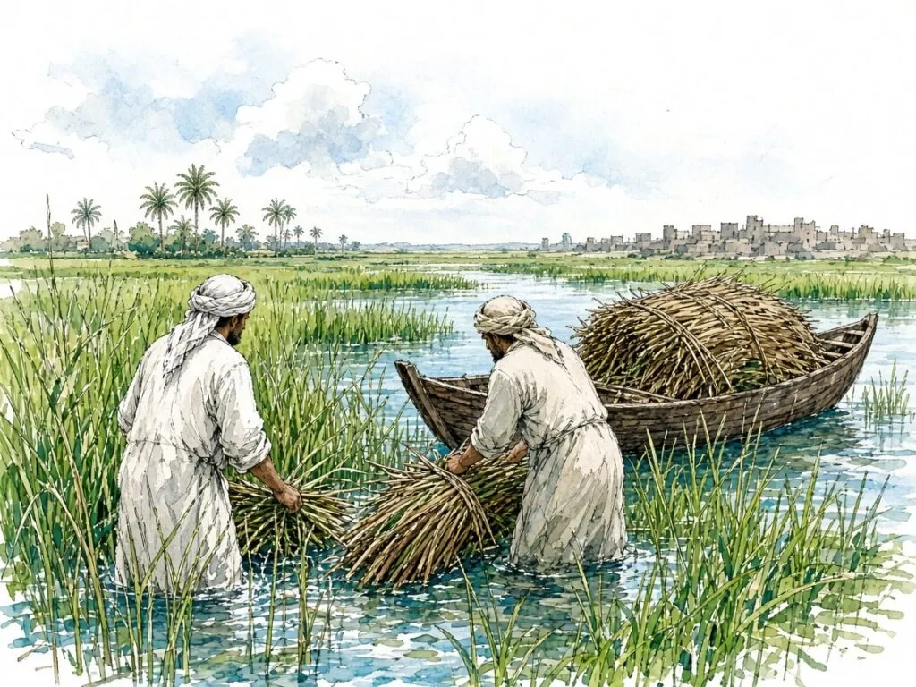
A reed pen wears as it is used, and must be recut. For naskh this posed a particular problem. When a pen was recut, Derman explains, even a difference of a few microns in the width of its nib would produce a serious aesthetic flaw in fine scripts like naskh and riqāʿ, and recutting in the middle of a large book such as a Qur’an was therefore a risk[33]. Calligraphers who wrote long texts in a fine hand needed a pen whose tip did not wear easily.
The pens from Java
The solution came from the other end of the Islamic world. In the first half of the nineteenth century, Derman writes, calligraphers from Istanbul who travelled to the Hijaz saw Javanese pilgrims from Indonesia writing with a pen called the cava kalemi, the Java pen, and adopted it. These pens were thin, solid, blackish sticks, hard as ebony, formed from fibres that grew in a spiral around a palm-like plant[33]. Because they were too thin to hold comfortably, the cut tip was inserted into the hollow of an ordinary reed. They were hard to use and hard to cut, but they held their edge. The first to experiment with them, according to Derman, were Çömez Mustafa Vâsıf and his pupil Kazasker Mustafa İzzet Efendi, who used them for naskh and liked them, after which other calligraphers followed[33]. It is a small example of the way the pilgrimage connected the crafts of distant Muslim societies.
Cutting the nib
Cutting a pen is a skill learned slowly. Derman gives a detailed account of the steps. The joint of a new reed is cut off a finger’s width below with the penknife, otherwise the slit will not run straight. The reed is laid in the palm of the left hand and cut obliquely from top to bottom until its hollow and wall appear in the shape of an almond. The point below is pared and thinned, and the two sides of this flat tongue are trimmed equally to the desired width of the nib. If more is taken from one side than the other, the pen looks unbalanced[33]. A long tongue helps rapid writing, a short one makes for slow writing.
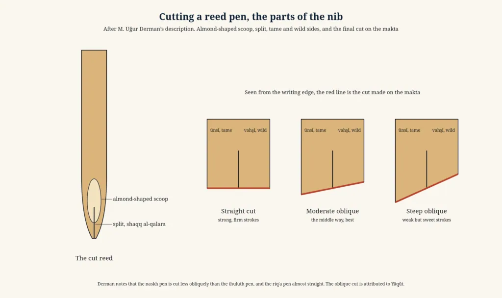
The tip is then split along its length for a few centimetres, a step called shaqq al-qalam. The slit acts as a small reservoir, so that ink fills it and flows steadily downward while the calligrapher writes. Of the two sides of the split nib, the one nearer the writer is called ünsî, the tame side, and the other vahşî, the wild side, and the wild side is left slightly wider[33]. Finally the tip is cut across. The reed is fixed in the groove of a small block of bone, ivory or hard wood called the makta, and the nib is cut obliquely so that the wild side is long and the tame side short. The cut is complete, Derman writes, when a faint click is heard[33].
The slant for each script
The angle of the final cut differs from script to script. Derman notes that the taʿlīq pen is cut less obliquely than the thuluth pen, the naskh pen less obliquely still, and the riqʿa pen almost straight[33]. The oblique cut allows the pen to rest naturally on the paper in the writer’s hand, leaning towards him. When the whole edge lies flat against the paper, a position called the prostration of the pen, a downward movement produces the thin parts of the letters and a movement from right to left produces the thick ones[33]. In thuluth and naskh, Derman adds, the forms of the letters are produced without lifting the pen, according to the direction in which it is held. Because the proportions of letters are measured in dots, and the dot depends on the width of the nib, the pen is the most important element of the calligrapher’s aesthetics[33].
A freshly cut pen writes very sharply. With use its edge becomes rough and the letters begin to show it. When writing is finished, Derman says, the tip of the pen is cleaned by wiping it on the index finger of the left hand, or by licking it, since otherwise the gum in the ink dries and blocks the flow[33]. The calligrapher holds the pen lightly, never squeezing it.
Pen boxes and shavings
Pens were kept in portable cases with built-in inkwells, called divit or kubur, or in boxes called kalemdan, typically thirty to forty centimetres long, with one or two inkwells set into the wood and a lower compartment for tools and even rolled sheets of sized paper. Many surviving pen boxes are of wood decorated with gold and colours under lacquer, a technique known in Turkish as rugânî or edirnekârî, while others are of ivory, mother-of-pearl or tortoiseshell[33]. Fine examples are displayed in the Topkapı Palace Museum. A writing set in the Detroit Institute of Arts gives an idea of how such tools were brought together as a single object of beauty[40].
The pen was treated with respect even when it was worn out. Derman records a custom that a pen too short to use should not be thrown away but buried in the earth in a place where no one would tread on it. The shavings produced each time a pen was cut, which the old writers called burâde-i kalem, were collected and buried in the same way. Many calligraphers kept the shavings of the pens they had cut throughout their lives and asked in their wills that the water for washing their bodies after death be heated with them[33]. The last fire lit for a calligrapher was fed with the residue of a lifetime’s work.
16. Soot, Gum and Burnished Paper
The black of classical naskh is the black of soot. The Qur’an itself speaks of ink, midād, in a famous image. If the sea were ink for the words of the Lord, the sea would run out before His words did, even if another sea like it were added (18:109). Derman, in his article on ink, notes this verse and a hadith reporting that the Prophet told scribes to make their ink well[41]. The ink most valued by calligraphers, which keeps its gloss and blackness even in the oldest manuscripts, was made from soot obtained by burning materials such as beeswax, linseed oil and naphtha[41].
Making good soot was a trade in its own right. Derman writes that in the Ottoman period the workshops of the soot makers were located in the ruined Byzantine palace known as Tekfur Sarayı, near the Eğrikapı gate of Istanbul. Soot from the oil lamps of mosques was used only for ordinary ink. The soot room of the Süleymaniye mosque, he notes, survives as an example. The air currents inside the mosque were calculated so that soot rising from its olive-oil lamps was carried to vents over the door facing the Golden Horn and collected in the room above[41].
The recipe of the rose garden
A seventeenth-century treatise, the Gülzâr-ı Savâb of Nefeszâde İbrahim, gives a recipe that Derman quotes. Earthenware bowls are filled with pure linseed oil, short wicks are placed in them, and they are lit in a place without wind. Other bowls are inverted over them. Before the soot collected on the upper bowls can overheat and burn, the bowls are lifted and the soot is swept onto paper with a bird’s wing. The soot is then wrapped in several layers of porous paper, placed in bread dough and baked in an oven, so that the oil in the soot passes into the bread. Oily soot spoils ink, and this procedure cleans it[41].
The soot is bound with gum arabic. The best, Derman writes, was a Sudanese variety known as cellâbî, which should dissolve overnight when soaked in cold water. The solution, thick as the fermented millet drink boza, is strained through fine cloth[41]. Older recipes added a remarkable list of other ingredients, among them saffron, aloes, rock candy, vinegar, verdigris, indigo, camphor, musk, alum, gall nuts and the juices of roses, henna, pomegranate rind and vine leaves, but over time the recipe was simplified to three elements, soot, gum and pure water[41].
Half a million blows
The hard part was the pounding. Derman gives the method of Necmeddin Okyay, one of the last masters of traditional ink making. The strained gum solution is placed in a stone mortar and soot is added little by little, because it flies into the air, and worked in with a stone pestle. As the mixture thickens, water is added. The pestle must strike so that it cracks like a pistol shot. The quality of the ink depends on the soot being thoroughly crushed and dissolved in the gum, which takes days of pounding[41].
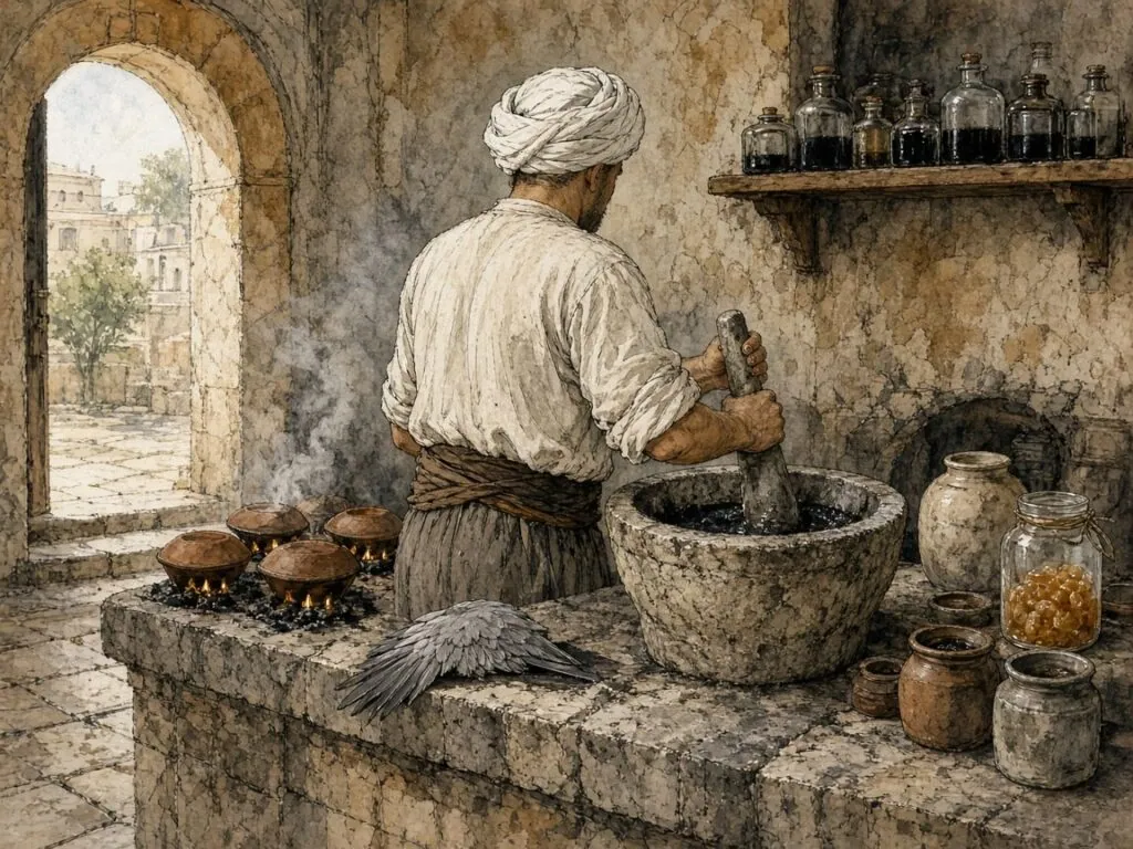
Okyay once hired a strong porter to do the pounding, counted how many blows he struck in half an hour, and multiplied by the number of half-hours the job required. He calculated that a mortar of ink needed about five hundred thousand blows. The old masters, Derman notes, had said eighty thousand[41]. The proportion was one part soot to four parts gum. With five parts gum the ink looked glossy but flowed poorly, wrote with difficulty and might crack in time. With less than four, the writing came off on the fingers[41].
When ink could not be pounded enough, it was matured by shaking. Derman writes that in the old days containers of ink were hung on the doors of bathhouses, which opened and closed constantly, or on camels setting out on long journeys. The sixteenth-century calligrapher Revânî Receb Halîfe is said to have walked about with bottles of ink tied to his legs for the same purpose[41]. The finished ink was diluted eight or ten times according to the script, and the old ink makers used to ask their customers what kind of writing the ink was for, because thuluth, taʿlīq and naskh each needed a different consistency[41].
Ink that can be licked
Soot ink, Derman explains, is a suspension. Its particles do not dissolve but are held in water by the gum. Written on sized paper, it stays on the surface, where it can be wiped off, scraped away or even licked. That property was essential for calligraphy, because it allowed mistakes to be corrected, and it gave rise to the old Turkish expression mürekkep yalamış, one who has licked ink, for an educated person[41]. Red ink, made from cinnabar and called surh, was used, among other things, for the signs marking pauses in the Qur’anic text[41].
Starch, egg and alum
The paper on which naskh was written was also prepared by hand. Derman writes that the Turkish word âhar, from ak, white, means a sizing or polish, and that its Arabic equivalent is ṣaql. Unsized paper absorbs ink or lets it spread, making writing and correction difficult. The protective layer formed by sizing makes the surface smooth and easy to write on and stops the ink from soaking in, so that mistakes can be corrected by wiping, light scraping or licking without damaging the sheet[25]. The most common sizes were made of egg, flour and starch. For egg size, the whites of fresh eggs were stirred with a lump of alum until they thickened and then turned to liquid, the foam was allowed to separate, and the clear liquid was used[25].
Size was applied with a sponge, gauze or cotton wrapped in muslin, on both sides of sheets intended for books and on one side, in several coats, of sheets intended for panels. A script like naskh or riqʿa, which needs little correction, required only a single coat, while large scripts needing frequent correction required double sizing, with a coat of egg size over starch and flour[25]. The sized sheets were dried in the shade, burnished, and then stacked under a weight for at least a year before use. Sized paper, Derman notes, grows more beautiful and more valuable as it ages[25].
The flint and the linden board
Burnishing gave the paper its final surface. Derman explains that sized paper had to be burnished within a week, so that the size would not crack and let soot ink fill the cracks. The most common burnisher was a smooth wooden bar with a handle at each end and a groove along its length holding a hard, glossy flint about ten to twelve centimetres long. The sheet was placed on a smooth board of linden wood larger than the paper, a thick cloth rubbed on oily skin or dry soap was passed over it to make it slippery, and the burnisher, held at both ends, was pressed firmly and moved back and forth[42]. In Ottoman Istanbul a specialised trade of burnishers worked in the basements of the market of illuminators and bookbinders between Beyazıt and Vezneciler, completing this last stage of the preparation of paper[42]. Hamdullah’s village of burnishers, granted by Bayezid II, belonged to this world[5].
17. Learning by Copying
Naskh was transmitted, like every classical script, from hand to hand. Uğur Derman’s account of the training of Ottoman calligraphers, in his encyclopaedia article on the calligrapher, is the fullest description of the system as it worked in Istanbul from the fifteenth century to the twentieth[43]. It began in the neighbourhood primary school, where children learned to recite the Qur’an and were also taught good handwriting. In some schools a separate teacher came on set days to give the children a model line to copy. That model line was called a meşk, and so learning to write was called taking a meşk and teaching was called giving one[43].
Derman is frank about the quality of these school teachers, few of whom, on the evidence of their surviving models, were even middling calligraphers. The aim was not to produce calligraphers but to accustom the hand to writing and so to a certain sense of measure. Still, some great masters began there. Derman tells how Sâmi Efendi, one of the greatest calligraphers of the late Ottoman period, who died in 1912, began with the thuluth and naskh models written by his primary school teacher, Boşnak Osman Efendi. Years later, at the height of his fame, when people asked him from whom he had learned thuluth and naskh, he would give his teacher’s name on condition that they never belittle him and remember him with a recitation of the Fātiḥa, and he would bring out the old models and show them[43].
The zakat of art
Serious training took place outside the school. Masters taught in palace institutions, in endowed colleges and schools, and in their own homes. Derman writes that masters gave lessons at home on one or two days a week without expecting any payment, and would not even accept gifts. The tradition, regarded as the zakat of the art, the alms due on a talent, was maintained for centuries and survived until recent times[43]. Hâfız Osman’s free Sunday lessons for poor children belong to this tradition[6]. Teachers in endowed schools were paid. Derman notes that according to the sixteenth-century biographer Mustafa Âlî, Şeyh Hamdullah received a daily wage of thirty akçe and Ahmed Karahisârî fifteen or sixteen, and that some mosque complexes had a room set aside for calligraphy lessons, the meşkhâne, with a salary for the master provided by the endowment[43].
Not every master accepted every pupil. Derman records that Mehmed Şevki Efendi, whose thuluth and naskh style has still not been surpassed, was so meticulous in writing his models that he taught only ten pupils at a time, and took a new one only when he had licensed an old one[43]. Some masters tested a beginner’s commitment by postponing his lessons or keeping him waiting, so that the half-hearted would drop out of their own accord and the art would be entrusted only to those worthy of it[43].
Letters, then words
The training proceeded in two stages. In the first, called müfredat, single letters, the pupil learned the alphabet one letter at a time. Thuluth and naskh lessons began with a short prayer written in both scripts, asking God to make the task easy and not difficult and to bring it to a good end. The pupil then copied the letters in rows, alif, bāʾ, jīm, dāl, rāʾ, sīn and so on, learning only one of each group of letters that differ only in their dots, because what mattered was the difference of shape, not of sound[43]. Next came the joining of letters in pairs. By the end of this stage the teacher could judge whether the pupil had a gift for calligraphy.
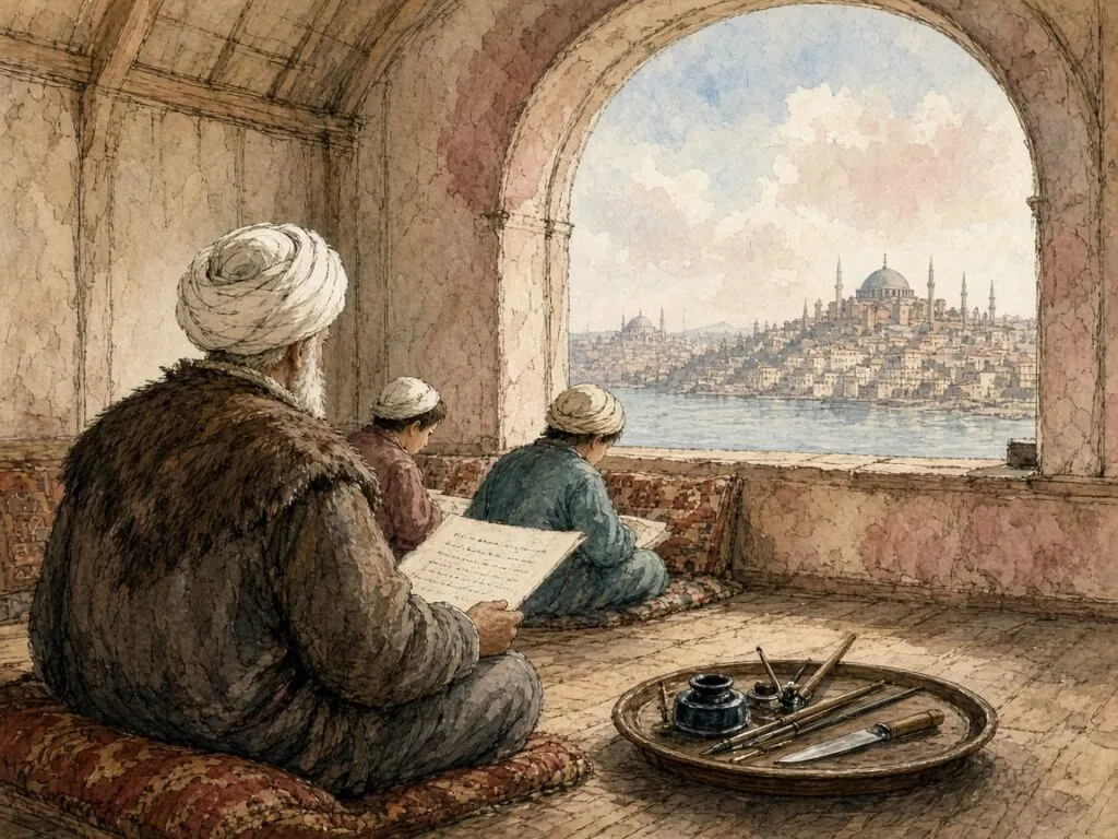
In the second stage, called mürekkebat, compounds, the pupil learned composition by copying whole lines of words. For thuluth and naskh, Derman writes, this meant a long Arabic ode, such as the Burda of al-Būṣīrī, followed by verses of the Qur’an, sayings of the Prophet, prayers, the letters of the abjad sequence and sayings about calligraphy[43]. When the pupil finished the single letters, the master wrote beneath the last model an Arabic phrase announcing that the letters had been completed with the help of God, the compassionate King[43]. A gifted pupil attending regularly every week could pass through all these stages in three to five years.
The teacher’s corrections
Lessons were usually given once a week, one line at a time. When thuluth and naskh were taught together, as they usually were, the teacher wrote one line of each, and with the next pair of lines the panel was complete[43]. Beneath each line of his model the teacher drew a mark formed from the joined letters sīn, ʿayn and yāʾ, spelling the Arabic word saʿy, effort, a reminder to the pupil to work. Derman notes that this mark has been used for at least three centuries and that it differs so much from master to master that the models of some famous calligraphers can be identified by it even when unsigned[43].
If the teacher was dissatisfied with the pupil’s copy, he wrote the faulty letter or word correctly beneath it and marked its proportions with dots. This was called harf çıkartmak, bringing out the letter. The pupil practised these and brought the whole line again to the next lesson. Passages the teacher particularly admired were outlined with the pen, which was called kaftanlamak, dressing in a kaftan. If he approved of the whole line, he placed his own saʿy mark beneath the pupil’s line, as if to say “you have written as well as your teacher”, or wrote “āfarīn”, well done, and gave a new model[43].
The licence to sign
At the end of training came the licence, the icazet. Derman explains that it was a permission to sign one’s own work. Since calligraphers signed with the Arabic word katabahu, he wrote it, the licence was also called the signature panel[43]. To obtain it, the pupil wrote a panel imitating a work by one of the old masters chosen by his teacher. Some candidates for a naskh licence copied a section or the whole of the Qur’an, and many candidates for a thuluth and naskh licence wrote a hilye[43]. Beneath the panel, if the teacher approved it, he wrote the licence itself in riqāʿ, the script that came to be called khaṭṭ al-ijāza, the licence script. Derman translates its standard wording. I have given licence to the writer of this fine panel to place his signature beneath his writings. May God increase his life and his knowledge. I am his teacher, followed by the teacher’s name and the date[43].
The licence was celebrated at a ceremony, usually held in a mosque, and sometimes combined with the ceremony for completing the memorisation of the Qur’an, since many calligraphers were also memorisers. The new calligrapher’s illuminated panel was presented to a jury of masters, several of whom added their own notes confirming the licence and congratulating their new colleague. Derman mentions licences from Edirne bearing the confirmations of thirty or forty calligraphers on a single panel[43]. The scholarly licence, Cemil Akpınar notes in his article on the icazet, was always personal rather than institutional, a bond between teacher and pupil rather than a diploma issued by a school[44]. The calligrapher’s licence shared that character. It placed its holder in a chain of masters that reached back, in principle, to Ibn Muqla.
18. Type Comes to Arabic
The first books printed in Arabic script were made in Italy, by Christians, for readers who were mostly not Muslims. Kemal Beydilli, in his article on printing in the Turkish encyclopaedia of Islam, notes that the Kitāb Ṣalāt al-Sawāʿī, a book of hours printed at Fano in 1514, was the first religious work published in Arabic in Europe, and that it was followed by other religious printings, generally addressed to the Christians of the East[45]. The online exhibition of early Arabic printing at the American University of Beirut describes the Fano book as the first Arabic incunable, printed with movable type cut for the purpose[46]. Its letters are crude by the standards of manuscript naskh. The type designer had to reduce a flowing, connected script with many contextual forms to a set of separate metal pieces that could be arranged in a frame and inked.
The problem was harder than it looked. A Latin font needs perhaps a hundred sorts, including capitals, small letters, punctuation and figures. Arabic letters take different shapes depending on whether they stand alone or at the beginning, middle or end of a word, and the calligraphic tradition used many more variant forms and ligatures, as well as vowel signs placed above and below the letters. A type founder who wanted printed Arabic to look like good naskh needed hundreds of sorts. One who was content with less ended up with a text that looked mechanical and broken to readers accustomed to manuscripts.
A Qur’an printed in Venice
The most notorious early experiment was a complete Qur’an printed in Venice by Paganino and Alessandro Paganini around 1537–1538. Roberto Tottoli, who has studied European editions of the Qur’an, notes that it was long thought lost until a single copy was identified in 1987[47]. The edition was full of errors, and its type was poor. It seems to have been intended for sale in the Ottoman market, and its failure there is easy to understand. A printed Qur’an riddled with mistakes, made by foreign Christians in letters that did not resemble the work of a calligrapher, could hardly appeal to Muslim readers who had a long tradition of beautifully written copies.
The Medici press
Far better results were achieved in Rome at the end of the century. The Typographia Medicea, founded in 1584 under the patronage of Cardinal Ferdinando de’ Medici, aimed to print books in Arabic and other Eastern languages for missionary purposes and for sale in the Ottoman world. Its Arabic types were cut by the French punchcutter Robert Granjon, one of the greatest type designers of the sixteenth century. Its printings included an Arabic edition of the Gospels in 1590–1591, illustrated with woodcuts, and Naṣīr al-Dīn al-Ṭūsī’s recension of Euclid in 1594[48]. Granjon’s type was a serious attempt to capture the forms of naskh, and it was admired and imitated for generations.
The Medici books also illuminate Ottoman attitudes to printing. Beydilli points out that a decree of Sultan Murad III, dated October 1588, permitting the free sale of Arabic books printed in Europe, was printed in the Medici Euclid. The decree, he argues, is not only the first example of printed Ottoman Turkish but also shows that there was no serious prejudice against printed books as such[45]. Claims that Bayezid II and Selim I banned Muslims from printing in Arabic letters have often been repeated, he notes, but cannot be documented[45]. What held printing back in the Muslim world was not a prohibition but the strength of the manuscript economy and the unsatisfactory appearance of early Arabic type.
Printing among the communities
Printing was already well established in the Ottoman Empire by the eighteenth century, but not in Arabic script. Jewish printers had been active in Istanbul since the end of the fifteenth century, and Beydilli describes the city as one of the leading centres of Jewish printing, alongside Venice and Amsterdam, by the seventeenth century. Armenian and Greek presses followed[45]. The first book printed in the Arab lands of the empire, according to Beydilli, was a Psalter in Syriac and Arabic written in Syriac letters, printed in 1610 at the monastery of St Anthony in northern Lebanon[45]. Christian printers in Syria and Lebanon continued to play a leading role in Arabic printing in the following centuries.
The press of Müteferrika
The first Ottoman press to print books in Arabic letters for a Muslim readership was founded in Istanbul in the 1720s by İbrahim Müteferrika, a Transylvanian convert to Islam, together with Mehmed Said Efendi, the son of the Ottoman ambassador to France[49][50]. In a treatise of 1726 on the usefulness of printing, Müteferrika stressed its benefits for education, the lower cost of printed books, and the fact that the books to be printed would deal with lexicography, history, medicine, physics, astronomy and geography. Religious books would not be printed, he insisted, and the privilege of printing in Arabic letters should not be given to foreigners[49]. The imperial licence was issued in July 1727, with the condition that four scholars act as correctors[49]. The Law Library of Congress notes that the first book, the Arabic–Turkish dictionary of Vankulu, appeared in 1729[51].
The press was small. According to the inventory of Müteferrika’s estate, published by Orlin Sabev, it had four presses for books and two for maps and employed five people, among them a Jewish typefounder named Yona[49]. Between 1729 and 1742 it printed sixteen or seventeen works in twenty-two volumes, usually in editions of five hundred, though some ran to a thousand or twelve hundred. About seventy per cent of the copies were sold[49]. After Müteferrika’s death in 1747, the press produced only a second edition of Vankulu’s dictionary, in 1757, and then closed[49].
The type of the Müteferrika press was a naskh, the obvious choice for books of history and science. It was serviceable but stiff, and the books printed with it could not rival the manuscripts produced by the calligraphers of Istanbul, who were then at the height of their art. That gap between the calligraphic norm and what metal could achieve would shape the history of Arabic printing for the next two centuries. Every advance in Arabic type, from Bulaq to Linotype to the digital fonts of the present, can be read as an attempt to close it, or as a decision to accept it.
19. Bulaq and the Cairo Qur’an
The second great Arabic press of the Muslim world was founded in Egypt. Muḥammad ʿAlī Pasha, the Ottoman governor who made himself master of Egypt after the French occupation of 1798–1801, wanted a modern army, a modern administration and the books and documents to support them. The Bibliotheca Alexandrina, which has assembled a digital history of the press, records that he sent a delegation to Milan in 1815 to study printing and that the building at Bulaq, the river port of Cairo, was completed in 1820. The press began work in 1821[52]. Its early output was dominated by military manuals, textbooks and official documents, but it soon expanded to include works of Arabic literature, history, grammar and religion, as well as translations from European languages.
Bulaq gave the Arabic-speaking world a large and continuous supply of books printed in Arabic letters in a Muslim land. The SOAS library blog on its collection of early Egyptian printed books notes that printing with movable type had first come to Egypt with the French expedition, whose presses left with the French in 1801. For Bulaq, three presses were acquired from Milan, and the Syrian-Egyptian typographer Nicola Musabiki was sent to Milan and Rome to study printing and type. The first book, an Italian–Arabic dictionary, appeared in 1822. Between 1822 and 1842 the press published some 243 to 252 works, almost half of them in Ottoman Turkish, and by 1851 nearly 570 works in Turkish, Arabic and Persian[53]. Its output shifted from military manuals towards education when authority over it passed from the Ministry of Defence to the Ministry of Education in 1837[53].
A typeface for a revival
At the beginning of the twentieth century the press was reorganised, and with the reorganisation came a new type. Khaled Hosny, the designer of the Amiri typeface, writes that in 1905 the Bulaq press, also known as al-Amīriyya, issued a new Arabic typeface as part of a revival of the then moribund press, and that it came to be one of the most widely used and highly regarded Arabic typefaces, even in the digital era[2]. What made it remarkable, in Hosny’s judgement, was that it maintained the aesthetics of naskh calligraphy while meeting the requirements and limitations of typesetting, a balance that is not easily achieved[2].
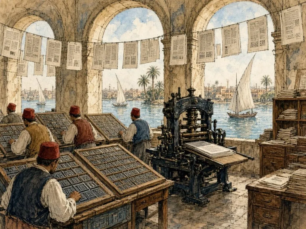
To achieve that balance, the type founders needed an enormous number of sorts. Titus Nemeth reproduces the case arrangement of an Arabic font of 470 characters used by the Egyptian Government Press in the early twentieth century[54]. Thomas Milo, writing about the case of type used in Egypt in the 1920s for the royal Qur’an, counts about five hundred pieces representing some three dozen basic letters in their contextual variants. There was no mechanism for selecting the correct variant, he notes. Everything depended on the skill of the compositor and his familiarity with calligraphic practice[55]. A compositor of Arabic was, in effect, a calligrapher working with metal.
The king’s muṣḥaf
The most important book printed with such type was the Qur’an of 1924. Its origins lay in a practical problem. Printed Qur’ans had circulated in Egypt for decades. A conference held in Cairo in 2021 under the auspices of the Dominican Institute for Oriental Studies heard that the best written and designed of them, the muṣḥaf of Riḍwān ibn Muḥammad al-Mukhallalātī, who died in 1893, still shared the shortcomings of the others, with poor paper, various mistakes and the absence of marks essential for correct recitation[56]. The Quran Archive Project, which documents printed Qur’ans, explains that because of these shortcomings a team of experts was assembled to create a better text. It was composed at the Amiri press at Bulaq, though the actual printing and binding took place at Giza, in the press that printed land surveys. In its standard format it ran to 827 pages of twelve lines, in a large format on heavier paper and a smaller one on light paper for distribution to primary schools, with words generously spaced to avoid reading errors by first-time readers[17]. Its afterword states that it follows the reading of Ḥafṣ from ʿĀṣim and that its spelling was taken from the scholars of the rasm, the orthography of the codices sent out by the caliph ʿUthmān[17].
The choice of the Uthmanic spelling mattered. The same conference heard that a muṣḥaf printed at Bulaq in 1881 had used the conventional modern spelling rather than the Uthmanic one, departing from the practice of manuscript Qur’ans since the seventh century[56]. The 1924 edition returned to the old orthography. The conference organisers prefer to call it King Fuʾād’s Qurʾān, to distinguish it from King Fahd’s Qurʾān, the Medina muṣḥaf of 1985[56], and the French-language journal of the same institute has examined its history and political stakes[57].
A calligrapher from Istanbul
The connection between print and calligraphy did not end with movable type. Maşalı records that in 1922 the Istanbul calligrapher Aziz Efendi travelled to Cairo at the invitation of King Fuʾād and wrote a muṣḥaf in accordance with the Uthmanic spelling. To establish unity of spelling and script in the copying of the Qur’an, the king had this muṣḥaf printed and distributed throughout the Islamic world. The original, Maşalı notes, is preserved in the Museum of Islamic Art in Cairo[14]. Aziz Efendi, who also founded a school of calligraphy in Cairo, was one of the masters through whom the Ottoman tradition was transmitted to Egypt after the collapse of the Ottoman Empire.
The template of the century
The Cairo text of 1924 became, in the course of the twentieth century, the most widely followed text of the Qur’an in the world. The Quran Archive Project observes that just about every muṣḥaf printed in the eastern Arab world owes a great debt to this edition. It was widely reprinted in Kuwait, Jordan, Qatar and Saudi Arabia, and it was used as the template for correcting other printed Qur’ans, including the Qur’an written by ʿUthmān Ṭāhā that the printing complex at Medina adopted[17]. Reception was not uniform. A speaker at the Cairo conference noted that in post-Ottoman Turkey, where Ottoman printed Qur’ans had circulated widely since the 1870s, the Egyptian edition was received with some reserve[56]. Naskh was the script in which this standardised text reached its readers. The calligraphic tradition that Hamdullah had made the servant of the noble Book now served it in printed form, through the skill of compositors who reproduced the forms of calligraphers in metal.
The Bulaq type of 1905 also lived on. Hosny, who based Amiri on it, describes it as the most elaborate and complete revival of the type, noting that earlier digital revivals had omitted many of the letter forms in the metal type for the sake of simplicity or because of the limitations of early digital systems[2]. The forms that compositors at Bulaq set by hand, sort by sort, are now available in an open-source font that anyone can download.
20. Hot Metal and the Typewriter
At the end of the nineteenth century the printing of Latin script was transformed by machines that cast whole lines or single letters of type from molten metal as an operator typed at a keyboard. The Linotype, introduced in the 1880s, and the Monotype, its great rival, made it possible to set newspapers and books many times faster than by hand. For Arabic, these machines posed a dilemma. Titus Nemeth, who has written the standard history of Arabic type in the machine age, explains that the capacity of the machines was fixed. Arabic typefaces for hand composition often had up to 470 characters, while Arabic typefaces for Linotype composition were reduced to 180, the capacity of a Linotype machine fitted with an auxiliary magazine[54]. The reduction, he writes, profoundly altered the appearance of Arabic[54].
Nemeth illustrates the change with a comparison. He sets the 470-character case of the Government Press, described in the previous chapter, beside a notional case for the first Linotype Arabic font, which had 181 characters. The reduction, he notes, was achieved mainly through the removal of ligatures[54]. The rich repertoire of variant forms that the Bulaq compositors used to imitate calligraphy, letters stacked one above another, and alternative shapes chosen for the sake of rhythm and balance, could not fit into the magazine of a machine.
The typewriter’s two shapes
The typewriter went further still. Nemeth explains that of the twenty-eight letters of the Arabic alphabet, all but six are written in joined sequences and need several forms depending on their position. Where typographic fonts used a minimum of four shapes for such letters, the typewriter had only two. A typical Arabic typewriter character set therefore consisted of only about ninety characters, including punctuation and figures[54]. Typewriters of this kind had been in use for decades, and the text they produced was acceptable for business correspondence and accounts. For typeset documents, however, Nemeth writes, any equivalent simplification would have seemed too unconventional, much as setting literary texts in capital letters alone would seem in Latin script[54].
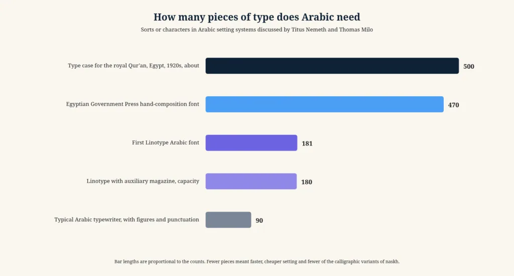
Thomas Milo, the Dutch type designer and scholar of Arabic script, has argued that this typewriter model shaped the early history of Arabic computing. When Arabic computing began in the 1970s, he writes, it was entirely focused on immediate government and business needs, and typographic quality was of no relevance. Arabic computing took off with the typewriter metaphor, a very limited keyboard with a matching set of glyphs, using the shift mechanism designed for capital letters in Latin script to provide two glyphs per key[55]. The result, in Milo’s view, was a step backwards from the quality of Arabic typesetting that computers were then superseding.
A newspaper in Beirut
The most influential simplification of Arabic type was proposed not by an engineer but by a newspaper owner. Nemeth tells the story in detail. Kamel Mrowa founded the Lebanese daily al-Hayat in 1946, three years after Lebanon’s independence. In 1954 he approached Linotype with a proposal for a new Arabic typeface. Meeting the company’s representative Herbert Ellis, he described with enthusiasm the satisfactory and simple form of Arabic script produced by a German typewriter he knew, and suggested that the same principle could be applied to Linotype composition[54]. Mrowa wanted faster composition and a text that was still acceptable to the typical newspaper reader. His aim, Nemeth writes, was a pragmatic solution that could be implemented within the constraints of the machines without upsetting reading habits too dramatically[54].
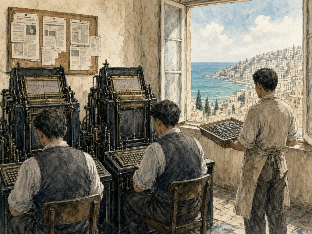
At Linotype the proposal was assessed by the company’s typographic adviser Walter Tracy, an English designer who later became one of the most respected writers on type, and who outlined a plan for a trial design[54]. The design went through several stages over three years. By late 1957 Linotype had produced a trial set of matrices, and on 13 December 1957 al-Hayat used it for the first time[54]. The results were striking. Nemeth notes that early in 1958 the newspaper’s Linotype operators reported a thirty per cent improvement in composing speed, which was expected to rise further as they became more familiar with the system[54].
Simplified Arabic
In November 1959, the company’s house magazine, the Linotype Matrix, announced the new typeface as Mrowa-Linotype Simplified Arabic. The article gave Mrowa much of the credit and assured customers that a reader of a newspaper set in the new type would find it no more different from the normal than italic is from roman, since some characters that would have required considerable alteration had been retained in their familiar shapes. The new system, the article claimed, struck a happy balance between the need for speed and economy and the preservation of traditional typographic forms, and was therefore evolutionary rather than revolutionary[54]. Its simplified keyboard also allowed Arabic line casters to be controlled by punched paper tape for the first time, promising a further large increase in speed, and because it needed far fewer matrices it was cheaper to buy[54].
Simplified Arabic was a commercial success, and competitors soon produced their own versions. Nemeth argues that the typeface established the simplified principle in Arabic typesetting as a de facto standard, making it one of the most influential Arabic typefaces of the twentieth century, whose influence can still be felt today[54]. His book on Arabic type-making in the machine age traces this influence through phototypesetting and into the first generations of digital type[8]. Much of the Arabic text that readers met in newspapers, government documents and computer screens in the late twentieth century descended from this compromise.
Naskh reduced
The loss can be measured against the calligraphic tradition. Classical naskh depends on the variation of letter forms according to their neighbours, on the vertical stacking of letters at the start of a word, on the extension of certain strokes for rhythm and on the careful placement of vowel signs. Simplified type kept the skeleton of naskh but discarded most of these refinements. Milo puts the paradox sharply. The compositor of the nineteenth and early twentieth century used no keyboard at all, but had in front of him four or more cases of metal glyphs capable of representing even the most heavily annotated text and designed to match the quality of well-written manuscripts[55]. Milo’s own illustrations include a fragment of Ottoman book typesetting modelled on the naskh of the calligrapher Kazasker Mustafa İzzet Efendi[55]. The machine made Arabic text cheaper, faster and more widely available than ever before, but it did so by moving it away from the hand.
The question that the digital era inherited was whether that distance could be closed again. The machines of the twentieth century had limited capacity, but computers do not. In principle a digital font can contain as many glyphs as a Bulaq type case, and software can choose among them according to rules. Whether it does depends on standards, software and designers, and on whether anyone is willing to do the work.
21. Naskh on the Screen
Digital text separates two things that a calligrapher never needed to distinguish, the letter as a unit of meaning and the shape in which it is drawn. The Unicode Standard, the international system that assigns a number to every character used in writing, makes this distinction explicit. Its chapter on the scripts of the Middle East explains that the Arabic script is cursive even in its printed form, so that the same letter may be written in different forms depending on how it joins its neighbours. Each letter therefore receives only one Unicode character value in the basic Arabic block, no matter how many contextual appearances it may have in text, and a word is spelled as a sequence of these letters[58]. The shape that appears on the screen is chosen later, by software.
The same chapter notes that vowels and other marks, the tashkīl, are encoded as separate combining marks applied to the consonants, and that in normal writing they are omitted[58]. A fully vocalised Qur’anic text in Unicode is thus a sequence of letters interleaved with marks, which the software must position correctly above and below the letters. The standard also describes the lām-alif ligature, which is obligatory in almost all font designs, and notes that in the prevailing Ḥafṣ style the lām forms the right part of the ligature and the alif the left, while in the style of North Africa the practice is reversed[58]. Even in a technical standard, the variety of the manuscript tradition leaves its mark.
Shaping by rule
Turning a string of Unicode characters into correct Arabic on the screen is the task of a shaping engine working with a font. Microsoft’s guidance for developers of OpenType fonts for Arabic describes the process step by step. The engine first analyses each character to determine the contextual form it should take, based on the characters before and after it, and maps it to one of four features, isolated, initial, medial or final. It then applies a sequence of features to the glyphs, among them one that composes mandatory ligatures such as lām-alif, and others that handle contextual alternates, optional ligatures and the positioning of marks[59]. The same guidance defines the kashīda, or tatwīl, the character used to elongate connections between letters and for justification[59].
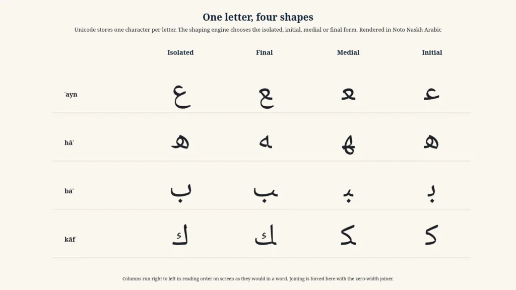
This architecture can in principle reproduce much of the richness of calligraphic naskh. A font may contain many alternative forms for a letter and rules for choosing among them, and marks can be positioned with great precision. In practice, many early digital Arabic fonts reproduced the simplified forms of the hot-metal era. The Unicode Standard still contains blocks of Arabic presentation forms, which encode individual contextual shapes and ligatures as separate characters. Hosny describes them as composed mostly of compatibility characters[2], a legacy of older systems that is not needed for modern shaping.
The calligraphic engine
The most ambitious attempt to model naskh on the computer was made by Thomas Milo and his colleagues at the Amsterdam firm DecoType. Milo has argued that Arabic computing began with the typewriter metaphor and that much digital Arabic remained, in typographic terms, inferior to the metal type it replaced[55]. DecoType’s answer was a system called ACE, the Arabic Calligraphic Engine, later the Advanced Composition Engine, which treats Arabic script as a set of grammatical rules governing how strokes combine, rather than as a set of fixed letter shapes[55][60]. Milo’s paper of 2003 claims that ACE covers all the Arabic characters required for the most sophisticated forms of text, can handle any combination of marks, resolves clashes between marks dynamically, and can justify lines by lengthening and varying letters in the manner of calligraphers rather than by inserting extension bars[55].
DecoType’s technology was used for a naskh font for Microsoft Windows and, later, in a system called Tasmeem, sold for Adobe InDesign[60]. In a lecture at a type conference in 2009, Milo presented the history and principles of the system, showing how its fonts could reproduce the layered, stacked compositions of Ottoman naskh[61]. Milo’s illustrations draw on Ottoman manuscripts and on the naskh of Mustafa İzzet, and his argument that Arabic script has its own grammar, distinct from its alphabet, echoes in modern terms the classical idea that the proportions of letters follow from rules.
Amiri and Noto
Open-source fonts have brought high-quality naskh to anyone with a computer. Khaled Hosny’s Amiri, begun in 2008 and first released in alpha form in November 2010, is a revival of the Bulaq type of 1905[2]. Hosny writes that it aims to be the most elaborate and complete revival of that type, reproducing letter forms that earlier digital versions had omitted, while leaving out features that were merely the result of the limitations of metal type[2]. Great care was taken, he notes, to make Amiri suitable for typesetting the Qur’an, by providing the necessary glyphs and shaping rules and sometimes working around the shortcomings of Unicode[2]. The font is free software under the SIL Open Font License[62].
Google’s Noto project, which aims to provide fonts for every script in Unicode, includes Noto Naskh Arabic, a naskh text face released under the same open licence[63]. Its forms are simpler than Amiri’s, and because it is distributed freely and widely it is among the fonts most often used to display Arabic text on screens. The diagrams in this essay set their Arabic letters in Noto Naskh Arabic, rendered by a web browser’s shaping engine following the rules described above.
The Medina muṣḥaf
The most widely distributed naskh in the world today is the hand of a Syrian calligrapher, ʿUthmān Ṭāhā. The King Fahd Glorious Qur’an Printing Complex in Medina, founded by Saudi Arabia in 1982 and opened in 1984, adopted his calligraphy for its muṣḥaf[64]. The Quran Archive Project notes that the 1924 Cairo edition was used as the template for correcting the Qur’an written by ʿUthmān Ṭāhā that the complex adopted[17], and the conference report on the Cairo edition refers to the Medina muṣḥaf of 1985 as King Fahd’s Qur’an[56]. Saudipedia records that ʿUthmān Ṭāhā devoted more than thirty years of work at the complex to writing the Qur’an by hand twelve times, each copy reviewed by a scholarly committee before printing, and that in 2018 the complex’s average production exceeded eighteen million copies a year[64].
ʿUthmān Ṭāhā’s naskh belongs to the Ottoman tradition, transmitted through the masters of Istanbul and their pupils in the Arab world. In his muṣḥaf the âyet-berkenar layout reaches its widest diffusion, each page ending at the end of a verse and each copy identical to every other. A memoriser in Jakarta and another in Dakar may learn the same text from the same page. The page is now reproduced photographically and digitally, as well as in print. A calligrapher’s hand has become a standard, as type once did, but it remains a hand.
22. The Long Life of a Working Script
Naskh began as a name for a task. In the bookshops of Abbasid Baghdad, copying was a trade, and the rounded hand in which copyists worked had no particular prestige. The scripts of majesty were the angular Kufic of the great parchment Qur’ans and the chancery hands of the caliph’s secretaries. Over a thousand years, the copyists’ hand became the most widely read form of Arabic script in the world. It is the script of most printed Arabic books and newspapers, of the standard printed Qur’ans, of the default Arabic fonts on computers and phones. The history traced in this essay explains, in part, how that happened.
Three things seem to have mattered most. The first was measure. When Ibn Muqla related every letter to the alif and the circle and measured both in rhombic dots made by the pen, he gave the cursive scripts a grammar of proportion that could be taught and transmitted[4][10]. The second was the character of the masters who worked within that grammar. Ibn al-Bawwāb gave the system grace, Yāqūt refined the pen and fixed the classical proportions, Hamdullah renewed the six pens and made naskh the script of the muṣḥaf, and Hâfız Osman distilled the Ottoman naskh that later calligraphers and type founders took as their model[24][32][5][6]. The third was use. Naskh was always the script in which most things were actually written. Once a reading public wanted its scripture in the familiar hand of its everyday books, and once printers needed letters that could be cut in steel and cast in lead, naskh was already to hand.
Measure and freedom
The classical writers returned again and again to a tension between rule and freedom. The anonymous treatise summarised by Rice denied that ruler and compass could ever produce perfect writing, because good letters share the organic proportions of living things[10]. Robertson’s contrast between the geometric draughtsmanship of Ibn Muqla and the living grace of Ibn al-Bawwāb expresses the same idea[10]. The Ottoman masters, who copied their predecessors so faithfully that their imitations are sometimes hard to distinguish from the originals, nevertheless believed that each generation must find its own way within the tradition. Hamdullah studied Yāqūt and created something new, and Hâfız Osman studied Hamdullah and did the same[5][6].
The same tension reappeared when naskh entered the age of machines. Metal type was a set of rules made physical, a fixed repertoire of shapes that could be combined in limited ways. The Bulaq compositors, working with hundreds of sorts, could still exercise judgement. The Linotype operator could not. Simplified Arabic was a decision to accept the rules of the machine in exchange for speed[54]. Digital technology reopened the question, because a font with shaping rules can, in principle, make choices of the kind that calligraphers made. Milo’s calligraphic engine and Hosny’s revival of the Bulaq type are two different answers to the question of how much of the calligrapher’s freedom can be written into rules[55][2].
The chain of hands
Another theme of this history is continuity. The licence that an Ottoman master wrote beneath his pupil’s panel placed the new calligrapher in a chain of teachers that reached back, at least in principle, to the founders of the art[43]. Hâfız Osman’s chain, Derman notes, has continued down to the present through two branches[6]. The pupils of the last Ottoman masters taught in Cairo, Baghdad, Damascus and elsewhere, and their pupils in turn taught a generation of calligraphers who wrote the Qur’ans printed in the late twentieth century. When ʿUthmān Ṭāhā wrote the Medina muṣḥaf twelve times over three decades, he was working within that chain[64].
Print and digital technology did not break the chain. In some ways they extended it. Hâfız Osman’s Qur’an of 1686 reached a far wider audience when it was printed in 1881 than it could ever have done as a manuscript[6]. The Cairo Qur’an of 1924 was composed by hand from type that imitated the forms of calligraphers[55][17], and Aziz Efendi’s muṣḥaf, written for King Fuʾād, was printed and distributed for the sake of unity in the spelling and script of the Qur’an[14]. Today, Amiri and Noto Naskh Arabic carry the forms of the Bulaq type and of the calligraphic tradition into millions of documents[2][63]. The copyists of the Sūq al-Warrāqīn would not recognise the tools, but they would recognise the task.
Reading naskh today
For a reader who does not know Arabic, naskh can seem a single, uniform thing, the ordinary form of the script. Looked at more closely, it is full of history. The slight lean of a letter, the depth of a bowl, the way an initial letter sits on another, the shape of a final nūn or yāʾ, the placement of the dots, all record decisions made by particular people at particular times. A digital naskh that stacks letters at the beginning of a word, or varies the length of a connecting stroke, preserves a habit of Ottoman calligraphers. A simplified newspaper font that does neither records the compromise made in Beirut in the 1950s. The default font on a phone carries some of each.
The same is true of the page. The fifteen-line page of a modern muṣḥaf, ending each page at the end of a verse, descends from a layout whose origins are unknown but which, as Maşalı notes, may go back to a Qur’an signed by Yāqūt[14]. The marks that divide its text into verses and groups of verses descend from the blue dots, teardrops and medallions of Ibn al-Bawwāb’s small Qur’an[24]. The vowel signs that make the reading unmistakable, as Yūsofī puts it[9], follow in the 1924 edition and its successors the system of the eighth-century grammarian al-Khalīl ibn Aḥmad[17]. A printed Qur’an bought today in any city of the Muslim world is an artefact of this long history, whether or not its reader thinks of it that way.
Servant of the Book
Müstakimzâde called naskh the servant of the noble Book[1]. The phrase captures something essential about the script. Naskh has rarely been the most admired of the calligraphic styles. Connoisseurs have generally preferred the grandeur of thuluth, the elegance of nastaʿlīq or the austere majesty of early Kufic. Naskh’s virtue has been a willingness to serve. It is legible, compact and adaptable. It can be written quickly or slowly, large or small, plain or vocalised. It can carry a legal commentary, a dictionary, a newspaper or the word of God. It can be cut in metal and coded in software. It has outlived the chanceries that scorned it and the machines that simplified it.
The copyists of Baghdad who gave it its name could not have imagined its future. The masters who measured it in dots, Ibn Muqla, Ibn al-Bawwāb and Yāqūt, would have recognised its forms in a modern printed book, and Hamdullah and Hâfız Osman would have recognised its page. What they might find strangest is not the technology but the scale. A script that once lived in the hands of a few thousand professionals is now read by hundreds of millions of people every day, most of whom never think about it at all. That, perhaps, is the final achievement of a working script. It disappears into the reading, leaving the text behind.
Timeline
This timeline gathers 30 dated events in the life of naskh, from a Nabataean-script epitaph in the Syrian desert to the digital fonts of the present. Select an entry to read a short note and its source.
An epitaph for Imruʾ al-Qays, carved in the Syrian desert in Nabataean letters, records the Arabic language in a script ancestral to the Arabic alphabet[12]..
Leaves such as the Birmingham fragments, radiocarbon dated to the early Islamic period, show the sloping Ḥijāzī hand of the first written Qur’ans[16]..
Documents from the Sogdian site of Panjikent show that paper was already in use in Central Asia before the Abbasid revolution[3]..
The first calligrapher known by the title muḥarrir, credited by Ibn al-Nadīm with devising four pens[22]..
A manuscript in Leiden dated 866 is the oldest dated Arabic book on paper[3]..
The vizier who related every letter to the alif and the circle, measured in dots, dies in prison[26]..
ʿAlī ibn Shādān al-Rāzī copies the oldest dated Qur’an on paper[3]..
ʿAlī ibn Hilāl completes in Baghdad the small Qur’an now in the Chester Beatty Library[10]..
He is buried in Baghdad near the tomb of Aḥmad ibn Ḥanbal[10]..
Muḥammad ibn Altuntaş writes a Qur’an in the naskh of Ibn al-Bawwāb’s school[1]..
Yāqūt al-Mustaʿṣimī survives the Mongol sack by hiding in a minaret[32]..
The qibla of the scribes dies in Baghdad, leaving six famous pupils[32]..
Ibn al-Waḥīd writes a seven-volume Qur’an in gold for Baybars al-Jāshnagīr in Cairo[35]..
The Mamluk secretary whose manual records the pens of his time dies in Cairo[22]..
Bayezid II brings his teacher from Amasya to the palace[5]..
A book of hours printed at Fano is the first Arabic religious book printed in Europe[45]..
The shaykh who made naskh the script of the Ottoman muṣḥaf is buried at Karacaahmet[5]..
Paganino and Alessandro Paganini print a complete Qur’an, known today from a single copy[47]..
The Typographia Medicea in Rome prints the Gospels in Arabic[48]..
The Ottoman master writes the muṣḥaf later printed for distribution across the Islamic world[6]..
He is buried at the Sünbül Efendi lodge in Istanbul[6]..
The Vankulu dictionary is the first book from the Ottoman press of İbrahim Müteferrika[51]..
The government press at Bulaq issues an Italian–Arabic dictionary[53]..
Sultan Abdülhamid II orders the printing of the 1686 Qur’an[6]..
The Amiri press issues the typeface later revived as Amiri[2]..
The King Fuʾād muṣḥaf is composed at the Amiri press at Bulaq[17]..
Al-Hayat uses Linotype’s trial matrices on 13 December[54]..
The King Fahd Glorious Qur’an Printing Complex begins work in Medina[64]..
The first alpha release of Khaled Hosny’s revival of the Bulaq type appears in November[2]..
Glossary of terms
The following 30 terms recur in the chapters above. Each definition gives the sense in which the word is used in this essay.
- âhar
- Size of egg, starch or flour applied to paper so that ink stays on the surface and can be corrected[25]..
- al-aqlām al-sitta
- The six pens, thuluth and naskh, muḥaqqaq and rayḥān, tawqīʿ and riqāʿ[22]..
- al-khaṭṭ al-mansūb
- Proportioned script, the system in which letters are measured against the alif and the dot[27]..
- alif
- The first letter of the Arabic alphabet, a vertical stroke that served Ibn Muqla as the unit of proportion[4]..
- âyet-berkenar
- An Ottoman muṣḥaf of fifteen lines in which every page ends at the end of a verse[14]..
- cava kalemi
- A hard pen from Java adopted by Ottoman naskh calligraphers in the nineteenth century[33]..
- ghubārī
- The finest, dust-sized variety of naskh[1]..
- ḥawāshī
- A small naskh written in sloping lines, typically in margins[1]..
- hilye
- A calligraphic panel describing the Prophet, given its classic form by Hâfız Osman[6]..
- icazet
- The licence by which a master allowed a pupil to sign his own work[43]..
- kashīda
- The extension of a connecting stroke, also encoded as the tatwīl character[59]..
- kıta
- A calligraphic panel written on one side of a sheet, often combining thuluth and naskh[43]..
- kūfī
- The angular script of early parchment Qur’ans and monumental inscriptions[19]..
- makta
- The small block of bone or hard wood on which the nib of a reed pen is cut[33]..
- meşk
- A model written by a teacher for a pupil to copy, and by extension the lesson itself[43]..
- muḥaqqaq
- A broad script with long horizontals, used for large Qur’ans until the sixteenth century[22]..
- mühre
- A burnisher, usually a flint set in wood, used to polish sized paper[42]..
- muṣḥaf
- A written or printed copy of the Qur’an as a physical book[14]..
- naskh
- The rounded book hand whose name means copying, the most common form of Arabic script[1]..
- nastaʿlīq
- The hanging Persian script that combined naskh and taʿlīq[9]..
- nuqṭa
- The rhombic dot made by a pen nib, used as the unit for measuring letters[4]..
- qalam
- The reed pen, and by extension a script defined by the width of the pen[33]..
- rasm
- The consonantal skeleton and orthography of the Qur’anic text[17]..
- rayḥān
- The smaller partner of muḥaqqaq, also called rayḥānī[22]..
- riqāʿ
- A small chancery script that survived as the licence script for signatures and colophons[5]..
- saʿy mark
- The mark spelling effort that a teacher drew beneath each line of a model[43]..
- taqlīd
- Exact imitation of a master’s work, regarded as an honourable discipline[6]..
- tashkīl
- Vowel signs and other marks added to the consonants, encoded in Unicode as combining marks[58]..
- thuluth
- The large, rounded partner of naskh, used for headings, inscriptions and panels[29]..
- ünsî and vahşî
- The tame inner and wild outer sides of a split reed nib[33]..
References
- M. Uğur Derman, “Nesih”, TDV İslâm Ansiklopedisi (Türkiye Diyanet Vakfı İslâm Araştırmaları Merkezi) *
- Khaled Hosny, “The Amiri Typeface”, TUGboat 33, no. 1 (2012) *
- Jonathan M. Bloom, “Revolution by the Ream. A History of Paper”, Saudi Aramco World 50, no. 3 (May/June 1999) *
- Ḡolām-Ḥosayn Yūsofī, “Calligraphy i. The beginnings”, Encyclopaedia Iranica (1990, updated 2013) *
- Muhittin Serin, “Hamdullah Efendi, Şeyh”, TDV İslâm Ansiklopedisi (Türkiye Diyanet Vakfı İslâm Araştırmaları Merkezi) *
- M. Uğur Derman, “Hâfız Osman”, TDV İslâm Ansiklopedisi (Türkiye Diyanet Vakfı İslâm Araştırmaları Merkezi) *
- David J. Roxburgh, “On the Transmission and Reconstruction of Arabic Calligraphy. Ibn al-Bawwab and History”, Studia Islamica 96 (2003), 39 - 53 *
- Titus Nemeth, Arabic Type-Making in the Machine Age. The Influence of Technology on the Form of Arabic Type, 1908 - 1993 (Brill, 2017) *
- Ḡolām-Ḥosayn Yūsofī, “Calligraphy ii. Scripts”, Encyclopaedia Iranica (1990, updated 2013) *
- D. S. Rice, The Unique Ibn al-Bawwāb Manuscript. Complete Facsimile Edition of the Earliest Surviving Naskhī Qurʾān (Chester Beatty Library, 1955), PDF from the Chester Beatty *
- Nabia Abbott, The Rise of the North Arabic Script and Its Ḳurʾānic Development (Oriental Institute Publications 50, University of Chicago Press, 1939), PDF from ISAC *
- “Linteau d’Imru’ al-Qays”, the Namara epitaph, Musée du Louvre, Département des Antiquités orientales *
- “Marʾ-al-qays bar ʿAmrū”, Ancient Arabia. Archaeology and History of Pre-Islamic Arabia (CNRS) *
- Mehmet Emin Maşalı, “Mushaf”, TDV İslâm Ansiklopedisi (Türkiye Diyanet Vakfı İslâm Araştırmaları Merkezi) *
- “Early Qur’ans (8th - Early 13th Century)”, Heilbrunn Timeline of Art History, Metropolitan Museum of Art *
- “Birmingham Qur’an Manuscript Dated among the Oldest in the World”, University of Birmingham (22 July 2015) *
- “Miṣr, King Fuʾād muṣḥaf”, Quran Archive Project (2024) *
- François Déroche et al., Islamic Codicology. An Introduction to the Study of Manuscripts in Arabic Script (Al-Furqān Islamic Heritage Foundation, 2006) *
- Muhittin Serin, “Kûfî”, TDV İslâm Ansiklopedisi (Türkiye Diyanet Vakfı İslâm Araştırmaları Merkezi) *
- “Broken cursive (New Style)”, islam.museum, summarising Sheila S. Blair, Islamic Calligraphy (2006), 184 - 185 *
- Jonathan M. Bloom, Paper Before Print. The History and Impact of Paper in the Islamic World (Yale University Press, 2001) *
- Nihad M. Çetin, “Aklâm-ı Sitte”, TDV İslâm Ansiklopedisi (Türkiye Diyanet Vakfı İslâm Araştırmaları Merkezi) *
- Yasser Tabbaa, “The Transformation of Arabic Writing. Part I, Qurʾānic Calligraphy”, Ars Orientalis 21 (1991), 119 - 148 *
- Muhittin Serin, “İbnü’l-Bevvâb”, TDV İslâm Ansiklopedisi (Türkiye Diyanet Vakfı İslâm Araştırmaları Merkezi) *
- M. Uğur Derman, “Âhar”, TDV İslâm Ansiklopedisi (Türkiye Diyanet Vakfı İslâm Araştırmaları Merkezi) *
- Abdülkerim Özaydın, “İbn Mukle”, TDV İslâm Ansiklopedisi (Türkiye Diyanet Vakfı İslâm Araştırmaları Merkezi) *
- “Proportional script and the six pens (al-aqlam al-sitta)”, islam.museum, summarising Maryam Ekhtiar and Sheila S. Blair *
- M. Uğur Derman, “Hat”, TDV İslâm Ansiklopedisi (Türkiye Diyanet Vakfı İslâm Araştırmaları Merkezi) *
- Muhittin Serin, “Sülüs”, TDV İslâm Ansiklopedisi (Türkiye Diyanet Vakfı İslâm Araştırmaları Merkezi) *
- “The Ibn al-Bawwab Qur’an”, Discover Islamic Art, Museum With No Frontiers *
- “Adorning the Qur’an”, Smarthistory *
- Muhittin Serin, “Yâkūt el-Müsta‘sımî”, TDV İslâm Ansiklopedisi (Türkiye Diyanet Vakfı İslâm Araştırmaları Merkezi) *
- M. Uğur Derman, “Kalem”, TDV İslâm Ansiklopedisi (Türkiye Diyanet Vakfı İslâm Araştırmaları Merkezi) *
- David J. Roxburgh, “The Legacy of Yaqut al-Mustaʿsimi”, in Writing the Word of God. Calligraphy and the Qurʾan (Museum of Fine Arts, Houston, 2007), 41 - 51 *
- “Ibn al-Wahid (Sharaf al-Din Muhammad ibn Sharif)”, islam.museum, summarising Sheila S. Blair *
- Ḡolām-Ḥosayn Yūsofī, “Calligraphy vii. Calligraphy outside Persia”, Encyclopaedia Iranica (1990, updated 2013) *
- Sheila S. Blair, Islamic Calligraphy (Edinburgh University Press, 2006) *
- “Ahmad Neyrizi”, Anthology of Iranian Masters of Calligraphy, Reed College *
- Ahmad Nairizi, Leaf with Arabic Prayers, dated 1126 AH/1714 CE, Metropolitan Museum of Art *
- “Writing set”, Discover Islamic Art, Museum With No Frontiers (Museum of Turkish and Islamic Arts, Istanbul) *
- M. Uğur Derman, “Mürekkep”, TDV İslâm Ansiklopedisi (Türkiye Diyanet Vakfı İslâm Araştırmaları Merkezi) *
- M. Uğur Derman, “Mühre”, TDV İslâm Ansiklopedisi (Türkiye Diyanet Vakfı İslâm Araştırmaları Merkezi) *
- M. Uğur Derman, “Hattat”, TDV İslâm Ansiklopedisi (Türkiye Diyanet Vakfı İslâm Araştırmaları Merkezi) *
- Cemil Akpınar, “İcâzet”, TDV İslâm Ansiklopedisi (Türkiye Diyanet Vakfı İslâm Araştırmaları Merkezi) *
- Kemal Beydilli, “Matbaa”, TDV İslâm Ansiklopedisi (Türkiye Diyanet Vakfı İslâm Araştırmaları Merkezi) *
- “First Arabic Incunabula”, Early Arabic Printing in Europe. A Selection of Books (1514 - 1694), AUB Libraries online exhibition *
- Roberto Tottoli, “Editing the Qurʾān in Sixteenth- and Seventeenth-Century Europe”, Institute for Advanced Study, Ideas (2017) *
- The Holy Gospel of the Lord Jesus Christ, in Arabic (Rome, Typographia Medicea, 1590 - 1591), Library of Congress *
- “Müteferrika Matbaası”, TDV İslâm Ansiklopedisi (Türkiye Diyanet Vakfı İslâm Araştırmaları Merkezi) *
- Erhan Afyoncu, “İbrâhim Müteferrika”, TDV İslâm Ansiklopedisi (Türkiye Diyanet Vakfı İslâm Araştırmaları Merkezi) *
- “Ibrahim Muteferrika, First Muslim Printer of the Ottoman Empire”, In Custodia Legis, Law Library of Congress (August 2023) *
- “Phases of Establishing the Bulaq Press”, Bibliotheca Alexandrina *
- “Discover Early Egyptian Printed Books in SOAS Library Special Collections”, SOAS University of London blog *
- Titus Nemeth, “Simplified Arabic. A New Form of Arabic Type for Hot Metal Composition”, Typography Papers 9 (2013), 173 - 189 *
- Thomas Milo, “Ali-Baba and the 4.0 Unicode Characters. New Input and Output Concepts under Unicode”, TUGboat 24, no. 3 (2003) *
- “The Cairo Edition of the Qurʾān 1924. Texts, History and Challenges”, conference report, Dominican Institute for Oriental Studies, Cairo *
- “Le Coran de 1924, histoire et enjeux politiques”, MIDÉO. Mélanges de l’Institut dominicain d’études orientales *
- The Unicode Consortium, The Unicode Standard, Version 17.0, chapter 9, “Middle East-I” *
- Microsoft Typography, “Developing OpenType Fonts for Arabic Script” *
- DecoType, Amsterdam, “ACE, the Advanced Composition Engine, and WinSoft Tasmeem” *
- Thomas Milo, “DecoType, ACE and Tasmeem. Font Technology, Layout Engine and Showcase”, lecture at the 4th DTL FontMaster Conference (2009), TIB AV-Portal *
- Khaled Hosny, “Amiri. An Arabic Text Typeface”, Alif Type *
- “Noto Naskh Arabic”, Google Fonts specimen *
- “King Fahd Glorious Quran Printing Complex”, Saudipedia *
Select bibliography
- Sheila S. Blair, Islamic Calligraphy, Edinburgh University Press, 2006
- Jonathan M. Bloom, Paper before Print. The History and Impact of Paper in the Islamic World, Yale University Press, 2001
- M. Uğur Derman, Letters in Gold. Ottoman Calligraphy from the Sakıp Sabancı Collection, Istanbul, Metropolitan Museum of Art, 1998
- François Déroche and others, Islamic Codicology. An Introduction to the Study of Manuscripts in Arabic Script, Al-Furqān Islamic Heritage Foundation, 2006
- Khaled Hosny, The Amiri Typeface, TUGboat 33, no. 1, 2012
- Thomas Milo, Ali-Baba and the 4.0 Unicode Characters, TUGboat 24, no. 3, 2003
- Titus Nemeth, Arabic Type-Making in the Machine Age, Brill, 2017
- Titus Nemeth, Simplified Arabic. A New Form of Arabic Type for Hot Metal Composition, Typography Papers 9, 2013
- D. S. Rice, The Unique Ibn al-Bawwāb Manuscript, Chester Beatty Library, 1955
- Yasser Tabbaa, The Transformation of Arabic Writing. Part I, Qurʾānic Calligraphy, Ars Orientalis 21, 1991
- TDV İslâm Ansiklopedisi, articles on Nesih, Kalem, Mürekkep, Âhar, Mühre and Hattat
- Ḡolām-Ḥosayn Yūsofī, Calligraphy, Encyclopaedia Iranica
- The Unicode Standard, Version 17.0, chapter 9