Ktav Ashuri, the Upright Script
1. The Letters on the Page
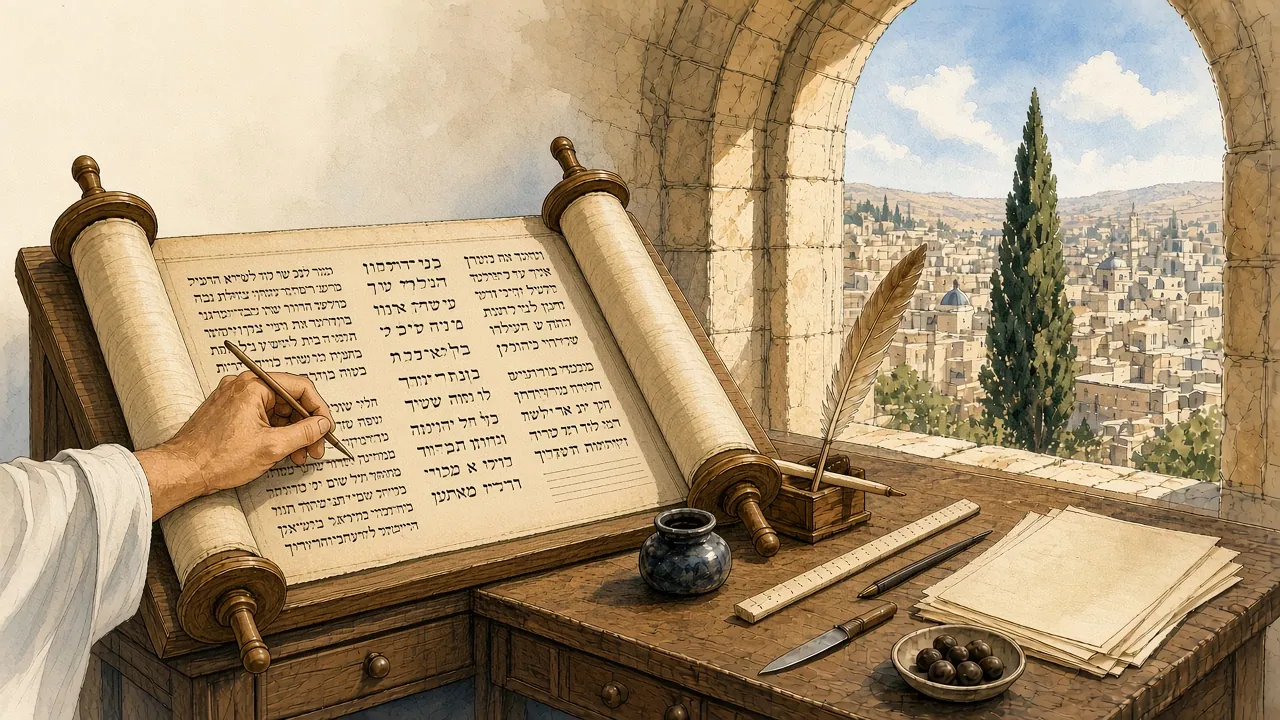
Open almost any Hebrew book printed in the last five hundred years, look at a street sign in Tel Aviv, glance at the doorpost of a Jewish home where a small case holds a rolled parchment, or watch a congregation lift a Torah scroll on a Sabbath morning, and you are looking at the same set of twenty-two letters. Their proportions vary, their weight changes from the heavy black of a scribe’s quill to the light strokes of a modern sans serif, and their details have been argued over for two thousand years. Yet the skeleton is recognisably one. A child who learns to read in Jerusalem today can, with a little patience, read the Isaiah scroll copied by the Dead Sea more than two thousand years ago. Few writing systems on earth can make that claim, and fewer still have carried so heavy a load of law, devotion and memory.
The Jewish tradition calls this alphabet ktav ashuri, “Assyrian writing”, or in the feminine form preferred by the Talmud, ashurit. Modern scholars call it the square script, the Jewish script, or simply the Hebrew alphabet, and each of these names tells a different story. This long read follows the script from its beginnings in the offices of the Near Eastern empires, through the scrolls of the Second Temple period and the debates of the rabbis, into the workshops of the scribes who still write Torah scrolls by hand, across the medieval Jewish world from Yemen to the Rhineland, and finally into the age of movable type, metal foundries and digital fonts. It is a history of letters in the most literal sense, and also a history of the people who wrote them.
What the name means
The name itself is a puzzle that the rabbis set for themselves. In the Babylonian Talmud, a teaching in the name of Mar Zutra, or perhaps Mar Ukva, holds that the Torah was first given to Israel in ivrit script and the sacred tongue, and was given again in the days of Ezra in ashurit script and the Aramaic tongue; Israel then kept the ashurit letters and the holy tongue for its scrolls, leaving the ivrit letters and the Aramaic language to the commoners, whom Rav Ḥisda identifies as the Samaritans[1]. The same passage asks why the script is called ashurit and gives two answers. One is geographical, that it “ascended with the Jewish people from Ashur” when they returned from Babylonia. The other is a play on words, that the script is meusheret, “beautiful and straight”[2].
Both answers have survived because both hold part of the truth. The script did come from the east, from the Aramaic writing that the Assyrian, Babylonian and Persian empires used for their administration, and the term Ashur in the Talmud is a loose memory of that imperial world. And the script is upright, in a way that the angular, leaning letters of the older Hebrew writing were not. Moses Maimonides, writing in Egypt in the twelfth century, preferred the second reading. In his commentary on the Mishnah he explained ashurit as “the finest and most choice” of scripts, one whose characters “are not interchangeable” and do not resemble each other so closely that doubt might arise[3]. The phrase “upright script” in the title of this essay is a translation of that rabbinic pun, and a reminder that for those who used it the shape of the letters was never only a matter of history.
A misnamed square
The English name “square script” is less exact than it sounds. Solomon Asher Birnbaum, the palaeographer whose work underpins much of what follows, observed that the invisible frame within which a letter is written is usually a rectangle standing on one of its shorter sides, and only rarely a true square, so that the name “is really a misnomer”[4]. What gives the script its square appearance is not the outline of each letter but the strong horizontals that run along the top and bottom of the line. Birnbaum described how, in the fully developed book hand, half the letters rest on their own bases while the other half stand partly on their own and are partly carried by their neighbours, a structure he likened to a suspension bridge[4]. The effect is of a line that holds together like a string of beads, each letter distinct, yet all of them hanging from a common rail.
Joseph Naveh, the epigrapher who wrote the companion section of the same encyclopedia article, argued for a further change of name. Since the script was developed and used by Jews of the Second Temple period and after, he wrote, it should properly be termed the Jewish script, and the phrase “Hebrew script” should be kept for the older alphabet of the Israelites, which scholars call Paleo-Hebrew[4]. That suggestion has never quite displaced ordinary usage, but it captures something important. The letters of a modern Hebrew newspaper are not the letters in which the prophets of the First Temple period wrote. They are the letters of a later community that adopted an imperial script and made it its own.
Two alphabets, one language
At the centre of this story is a change of alphabet without a change of language. For centuries before the Babylonian exile, Hebrew was written in a script descended from the alphabet of the Phoenician cities, the script of the Gezer calendar, the Siloam tunnel inscription and the silver amulets from Ketef Hinnom. During and after the exile, as Aramaic spread as a spoken language and as the official tongue of the Persian administration, Jews increasingly wrote in Aramaic letters, first for Aramaic texts and then for Hebrew ones. Naveh noted that the earliest Hebrew manuscripts found at Qumran, fragments of Exodus and Samuel probably copied late in the third century before the common era, are already written in a “Proto-Jewish” script, the earliest Jewish national development of the Official Aramaic hand[4]. From that point the older script was restricted to Hebrew texts, while the new one served for both Hebrew and Aramaic.
The older alphabet did not vanish. It survived among the Samaritans, whose script is its direct descendant, and among Jews themselves it lived on as a symbol. The Hasmonean kings and the rebels of the two revolts against Rome put Paleo-Hebrew legends on their coins, and some scribes at Qumran wrote the divine name in the old letters even when the rest of a scroll was in the new[4][5]. The rabbis, for their part, made the square script a matter of law. The Mishnah rules that sacred scripture renders the hands impure, its way of marking holiness, only when it is written “in the Assyrian script, on parchment, and in ink”[6], and that tefillin and mezuzot may be written only in ashurit[7]. Those rulings are still in force for every Torah scroll, every pair of tefillin and every mezuzah written today.
How this history is told
Several kinds of evidence meet in the chapters that follow. There are inscriptions on stone, pottery and metal, which survive in the ground and can often be dated by their archaeological context. There are documents on papyrus and leather from the dry places of the Near East, above all the Jewish garrison island of Elephantine on the Nile and the caves of the Judean desert. There are the rabbinic texts, the Mishnah, the two Talmuds and the later codes, which record not only laws about writing but also memories and legends about where the letters came from. There are the great medieval codices, some of them dated by their scribes to the year, and the vast store of fragments from the Cairo Genizah. And there are the books printed from the 1470s onward, whose typefaces fix in metal the hands of particular regions and particular moments.
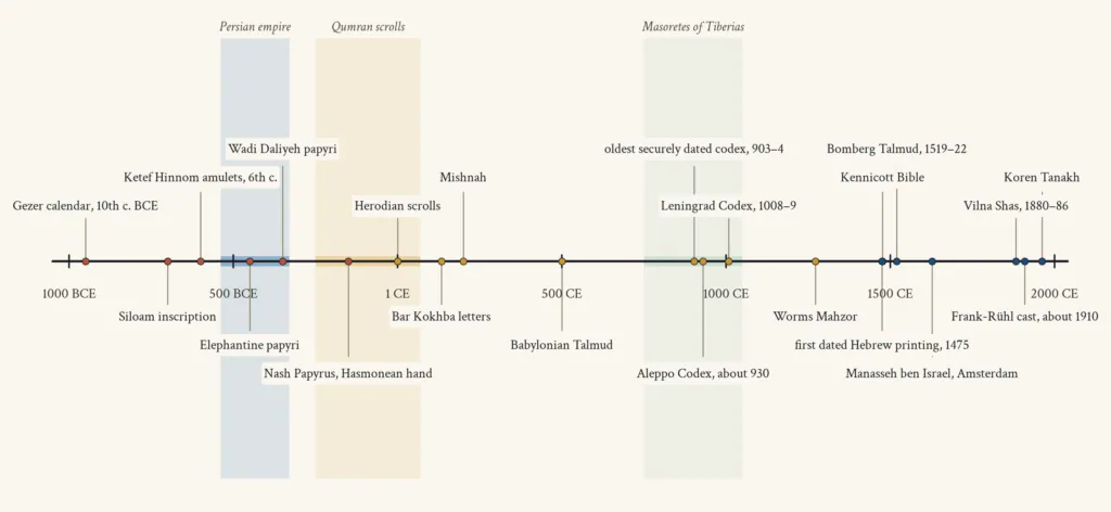
Each kind of evidence has its own way of misleading. Inscriptions are formal and often conservative; documents are hasty and personal; legal texts describe ideals as much as practice; manuscripts survive unevenly, so that some regions are rich in dated books and others almost silent. Malachi Beit-Arié, who spent almost fifty years surveying the dated Hebrew manuscripts of the Middle Ages, insisted that handwritten books should be read “not only as receptacles of texts, but also as cultural artefacts replete with information” about the communities that made them[10]. That is the spirit of this essay. The shape of a letter can tell you where a book was copied, what pen its scribe held, which tradition he learned from and, sometimes, what he believed.
The chapters run roughly in time. The second and third trace the older Hebrew alphabet and the rise of Aramaic as the script of empire. The fourth turns to the rabbinic accounts of the change, and the fifth to the scrolls of the Judean desert, where the square script can be watched taking shape. The sixth, seventh and eighth leave chronology for craft, describing how the letters are built, what they are written with and how scribes crown and correct them. The ninth follows the Masoretes of Tiberias and their codices, and the tenth the Cairo Genizah and the statistical study of the medieval Hebrew book. The eleventh and twelfth survey the regional hands of East and West. The thirteenth and fourteenth tell the story of Hebrew printing from Reggio and Soncino to Amsterdam and Vilna, and the fifteenth follows the letter into the twentieth century and onto the screen. A timeline and a glossary close the essay.
2. Before the Square, the Script of the Hebrews
Long before anyone wrote a square Hebrew letter, Hebrew was already a written language. The first scribes of Israel and Judah used a script that belonged to the great family of alphabets spreading out from the Levantine coast in the late second and early first millennia before the common era. The encyclopedia entries on the individual letters trace the pattern again and again. The alef begins as an acrophonic pictograph of an ox head in the Proto-Sinaitic inscriptions of about 1500 before the common era, passes through the Proto-Canaanite and classical Phoenician alphabets of the tenth and ninth centuries, and from there branches into Hebrew, Aramaic and, by way of Greek, the alphabets of Europe[4]. The Hebrew branch kept a formal alef that survived for centuries in the Paleo-Hebrew scrolls of the Dead Sea and on Jewish coins, while the Aramaic branch developed the form that would become the alef of the square script.
This older Hebrew writing is what the Talmud calls ktav ivri, “Hebrew script”, and what Rav Ḥisda in the Babylonian Talmud names libona’a[1]. Modern scholars call it Paleo-Hebrew, following the usage introduced in Birnbaum’s The Hebrew Scripts[4]. It is an angular, slanting alphabet. Its letters are made of strokes that lean and cross, with long tails and open heads, and it was written on everything from potsherds to plastered walls. To read it a modern Hebrew reader must learn a new alphabet, even though the words are the words of the Bible.
A farmer’s calendar
The oldest substantial Hebrew text is a small limestone tablet found at Gezer in 1908 by the Irish archaeologist R. A. S. Macalister. Seven lines long and dated by its script to the tenth century before the common era, it lists the agricultural year in two-month and one-month units, from the olive harvest through sowing, late sowing, the flax harvest, the barley and wheat harvests, the vine pruning or vintage, to the summer fruit[8]. Some scholars read it as a schoolboy’s writing exercise, and if they are right it is a fitting place for a history of letters to begin. The hand is uncertain, the letters irregular, the purpose obscure, but the alphabet is there, twenty-two signs for twenty-two consonants, with no vowels and no word dividers worth the name.
Across the next three centuries the script matured. In the archives of the fortress of Arad, in the Negev, excavators found ostraca, ink-inscribed sherds, in both Hebrew and Aramaic, among them a group belonging to the papers of “Eliashib, son of Eshyahu”, a high-ranking official, as well as ostraca bearing the names of priestly families known from the Bible[12]. At Lachish, in a room by the city gate destroyed by Nebuchadnezzar of Babylonia, J. L. Starkey found eighteen inscribed sherds in 1935 and three more in 1938. Most are letters sent to Ya’ush, an army commander, by a subordinate named Hoshaiah, and one ends with the famous report that “we are watching for the fire signals of Lachish, according to all the signs my lord gave”[13]. These are working documents, written fast in ink by officers and clerks, and they show the Hebrew script as an everyday tool on the eve of the Babylonian conquest.
The tunnel and the amulets
The most beautiful Paleo-Hebrew inscription is also the most dramatic. In 1880 a six-line text was found by accident cut into the rock wall near the lower entrance of the tunnel of King Hezekiah, which carries water from the Gihon spring to the Pool of Siloam in Jerusalem. It describes the moment when two crews of miners, boring from opposite ends, heard each other’s voices through the rock, struck “pick-axe against pick-axe”, and let the water flow from the spring to the reservoir “for 1,200 cubits”[14]. In 1890 the inscribed rock was cut out to be taken to a museum and broke into several pieces; the restored inscription is now in Istanbul[14]. Its letters are carefully cut, evenly spaced and divided into words by dots, a stonemason’s version of a scribal hand.
The smallest Paleo-Hebrew texts are perhaps the most moving. In 1979 two tiny rolled silver plaques were excavated at Ketef Hinnom, on the slope of the Hinnom valley across from Mount Zion. The Israel Museum, which displays them on behalf of the Israel Antiquities Authority, dates them to the sixth century before the common era and identifies the text inscribed on them as a version of the Priestly Benediction from the Book of Numbers[15]. The larger of them is under ten centimetres long. Someone had the blessing scratched into silver in the old Hebrew letters and wore it, rolled up, perhaps on a cord at the neck. The impulse to carry sacred words on the body, which would later take the form of tefillin and mezuzot written in square letters, was already present in the script that preceded them.
The shape of the old letters
What did these letters look like, and how do they differ from the square script? The comparison plate in this chapter sets the twenty-two Paleo-Hebrew letters, in the form unified by Unicode with the Phoenician alphabet, beside the Imperial Aramaic letters of the Persian chancery and the square letters of a modern Hebrew book face. Several features stand out. The Paleo-Hebrew letters lean. Their verticals run down at an angle and often project below the line, while their heads are open triangles, loops or forks. The Aramaic letters of the Persian period have already begun to open their heads; the closed loops of bet, dalet and resh have become hooks, and the heads of ayin and qof have opened into strokes. The square letters inherit the Aramaic skeleton but sit upright between two imaginary horizontal lines.
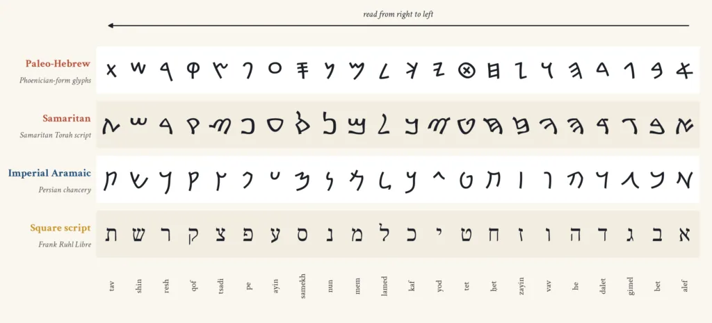
The contrast is clearest in a few letters. The Paleo-Hebrew he is a vertical with three horizontal arms, like a backward E; the square he is a roof with a hanging leg on the right and a separate, suspended leg on the left. The Paleo-Hebrew mem is a zigzag with a long tail; the square mem is a compact box, open at its lower left in its medial form and closed in its final form. The Paleo-Hebrew shin is a sharp W; the square shin is a three-branched cup. The Paleo-Hebrew waw is a forked Y; the square waw is a single hooked stroke, the “hook” of the Tabernacle in the rabbinic interpretation discussed in a later chapter[2]. Only a handful of letters, such as the gimel and the lamed, look broadly similar in both alphabets.
The Samaritan inheritance
The old script had heirs who never gave it up. The Samaritans, the community centred on Mount Gerizim near Shechem who regard themselves as the descendants of the northern tribes of Israel, continued to write their Torah and their liturgy in a script that descends directly from Paleo-Hebrew. Naveh noted that the Samaritan script was employed for both Hebrew and the Western Aramaic dialect the Samaritans spoke[4]. When the Babylonian Talmud records that Israel “left ivrit script and the Aramaic tongue for the commoners”, and Rav Ḥisda glosses the commoners as the Samaritans, it is describing, in the language of polemic, a real divergence between two communities that read the same Torah in different alphabets[1].
This divergence gave the choice of script a sharp edge. For Jews of the late Second Temple period and after, writing the Torah in the square letters became a mark of belonging to the community that looked to Jerusalem and to the rabbis, while the old letters came to be associated with a rival tradition. That association helps explain why the rabbis could rule that scripture written in ktav ivri does not render the hands impure[6], and why the old letters nonetheless kept a place of honour on coins and in a handful of scrolls. They were the letters of the ancestors, but no longer the letters of the sanctuary.
Letters on coins
Coins offer the clearest view of the old script as a deliberate symbol. When the Hasmonean dynasty began to strike its own coinage in the second century before the common era, it chose Paleo-Hebrew for the legends. The Encyclopaedia Judaica notes that Hasmonean coinage and the coins of the First and Second Jewish Revolts against Rome all bear Paleo-Hebrew legends, and argues that the Hasmoneans did not revive a forgotten national script but used one that had survived, “though in a narrow circle”, throughout the Second Temple period[4]. The bulk of the Hasmonean issues were small bronze coins with emblems such as cornucopias, wreaths, anchors and stars, and no likeness of living beings, in keeping with the Second Commandment[17].
The rebels of 66 and of 132 to 135 made the same choice. The silver shekels and bronze coins of Bar Kokhba’s revolt carried slogans of national liberation in the old letters, at a time when no one wrote books or letters in them any longer. In the Bar Kokhba letters found in the caves of the Judean desert, written by the rebel leader and his officers, the hand is a fluent Jewish cursive descended from Aramaic[4][18]. The same men who struck coins in the script of the First Temple wrote their military dispatches in the script that would become ktav ashuri. The old letters spoke of the past and of independence; the new letters were simply how Jews wrote.
The rest of this essay belongs to the new letters. But it is worth keeping the old ones in mind. They are the reason the square script needed a name, the reason the rabbis argued about where it came from, and the reason a handful of Qumran scribes, as we shall see, still reached for an older alphabet when they came to write the name of God.
3. The Chancery of Empires
The square script was born in an office. Its ancestor was not a sacred alphabet but the working script of imperial administration, the Aramaic writing in which the Assyrian, Babylonian and Persian empires kept their accounts, issued their orders and sent their letters from Anatolia to Afghanistan. Naveh summarised the process with characteristic economy. Aramaic, “being an official language of the Assyrian, neo-Babylonian, and Persian empires, was spoken and written in a vast area”, and Aramaic inscriptions have been found in Egypt, North Arabia, Palestine, Syria, Anatolia, Mesopotamia, Persia, Afghanistan and Pakistan[4]. Remarkably, the examination of all this material shows that until the end of the third century before the common era no local variants developed. Official Aramaic was written in essentially one script across the whole of the empire.
That uniformity is the key to everything that follows. A script used by thousands of clerks in hundreds of offices, trained to produce documents that could be read anywhere from Elephantine to Bactria, had to be stable, quick and legible. Its letters were simplified for the reed pen and the ink cake. Their heads opened, their strokes thickened along the line, and their forms settled into a recognisable chancery style. When Jews in Babylonia and in Judea began to write Hebrew in Aramaic letters, they were adopting the most prestigious and most widely understood writing of their world.
Aramaic on the move
How Aramaic became an imperial language is itself a long story. The Arameans were a group of peoples of Syria and upper Mesopotamia whose language and alphabet spread under Assyrian rule, as the empire deported populations, employed Aramean scribes and found that a twenty-two letter alphabet written in ink on leather was far easier to use than cuneiform on clay. By the seventh century before the common era, Assyrian reliefs show pairs of scribes, one with a stylus and tablet and one with a pen and scroll, recording the same events in two systems. The Babylonians inherited the arrangement, and the Persians, who conquered Babylon in 539, made Aramaic the common written language of their administration in the west.
Elephantine
Open in Google MapsBabylon
Open in Google MapsSusa
Open in Google MapsPersepolis
Open in Google MapsFustat
Open in Google MapsJerusalem
Open in Google MapsTiberias
Open in Google MapsDamascus
Open in Google MapsAleppo
Open in Google MapsSana’a
Open in Google MapsAden
Open in Google MapsSamaria
Open in Google MapsWadi Daliyeh
Open in Google MapsGezer
Open in Google MapsQumran
Open in Google MapsLachish
Open in Google MapsArad
Open in Google MapsMasada
Open in Google MapsThe Bible preserves a memory of this world. The Book of Ezra introduces a letter to King Artaxerxes of Persia with the words “a letter written in Aramaic and translated”, and then switches language: what follows is written in Aramaic[22]. The Book of Esther imagines the Persian chancery sending letters “to every province in its own script and to every people in its own language, and to the Jews in their own script and language”[23]. That verse would become a proof text in rabbinic discussions about whether the script of the Torah had ever changed[2]. For the biblical writers, it simply described how an empire worked.
The archive at Persepolis
The Achaemenid administration has left one of the great archives of the ancient world. In March 1933 excavators working for the Oriental Institute of the University of Chicago at Persepolis, the ceremonial capital of the Persian kings, found tens of thousands of clay tablets and fragments in the fortification wall at the north-eastern corner of the terrace. The Encyclopaedia Iranica summarises their make-up. About seventy per cent or more, the remains of some ten thousand original documents, are written in cuneiform script and the Elamite language. Roughly a fifth bear only seal impressions. And about five per cent, the remains of perhaps a thousand documents, are written in Aramaic script and language[19].

The Aramaic texts at Persepolis are a small share of the archive, but they show Aramaic doing its imperial work in the very heart of Iran. The documents record the movement of food, livestock and labour across the province, and their letters were incised or written in ink on the clay. Elsewhere the same administration wrote on leather and papyrus, materials that rarely survive. It was in this script, carried by officials and soldiers across the empire, that a Judean governor would have written to the satrap of Beyond the River, and that the satrap’s office would have answered.
Letters from Elephantine
The richest record of Jews writing Aramaic in the Persian period comes from the far south of Egypt. On the island of Elephantine in the Nile, opposite modern Aswan, the Persians kept a frontier garrison, and among its soldiers were companies of Jews, organised in units called degalim, “banners”[24]. Papyri from the island, recovered by German excavations between 1906 and 1908 and by earlier purchases on the antiquities market, are now held in Berlin, Cairo, Brooklyn and elsewhere; the Egyptian Museum and Papyrus Collection in Berlin describes the island as a uniquely well documented place, inhabited by a multi-ethnic and multi-religious community whose texts span four thousand years[20].
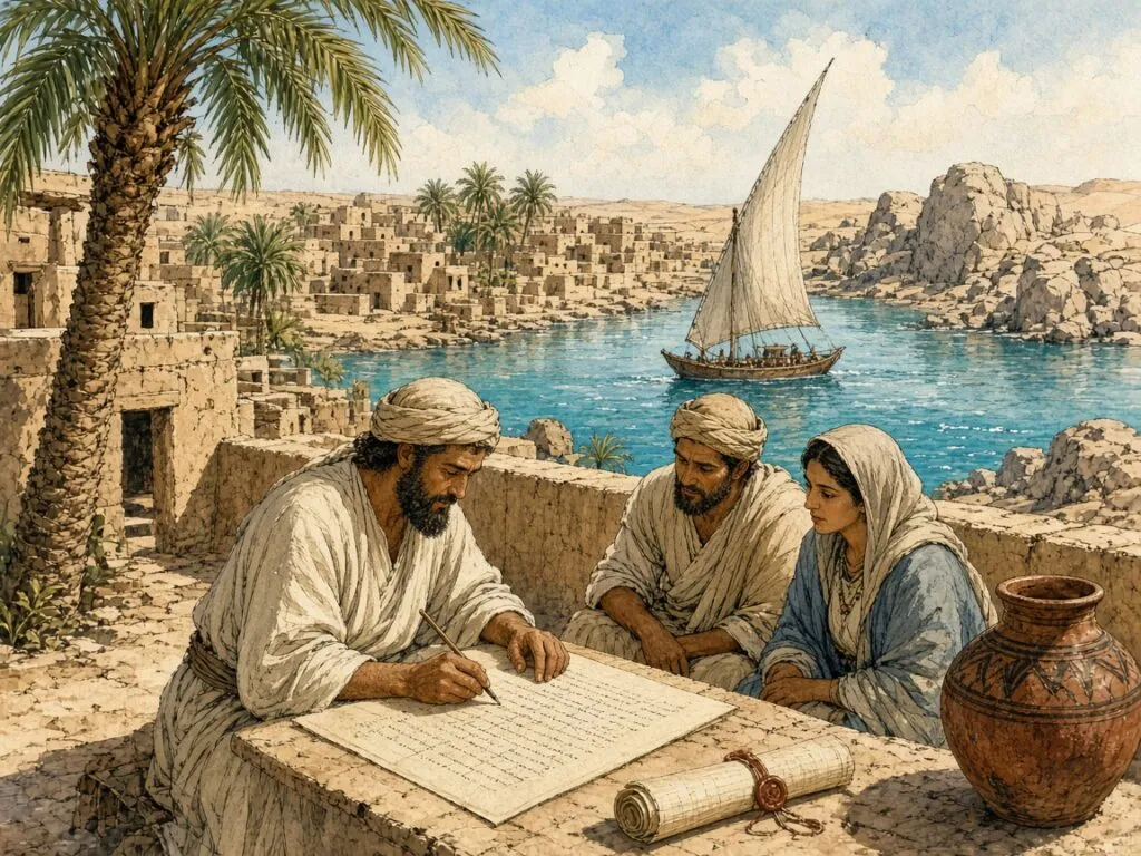
The Jewish papyri of Elephantine, first collected in A. E. Cowley’s edition of 1923, are marriage contracts, deeds of sale, loans, letters and petitions, written in Aramaic in the chancery script of the empire[24]. The Encyclopaedia Judaica entry on Hebrew manuscripts dates the collection from Elephantine and Aswan to the years 494 to 407 before the common era[25]. Among them is a famous petition to Bagoas, the governor of Yehud, asking for help in rebuilding the community’s temple, which had been destroyed[24]. These Jews spoke and wrote Aramaic, swore oaths, made wills and quarrelled with their neighbours in it. Their letters are not yet the square script, but they are its direct ancestor, and in them the reader can watch the forms of the Aramaic chancery hand that later Jewish scribes would regularise.
Yehud on silver
Back in Judea, the Persian province of Yehud began to issue its own small silver coins in the late fifth and fourth centuries before the common era. The Encyclopaedia Judaica notes that at least six types are known with the Aramaic inscription Yehud, some imitating the Athenian owl, others showing a falcon, a lily, a two-faced head or a seated deity, and that one coin carries the Hebrew name Hezekiah, perhaps the high priest mentioned by Josephus[17]. Most of them are tiny, obols and half-obols, and the letters are cramped and crude. But their very existence is telling. The local mint of Jerusalem, under Persian rule, sometimes used Aramaic letters and sometimes Paleo-Hebrew for the province’s name. Two scripts, and two languages, were in use side by side.
The same mix appears on the jar stamps and seal impressions of the period. Naveh observed that there existed in the Persian period an Aramaic lapidary script, attested on the fourth-century Judean jar stamps, but that the influence of the cursive pen hand was so strong that many inscriptions on hard materials were in fact written in the cursive style[4]. The pen was setting the pace. Letters shaped for quick writing in ink were being cut into clay and stone, and the standard Aramaic cursive outlived the Persian empire itself by a century or more.
Papyri in a cave
The last great cache of Persian-period Aramaic documents from the land of Israel was found not in a city but in a cave. In the early spring of 1962, Ta’amireh Bedouin discovered papyri buried with the skeletons of scores of people in a cave of the Wadi ed-Daliyeh, a desolate canyon north of Jericho. Frank Moore Cross, who led their study, reported on them under the title of the Samaria papyri[26]. They are legal documents, many of them deeds for the sale of slaves, drawn up in Samaria in the fourth century before the common era, and the Center for Online Judaic Studies describes how their owners, prominent citizens of Samaria, seem to have fled into the desert after the arrival of Alexander the Great and died in the cave[27].
For the history of the script the Wadi Daliyeh papyri are precious because some carry exact dates in the reigns of Persian kings. They show the Aramaic cursive of the province on the eve of the Hellenistic age, and Cross used them, alongside the Elephantine papyri, to build the typological sequence by which the later Dead Sea Scrolls are dated. The handwriting of these slave sales is the immediate background against which, within a century, Jewish scribes would begin to develop a hand of their own.
From empire to nation
The fall of the Persian empire to Alexander in 330 before the common era broke the administrative unity that had kept Aramaic writing uniform. Naveh describes what followed. In the third and second centuries before the common era local scripts began to develop out of the imperial one. In the west two national scripts were born, the Jewish, which is the square Hebrew, and the Nabatean, from whose cursive the Arabic script would later grow. In the east appeared Palmyrene, Syriac, Mandaic and a series of local hands in Mesopotamia, Iran and the Caucasus[4].
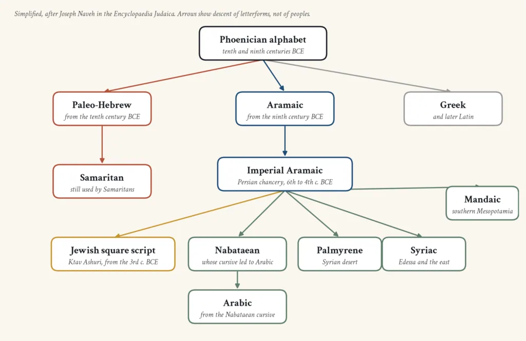
The family tree in this chapter sets out these relationships. It is not a pedigree of peoples but of letterforms, and it explains a fact that often surprises readers, that the Hebrew alphabet of today is a closer cousin of Arabic and Syriac than of the Paleo-Hebrew in which the prophets wrote. The Jewish script was one regional development of a common imperial hand, shaped by a community that used it for a particular purpose, the copying of sacred books. By the end of the fourth century before the common era, Naveh concluded, the Jewish forms “closely approached the full-fledged Jewish script”[4]. The next steps would be taken in the scrolls.
4. What the Rabbis Remembered
By the time the rabbis of the Mishnah and the Talmud came to discuss the script of the Torah, the change from the old letters to the new lay several centuries in the past. No one living had seen a Torah scroll written in Paleo-Hebrew in ordinary use. Yet the memory of a change had not been lost, and the sages argued about it with the seriousness they brought to any question touching the text of revelation. Their discussions, preserved in the Babylonian Talmud tractate Sanhedrin, in the Jerusalem Talmud tractate Megillah and in scattered passages elsewhere, are not history in the modern sense. They are a mixture of tradition, scriptural interpretation and theology. But they show what was at stake for the people who wrote and read the square letters, and they shaped Jewish thinking about the script for the next fifteen hundred years.
The Torah given twice
The central passage is a short teaching attributed to Mar Zutra, or in another version to Mar Ukva, two Babylonian sages. “Initially, the Torah was given to the Jewish people in Ivrit script, the original form of the written language, and the sacred tongue, Hebrew. It was given to them again in the days of Ezra in Ashurit script and the Aramaic tongue. The Jewish people selected Ashurit script and the sacred tongue for the Torah scroll and left Ivrit script and the Aramaic tongue for the commoners”[1]. The Talmud then asks who these commoners are, and Rav Ḥisda answers that they are the Samaritans; it asks what ivrit script is, and Rav Ḥisda answers that it is libona’a[1].
The teaching is a neat piece of symmetry. Two scripts and two languages are combined in four ways, and Israel chooses the pairing that unites the holy language with the new letters. The Jerusalem Talmud puts the same idea more sharply. “Assyrian has a script but no language; Hebrew has a language but no script. They choose for themselves Assyrian script and Hebrew language”[28]. Behind the epigram lies a realistic perception. The Aramaic alphabet had become the standard writing of the Near East, while Hebrew remained the language of scripture. Jews of the Second Temple period fused the two.
Ezra the scribe
The Talmud associates the change with Ezra, the priest and “ready scribe in the Torah of Moses” who led a group of exiles from Babylon to Jerusalem in the fifth century before the common era. A baraita, an early teaching quoted in the Talmud and found also in the Tosefta, reports in the name of Rabbi Yosei that Ezra would have been fit for the Torah to be given through him had Moses not come first, and that “even though the Torah was not given literally by him, the script of the Torah was changed by him”[1]. The proof text is the verse in Ezra describing the letter to Artaxerxes, “written in Aramaic”, which the rabbis read as a hint that the writing itself had been changed[2][22].

The figure of Ezra reading the Torah to the assembled people at the Water Gate, in the eighth chapter of Nehemiah, is the natural backdrop to this tradition. The biblical account describes Ezra standing on a wooden platform made for the occasion, opening the scroll in the sight of all the people, and reading “from the first light until midday”, while the Levites explained the Torah to the people[29]. The Encyclopaedia Judaica entry on the soferim, the early scribes, notes that the Talmud credits these men, active under Persian rule from Ezra to Simeon the Just, with laying the foundations of the oral law and with counting the letters of the Torah, so that they knew, for example, that the waw in the word gaḥon in Leviticus 11:42 marks its middle letter[30]. Whether or not the historical Ezra introduced the Aramaic letters, the rabbis remembered him as the patron of scribes and the guardian of the text.
Beautiful and straight
Not every sage accepted that the script had changed at all. The same passage of Sanhedrin records a teaching of Rabbi Yehuda HaNasi, the editor of the Mishnah, who held that the Torah was originally given in ashurit, the script in use in his day. When Israel sinned the script “turned into an impairment for them” and they began writing in libona’a; when they repented, the original script was returned. On this view, the name ashurit cannot mean that the script came from Assyria. Instead, the baraita explains, it is called ashurit “because it is meusheret, beautiful and straight, in script”[2].
A third opinion goes further still. Rabbi Shimon ben Elazar, quoting a chain of earlier authorities ending with Rabbi Elazar HaModa’i, held that the script never changed at all. His proof is a delightful piece of visual exegesis. The Torah describes the Tabernacle as having vavei ha-amudim, “the hooks of the poles”. Just as the poles did not change, so the hooks, the vavim, did not change; and the letter waw in ashurit has the shape of a hook, which is why the word for hook in the Torah is vav. The verse in Esther that speaks of writing “to the Jews according to their script and according to their language” confirms, on this reading, that neither the language nor the script of Israel ever altered[2][23].
Writing on the wall
The debate spills into a famous scene from the Book of Daniel. When a hand appears at Belshazzar’s feast and writes on the palace wall, the king’s wise men “could not read the writing”. For those who held that the script had changed, the explanation was simple: the words were written in the new script that Ezra would later bring, and the Babylonian sages had never seen it[2]. For Rabbi Shimon, who held that the script had not changed, the riddle needed another answer, and the Talmud supplies several. Rav says the words were written in a code that swapped each letter for its counterpart from the opposite end of the alphabet, the cipher known as atbash. Shmuel says the letters were written in columns to be read from top to bottom. Rabbi Yoḥanan says each word was written backward, and Rav Ashi that the first two letters of each word were reversed[2].
The passage is a reminder that the rabbis thought about letters as visual objects as well as sounds. They imagined text laid out in grids, read in different directions, encoded and decoded. The same habit of mind runs through their discussions of the letter shapes themselves, which they treated as bearers of meaning in their own right.
The seers and the final letters
Five letters of the square alphabet have two forms, one used at the beginning and in the middle of a word and one at the end. They are mem, nun, tzadi, pe and kaf, remembered together by the mnemonic menatzpakh. The rabbis noticed that these doubled letters had no place in the old script and asked where they came from. In the Babylonian Talmud tractate Shabbat, Rabbi Yirmeya, or perhaps Rabbi Ḥiyya bar Abba, says that “the prophets instituted the difference between the open and closed forms of the letters mem, nun, tzadi, peh, kaf”[31]. The Jerusalem Talmud records the same debate. One sage holds that menatzpakh is a practice of Moses from Sinai, while Rabbi Jeremiah, in the name of another, explains the word as “what the seers instituted for you”, playing on the letters of the mnemonic[28].
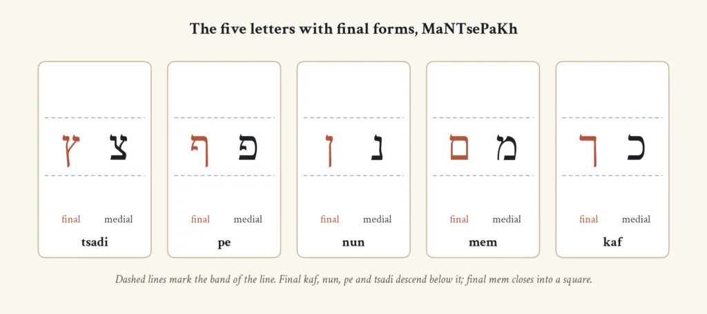
The Talmud also preserves a tradition that the closed letters were older than the open ones. Rav Ḥisda taught that the mem and samekh on the tablets of the covenant “were standing miraculously”. The letters were cut right through the stone, so the centres of the samekh and the final mem, being completely enclosed, should have fallen out; they stayed in place by a miracle[31]. If the final mem was already on the tablets, then the square script, or at least its closed letters, was present at Sinai. The tradition shows how far the rabbis were prepared to read the forms of their alphabet back into the foundational moment of revelation.
The children and the alphabet
The same page of Shabbat contains one of the most charming passages in the Talmud, in which children who come to the study house on a day when the sages are absent explain the meaning of the letters. They read the alphabet as a sequence of moral lessons. Alef bet means “learn wisdom”. Gimel dalet means “give to the poor”, and the foot of the gimel stretches toward the dalet because it is the way of the benefactor to run after the poor. The open and closed mem signify that the Torah has an open teaching understood by all and a hidden one. The bent and straight nun show that a faithful person who is humble now will one day stand upright, and the bent and straight tzadi say the same of the righteous[31].
The passage then turns to the qof and the resh. Why does the qof, which stands for kadosh, holy, face away from the resh, which stands for rasha, wicked? Because God cannot bear to look at the wicked. And why is the crown of the qof turned toward the resh? Because if the wicked person repents, God will tie a crown on him like His own. And why is the leg of the qof suspended, not touching its roof? So that the penitent may enter through the opening[31]. Every detail of the letter, its direction, its crown, the gap between its strokes, becomes a sermon. These details are precisely the ones that scribes must get right, and the next chapters will return to them.
Law for the letters
Alongside legend the rabbis created law. The Mishnah in Megillah rules that the only difference between Torah scrolls on the one hand and tefillin and mezuzot on the other is that Torah scrolls may be written in any language, while tefillin and mezuzot are written only in ashurit[7]. Rabban Shimon ben Gamliel restricts even the permission for Torah scrolls to Greek. The Talmud then works hard to reconcile this mishnah with a baraita stating that a scroll renders the hands impure only if it is written “in Ashurit script, on a parchment scroll, and in ink”[7][33]. Its conclusion is that a translation written in Hebrew letters is a different case from a translation written in foreign letters, and that the Scroll of Esther, at least, must be written in Hebrew, because Esther itself speaks of writing to the Jews “according to their writing, and according to their language”[33].
The Mishnah in Yadayim states the principle in its most compact form. Aramaic passages in Ezra and Daniel render the hands impure; an Aramaic passage written in Hebrew, or a Hebrew passage written in Aramaic, or Hebrew written in the Hebrew script, does not. Scripture “never defiles the hands until it is written in the Assyrian script, on parchment, and in ink”[6]. Three things together make a holy book: the right letters, the right material, the right ink. Maimonides codified the rule in his Mishneh Torah, stating that tefillin and mezuzot may be written only in the Assyrian script, and explaining elsewhere that Ashurit means “the finest and most choice” of scripts[3]. With those words the square script passed from history into halakha, where it has remained.
5. Scrolls in the Desert
In 1947, according to the story usually told, a Bedouin shepherd threw a stone into a cave above the north-western shore of the Dead Sea and heard the sound of breaking pottery. The jars inside held scrolls, and over the following decade the caves around Khirbet Qumran, and then other sites in the Judean desert, yielded the remains of hundreds of manuscripts. The Israel Antiquities Authority, which now cares for them, describes their discovery as widely considered the greatest archaeological event of the twentieth century, and notes that fragments of every book of the Hebrew Bible except Esther were found in the Qumran caves[34]. For the history of the square script the scrolls are decisive. Before 1947 the formative period of the Jewish book hand was known from a handful of inscriptions and a single papyrus. After 1947 it could be followed almost decade by decade.
The papyrus from the Fayyum
That single papyrus deserves its place first. In the early twentieth century W. L. Nash, secretary of the Society of Biblical Archaeology, bought from an Egyptian dealer a sheet of papyrus said to have come from the Fayyum, and in 1903 he presented it to Cambridge University Library, where it is catalogued as MS Or.233[35]. The library describes it as a second-century fragment, before the common era, containing the Ten Commandments followed by the Shema, and notes that before the Dead Sea discoveries it was the oldest known manuscript of a biblical text[35]. The Encyclopaedia Judaica adds that it is written in square Hebrew script, that its text of the Decalogue accords closely with the Greek Septuagint, and that the combination of the Decalogue and the Shema reflects the morning liturgy of Second Temple times, when, according to the Mishnah, the priests recited both[36].
The Nash Papyrus is a single sheet, not part of a scroll, and it may have been used for daily prayer or even for a phylactery. Its letters are the letters of a Jewish scribe of the Hasmonean age, written with a reed pen in ink. When scholars first studied it they argued about its date across several centuries. The discoveries at Qumran resolved the argument by supplying hundreds of comparable hands.
Four ages of the book hand
The scrolls are mostly undated, and some have been dated by radiocarbon, but most are placed in time by palaeography, the study of how handwriting changes. The method was developed above all by Frank Moore Cross and Nahman Avigad, and the New Catholic Encyclopedia summarises the scheme generally accepted. Four stages are recognised: an Archaic stage, from about 250 to 150 before the common era; a Hasmonean stage, from about 150 to 30; a Herodian stage, from about 30 before the common era to 70 of the common era; and a Post-Herodian or Ornamental stage after 70. A few biblical texts are in archaic script, but the vast majority of Qumran scrolls are in Hasmonean or Herodian hands, and palaeographers distinguish formal and cursive styles within each class. Palaeographic dates, the entry warns, are always to be understood as within about fifty years[9].
The Leon Levy Dead Sea Scrolls Digital Library gives examples of each period. The Community Rule fragment 4Q Serekh ha-Yaḥad e is dated to 50 to 25 before the common era in the Herodian period; the Aramaic Enoch fragment 4Q Enoch a to 150 to 50 before the common era, in the Hasmonean period; the great Psalms scroll from Cave 11 to between 1 and 68 of the common era[34]. In the Hasmonean scrolls the letters are still of uneven size and the line is ragged. In the Herodian scrolls they settle into a regular band, the horizontals strengthen, and many letters begin to acquire small thickenings at the tops of their strokes, the beginnings of the serifs that later scribes would develop into a system.
The letters take their places
Naveh traced the stages in the formal book hand as they appear in the figures accompanying his encyclopedia article. In the second half of the third century before the common era Hebrew writing was “already on the threshold of the square script”. By the middle of the second century further development had noticeably taken place, and during the first centuries before and after the turn of the era “the final form had almost been reached”. For the second century of the common era, he concluded, “it is already possible to speak of the square script proper”[4]. The Jewish book hand, in his summary elsewhere in the same article, “became stabilized in the Herodian period, and it did not undergo essential alterations until the present”[4].
What stabilised was the structure of the letters. The he acquired its separated left leg; the final forms became distinct from their medial counterparts; the letters began to hang from an imaginary upper line rather than stand on a lower one. What continued to change, slowly, was the style, the balance of thick and thin, the shape of the tops of strokes, the proportions of the whole. The comparison plate earlier in this essay shows the end point of that process in a modern book face, but a reader who looks at a Herodian scroll in the digital library will find most of its letters immediately familiar.
The old letters for the name
Not every scroll from Qumran is in the square script. The Israel Antiquities Authority notes that most Hebrew scrolls are in the standard square, or Jewish, script, “very similar to today’s Modern Hebrew”, while several are written in Paleo-Hebrew, and some scrolls in the square script use the ancient letters specifically for the divine name[5]. The best known of the Paleo-Hebrew scrolls is 11Q paleoLeviticus a, a copy of Leviticus written in the old script but dated to the Herodian period, between 1 and 50 of the common era[34][37]. Here, at the very moment when the square script was reaching its classical form, a scribe copied a book of the Torah in the letters of the First Temple.
Emanuel Tov has studied the scribal treatment of divine names at Qumran in detail. In addition to the writing of the Tetragrammaton in Paleo-Hebrew characters within scrolls otherwise written in square script, he identifies the use of four dots, the so-called tetrapuncta, in place of the name, and rarer devices such as a colon-like sign and a divine epithet written in red ink. He concludes that these graphic solutions cluster in the scrolls connected with what he calls the Qumran scribal practice, rather than appearing across all the Judean desert finds[38]. Antony Perrot and Matthieu Richelle have argued that the Paleo-Hebrew script of the scrolls has roots in a continuous Hebrew scribal tradition rather than being an antiquarian revival[39]. Either way the old letters had become a script of reverence, used for the holiest word.
Cursive hands and rebel letters
The Judean desert yielded more than literary scrolls. In the caves of Wadi Murabba’at and Naḥal Ḥever, refugees of the Bar Kokhba revolt of 132 to 135 left contracts, letters and personal papers. Naveh describes the Jewish cursive hand that these documents reveal. It began to develop in the late Hasmonean and early Herodian periods and flourished in the time of the Second Revolt. Its letters are rounded and tend to join, though there was not time for a fully ligatured writing like Syriac or Arabic to develop. Most of the examples come from the papyri and messages of Bar Kokhba and his officers. It seems, he concluded, that this cursive ceased to exist with Bar Kokhba’s defeat or soon after, and that later Jewish cursives grew afresh from the surviving book hand[4].
At Masada, the Herodian fortress where the last defenders of the first revolt held out until 73 or 74, excavators found ostraca and a scroll of the Book of Ben Sira, the apocryphal wisdom book whose Hebrew original was otherwise known mainly from medieval copies[4][40]. The Ben Sira scroll, written in a formal hand and laid out in stichometric lines, shows that the square book hand was in use for literary works in the decades before the destruction of the Temple, not only at Qumran but among the rebels themselves.
Writing in the desert
The scrolls also let us see how the scribes worked. Their sheets were ruled with a dry point, and the letters were written hanging below the ruled lines. Columns were planned in advance, and sheets were sewn together into scrolls. Corrections were made by erasure, by writing above the line, or by placing dots above or below letters to cancel them. Some scribes left more space at the end of sections, anticipating the open and closed paragraphs that the later halakha would regulate. Many of these practices would be codified in the rabbinic rules for writing a Torah scroll, and the next chapters will describe them as they are practised today.
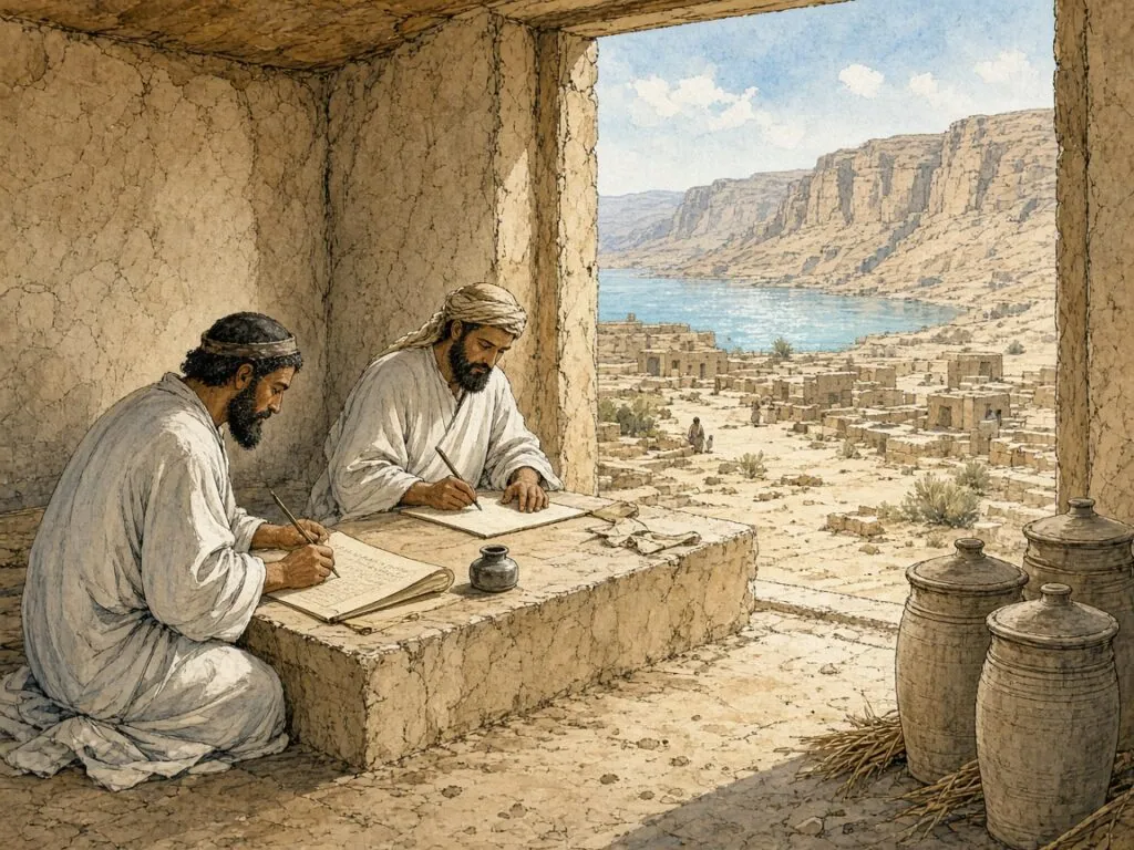
The illustration in this chapter imagines such a scribe at work in the settlement at Qumran, with the cliffs behind him and the jars that would preserve his work on the floor. Whether the Qumran scrolls were written at Qumran or brought there from elsewhere remains a matter of debate, and many were certainly copied in other places. What is not in doubt is that in the generations around the turn of the era, Jewish scribes across the land of Israel were writing a recognisably square script, and that the hands they used would be copied, with remarkable fidelity, for two thousand years.
6. The Anatomy of a Letter
Look closely at a line of Hebrew in a Torah scroll and the letters begin to resolve into parts. There are heavy horizontal bars, roofs and floors, laid down with the full width of the pen. There are thinner verticals, made with the pen turned on its edge. There are small heads at the tops of strokes, little hooks and points, and on some letters tiny crowns rising from the upper left corner. The scribe does not draw each letter in one movement. He builds it, stroke by stroke, in a fixed order, and the law that governs his work speaks of each letter’s components as if they were the parts of a building. This chapter describes that architecture, the shared structure that underlies every regional style of the square script.
The invisible frame
Birnbaum, who examined thousands of manuscripts for The Hebrew Scripts, described the developed book hand as one in which almost every letter has either a top bar or a head, and many have a base as well. The invisible frame within which each letter is written is an upright rectangle. Over the first few centuries of the common era, he wrote, there was a tendency for the horizontals to become thick and the downstrokes thin, and by the time of the first dated manuscript in the fully developed calligraphic style, written in 896, “the horizontals had originally played a very minor role compared with the uprights” but “the opposite extreme had now been reached”[4]. That manuscript’s style, he observed, has remained virtually unchanged ever since.
The point is easily seen by comparing the letters of a Herodian scroll with those of a medieval codex. In the scroll, verticals and horizontals have similar weight, and the letters look like a row of open frames. In the codex the horizontals have become broad bands of ink while the verticals are reduced to hairlines, so that a page seen from a distance looks like a stack of black rails. Yet Birnbaum insisted that this near-polarisation did not produce a dull geometric pattern. Some oblique strokes remained outside the system, some strokes rose above or dropped below the line, and the strokes themselves were “not geometrically straight but slightly curved, wavy, or tapering”[4]. The great weight of the horizontals, he wrote, created a clear impression of continuity along the line, with half the letters resting on their bases and the other half partly standing and partly carried by their neighbours, “in the manner of a suspension bridge”[4]. The letters keep their individuality even as they lock into a line.
Hanging from the line
One of the most distinctive features of the square script is that its letters hang. In Latin writing letters stand on a baseline; in a Torah scroll they are suspended from a ruled line above. The Shulchan Arukh, the sixteenth-century code of Joseph Karo, rules for tefillin that the scribe must score at least the top line and may score all the lines if he cannot write straight without them, adding that scoring should not be done with lead because the mark remains coloured; Moses Isserles, in his gloss, records the custom of always scoring the top and bottom lines and the side margins[41]. For a Torah scroll and a mezuzah, Maimonides states that it is a law given to Moses at Sinai that the parchment must be ruled[3]. The letters are then written beneath these lines, their roofs touching the score from below.

This is why the square script looks so even along its upper edge and slightly irregular along its lower one. Letters with descenders, such as the final kaf, the final nun, the final pe, the final tzadi and the qof, drop below the line, while the lamed alone rises above it with its tall neck. Everything else occupies the band between the ruled line and an imagined line beneath. The diagram in this chapter shows how the letters sit in that band, how their heavy horizontals align, and how the few letters that break the band give the line its rhythm.
Stretching the line
Medieval scribes found an elegant solution to a problem every copyist faces: how to keep the left margin straight in a script read from right to left. Birnbaum called it dilatation and described the litterae dilatabiles, the letters that can be stretched. When a letter stood at the left end of a line but did not reach the edge of the column, the scribe extended its top bar to fill the space, so that “the left edge of the column” became “neat and straight”. The device, he thought, arose spontaneously among scribes because it combined simplicity with effectiveness, and its forms do not appear before the sixth or seventh century[4].
The halakha also has views about the space between letters. The Encyclopaedia Judaica notes that in a Sefer Torah there must be a space between letters, a greater space between words, a nine-letter gap between sections and four blank lines between the five books[42]. Among the practices received by scribes from generation to generation, Maimonides lists the number of lines in a column, not fewer than forty-eight nor more than sixty, and a space of about nine letters between passages, enough to write the word asher three times[43]. The page of a Torah scroll is thus a grid of letters and spaces whose proportions are regulated almost as tightly as the letters themselves.
Each letter surrounded
The most fundamental rule of all concerns the boundary of the letter. Rav Yehuda, in the name of Rav, teaches in the Talmud that “any letter that is not encircled with blank parchment on all four of its sides” is unfit, so that a letter whose ink runs into the letter above, below, before or after it disqualifies the scroll[44]. The Shulchan Arukh restates the rule simply, “No letter may touch another; rather each letter must be completely surrounded by parchment”, and Isserles adds that the scribe must write a perfect script that does not lack “even the serif on one yud”[41]. The same passage of the Talmud explains that even the absence of the thorn of a yod, the tiny stroke at its foot, prevents fulfilment of the commandment[44].
These rules make the letter an object with edges. It must be complete, separate and legible. The Talmud discusses the case of a man whose tefillin had the leg of a he in the word ha-am cut through by a perforation. Rabbi Abba ruled that if the part of the leg still attached to the roof was the size of a small letter, a yod, the letter was fit, and otherwise not[45]. The Shulchan Arukh codifies this and adds a striking test. When a letter is damaged or doubtful, one asks a child who is “neither a genius nor a simpleton” to read it. If the child reads it correctly the letter is valid; if not, it is invalid. Isserles qualifies the rule, insisting that if the proper shape of the letter is visibly gone the letter is invalid even if a child can read it[41].
Written, not carved
A further principle governs how a letter may be corrected. The law requires that letters be written, not carved out. If a drop of ink falls into a letter and makes it unrecognisable, the Shulchan Arukh rules, it cannot be repaired by scraping away the excess ink to reveal the letter, because this would be “internal engraving” and the rule is “to write and not to engrave”. The same applies if a scribe wrote a dalet instead of a resh, or a bet instead of a kaf, and then tried to fix it by scraping off the projecting corner that distinguishes the two letters. An open mem whose gap has accidentally closed may not be reopened by scraping[41]. A letter must come into being by the addition of ink, never by its removal.
The rule explains why so much attention is paid to letters that differ only in a small detail. The Encyclopaedia Judaica notes that particular care must be given to letters similar in appearance, such as dalet and resh, so that they can be easily distinguished[42]. The dalet has a projecting corner at its upper right where the roof meets the leg; the resh is rounded. The bet has a small heel at its lower right that the kaf lacks. The he has a gap between its roof and its left leg; the ḥet does not. Maimonides, explaining why ashurit is the choicest of scripts, made precisely this point, that its characters are not so similar that doubt might arise[3]. The anatomy of the letter is a system for preventing confusion.
The scribe’s strokes
How does a scribe actually make these shapes? The Encyclopaedia Judaica describes the modern Ashkenazi practice. The thickness of the letters varies and it is often necessary to make several strokes to form a single letter. The scribe holds the quill sideways to make thin lines and flat, so that the whole point writes, to make thick ones. And, surprisingly for a script read from right to left, “each individual letter in the Sefer Torah is written from left to right”[42]. The heavy roof of a he, for example, is drawn as a band from left to right, then the right leg is dropped from its end, then the separate left leg is added.
The same entry lists the exceptional letters that a scribe must know by heart. Six letters are written particularly small, such as the alef at the end of the first word of Leviticus, and eleven very large, such as the bet that begins Genesis. Every letter must be complete, with one famous exception, the “split waw” in the word shalom in Numbers 25:12[42]. There are dots over certain words, and the two great songs of the Torah, the Song of the Sea and Ha’azinu, are laid out in special patterns, the first like “half bricks set over whole bricks”[42][32]. The anatomy of the letter is matched by an anatomy of the page.
One structure, many styles
All of this describes a structure, not a single style. The Rosh, Rabbi Asher ben Jehiel, who moved from Germany to Toledo at the beginning of the fourteenth century, testified that the forms of the letters differ from country to country and that all are valid as long as they meet the basic halakhic requirements of each letter’s components[46]. Maimonides, for his part, gives no detailed description of the letter shapes in the Mishneh Torah. Instead he rules simply that a letter which does not have a form a child could read is invalid, a point noted by modern commentators as evidence that the detailed traditions of letter forms were recorded mainly by Ashkenazi authorities[46].
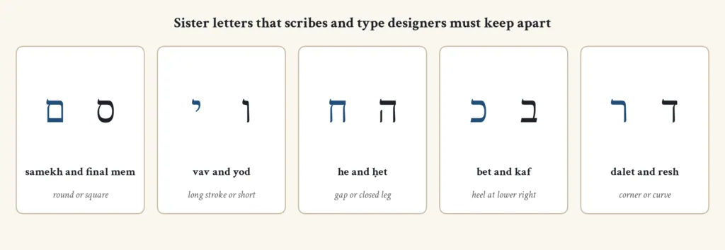
The result is a script with a common skeleton and many skins. A Yemenite scribe, a Sephardi scribe and an Ashkenazi scribe all observe the same rules about roofs and legs, crowns and gaps, but their letters look different, because they hold different pens, learned from different teachers and inherited different aesthetic ideals. The chapters on regional hands will return to these differences. First, though, the materials.
7. Parchment, Ink and Reed
The square script was made for particular materials, and the halakha has never allowed them to be separated from it. Scripture becomes holy writing, in the Mishnah’s formula, only when it is in the Assyrian script, on parchment and in ink[6]. The scribes who write Sifrei Torah, tefillin and mezuzot today, known collectively by the acronym STaM, still work with the materials of late antiquity: the prepared hide of a kosher animal, a cut pen, and a black ink whose recipe the rabbis discussed in detail. This chapter follows those materials from the tannery to the scribe’s desk.
Three kinds of skin
Maimonides distinguishes three kinds of parchment, gevil, kelaf and dukhsustos. The hide of a domesticated or wild animal is taken and the hair removed. If the hide is then salted, prepared with flour and treated with resin and other substances that harden it, while still whole, it is gevil. If it is split into two layers, the thinner layer from the hair side is kelaf and the thicker layer from the flesh side is dukhsustos[3]. It is, he writes, a law given to Moses at Sinai that a Torah scroll should be written on gevil on the side where the hair grew; tefillin are written on kelaf on the flesh side; and a mezuzah written on dukhsustos is acceptable on the flesh side[3]. A Torah scroll written with some portions on gevil and others on kelaf is invalid, because, as the commentary explains, the portions appear to be two different scrolls[43].
In practice most modern scrolls are written on kelaf, the finer layer. The Encyclopaedia Judaica describes how the preparation of the hide has changed. In talmudic times, it notes, salt and barley flour were sprinkled on skins that were then soaked in the juice of gallnuts. Today the skins are soaked in clear water for two days, the hair is removed by soaking them in limewater for nine days, and they are rinsed, dried and pressed flat. The processor must declare when soaking the skins that the work is done for the holiness of the Sefer Torah[42]. Maimonides codifies the same requirement of intention[3].
Scoring the lines
Before a single letter is written, the parchment is ruled. The practice, called sirtut, uses a stylus or a reed to press a fine groove into the surface, never a substance that leaves a mark. Maimonides holds that a Torah scroll or mezuzah written on unruled parchment is unfit[3][43], and the Shulchan Arukh specifies that lead must not be used because it leaves a coloured line[41]. The Encyclopaedia Judaica describes modern practice: forty-three thin lines are drawn across the width of each sheet with a stylus and ruler, two additional vertical lines mark the edges of each column, and generous margins are left, about four inches at the bottom, three at the top and two between the columns[42].
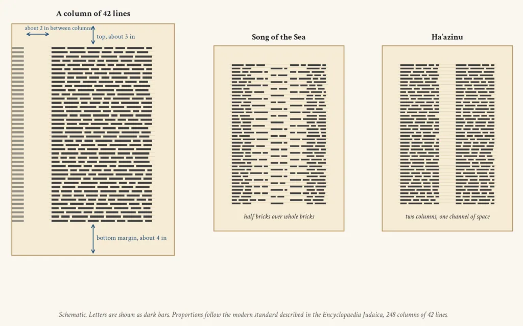
The number of lines and columns has varied. Maimonides records the scribal tradition that a column should have not fewer than forty-eight lines and not more than sixty[43]. The Encyclopaedia Judaica notes that from the beginning of the nineteenth century a standard pattern of 248 columns of 42 lines each became established, with each column wide enough to write the longest word in the Torah, le-mishpeḥoteihem in Genesis 8:19, three times[42]. The diagram in this chapter shows the layout of such a column and the special patterns of the Song of the Sea, set like brickwork, and Ha’azinu, divided by a single channel of space running down the column.
The ink
The Hebrew word for ink, deyo, appears only once in the Hebrew Bible, in Jeremiah 36:18, but the Jewish Encyclopedia points out that it is mentioned there as something well known[47]. The talmudic deyo, it explains, was not a fluid but a cake of pigment, made chiefly from soot, mixed with oil or balsam gum into a tough substance that had to be moistened before use; ink made with olive oil soot was preferred as the finest[47]. Maimonides gives the recipe. One collects the vapour of oils, tar, wax and the like, kneads it with tree sap and a drop of honey, moistens it, crushes it into flat cakes, dries them and stores them[3]. Red, green and other colours are excluded, and if even one letter of a Torah scroll, tefillin or mezuzah is written in another tint or in gold, the item is unfit[3][41].
Over the centuries gall ink displaced soot ink for most purposes. The Jewish Encyclopedia notes that gallnuts are unknown to the Mishnah but mentioned in the Gemara, and that Rabbi Meir mixed copper sulphate, kalkantus, into his ink to make the writing more permanent[47]. The Shulchan Arukh accepts black ink “whether or not the ink contains gallnut juice”, while Isserles prefers ink made of soot of wood or oil soaked in gallnut juice[41]. Today, according to the Encyclopaedia Judaica, ink is made by boiling gallnuts, gum arabic and copper sulphate crystals, and some scribes add vinegar and alcohol. It must be black and durable, though not indelible, since it must be possible to erase a mistake with a knife and pumice[42].
Reed and quill
The pen has shaped the letters as much as any rule. The Jewish Encyclopedia notes that the biblical term ’et designates both a metal stylus and a reed pen like the Arabic qalam, and that the scribe carried his inkhorn, the keset ha-sofer, in his belt, together with a scribe’s knife for sharpening the reed and cutting the writing material[47]. In talmudic times reeds were used. Today, according to the Encyclopaedia Judaica, Ashkenazi scribes use quills, preferably the turkey feather, “which is sturdy and long lasting”. The scribe cuts the point of the feather to give a flat surface suited to the square letters and slits it lengthwise[42]. Many scribes in Sephardi and Oriental traditions, by contrast, long kept to the reed.
The choice of pen may have affected the history of the script itself. Birnbaum noticed that in Ashkenazi writing the contrast between thick horizontals and thin verticals grew steadily stronger from the thirteenth century to the fifteenth, until the letters became wide, heavy and rigid. He wondered whether this development was purely aesthetic “or whether there was a special reason, or a partial one, perhaps the transition from the reed pen to the quill”[4]. The type foundry Fontef makes a similar observation in describing the two great archetypes of Hebrew lettering, the Ashkenazi model shaped by the quill and influenced by Latin blackletter, and the Sephardi model shaped by the reed, “brighter and softer” and lower in contrast[48].
Before the first letter
The writing itself is surrounded by ritual. The Encyclopaedia Judaica describes the modern practice. Before beginning his daily work, the scribe immerses in a mikveh. He tests his pen and ink by writing the name Amalek and crossing it out, in allusion to the command to blot out the memory of Amalek. He then declares that he is writing the Torah for the sake of its holiness, and before every name of God he declares again that he is writing it for the holiness of the name[42]. Maimonides warns the scribe that when he dips his pen he should not begin at once with a letter of the divine name, lest too much ink collect on the pen and leave a blot that must be rubbed out[3].
The scribe must also copy from a written text. The Encyclopaedia Judaica notes that talmudic scribes copied from another scroll, and that according to one tradition a model copy of the Torah was kept in the Temple for the purpose[42]. Modern scribes use a tikkun, a printed guide with the text laid out in scroll format, read each phrase aloud and then write it. The Shulchan Arukh instructs the scribe of tefillin to read each passage after writing it “well, with focus and meticulously, two or three times”, and to test the quill before he begins so that it will not carry more ink than necessary[41]. Tefillin must be written with the right hand and in order, and a missing letter cannot be inserted afterwards because it would then have been written out of order[41].
Sewing the scroll
When the sheets are written they are sewn together with giddin, thread made from the sinews of a kosher animal. The Encyclopaedia Judaica explains that every four pages form a section, that the stitches are made on the outer side of the parchment with an inch left unsewn at top and bottom, and that the ends of the scroll are tied to wooden rollers called atzei ḥayyim, “trees of life”[42]. In many Oriental and some Sephardi communities the scroll is housed instead in a rigid wooden or metal case, the tik, and read standing upright[42].
A scroll with errors can be repaired, since ink can be erased with a knife and pumice, but a mistake in one of the names of God cannot be corrected, because the name may not be erased, and the sheet must be replaced. When a mistake is found, the wimple is tied round the outside of the scroll’s mantle as a sign that it must not be used until corrected. A scroll beyond repair is placed in an earthenware urn and buried in the cemetery, and it was customary to bury such scrolls beside the grave of a prominent rabbi[42]. Even in death, the parchment and its letters are treated as something close to a person.
8. Crowns and Corrections
The square letters of a Torah scroll do not stand bare. Seven of them wear crowns, small clusters of strokes rising from their upper left corners. Others carry distinctive ornaments that a trained eye can spot across a synagogue, such as the little hump on the roof of the ḥet or the detached leg of the he. These details are not decoration in the ordinary sense. They have been argued over by sages, invested with mystical meaning and passed from scribe to scribe for more than fifteen centuries. This chapter looks at the crowns, at the scribe’s profession and at the ways in which a mistake in sacred writing can be mended, or not.
The seven crowned letters
The Encyclopaedia Judaica defines tagin as special designs resembling crowns, placed by a scribe on the upper left-hand corner of seven of the twenty-two letters of the alphabet in a Torah scroll, tefillin or mezuzah. A tag is generally made of three flourishes, each resembling a small zayin, “thick on top with a thin line extending downward to the letter”, with the centre stroke slightly higher than the two at the ends[49]. The rule comes from a single sentence in the Talmud. “Rava says: Seven letters require three crowns, and they are the letters shin, ayin, tet, nun, zayin; gimmel and tzadi”[45]. The list is remembered as a pair of nonsense words, shaatnez getz, and Rashi notes that it includes the final forms of nun and tzadi[49].

The diagram in this chapter shows these seven letters with their crowns, drawn schematically over modern letterforms. Other letters in the Ashkenazi tradition receive a single crowning stroke, and the tagin of certain words in the Torah are larger or more numerous than usual, following a separate and much more complicated tradition. The scribe learns these rules from the tikkun, the compendium for scribes that the Encyclopaedia Judaica describes as containing the traditional text of the Torah, the rules for the tagin, the regulations for the spacing of open and closed sections and the rules for writing scrolls in which each column begins with the letter vav, the so-called vavei ha-ammudim[50].
Moses in the study hall
The most famous story about the tagin is one of the most famous stories in the Talmud. Rav Yehuda reports in the name of Rav that when Moses ascended on high, he found God “sitting and tying crowns on the letters of the Torah”. Moses asked who was preventing God from giving the Torah without these additions. God answered that a man would be born after many generations, Akiva ben Yosef, “destined to derive from each and every thorn of these crowns mounds upon mounds of halakhot”[45]. Moses asked to see him and was sent to sit at the end of the eighth row in Akiva’s study hall. He could not follow the discussion and was distressed, until a student asked Akiva for the source of a ruling and Akiva replied that it was a law given to Moses at Sinai[45]. Then Moses was comforted.
The story continues darkly. Moses asked to see Akiva’s reward and saw his flesh being weighed in a butcher’s market, for Akiva was tortured to death by the Romans. When Moses protested, God replied, “Be silent; this intention arose before Me”[45]. The tale is told about the crowns, but its subject is the relationship between a fixed written text and the endless interpretation that grows from it. The tiny strokes on the letters stand for the possibility that every detail of the written Torah may carry meaning not yet discovered. The Encyclopaedia Judaica notes that Kabbalah places great stress on the mystical meanings of the tagin, treating every stroke as a symbol of “extraordinary secrets of the universe and creation”[49].
Hump and hanging leg
The same passage preserves a scribe’s observation. Rav Ashi said that he had seen the exacting scribes of the study hall of Rav “put a hump-like stroke on the roof of the letter ḥet” and suspend the left leg of the letter he, so that it was not joined to the roof[45]. The Talmud explains both details homiletically. The hump on the ḥet signifies that God lives, ḥai, in the heights of the universe. The he is open at the bottom like a portico open on one side, alluding to this world, from which anyone who wishes to leave may leave, and its left leg is detached at the top because one who repents is brought back in “through the opening at the top”[45].
These are classic examples of the way in which the rabbis read meaning into letter shapes, but they are also precious evidence of scribal practice in talmudic Babylonia. They show that the shapes were already conventional enough for a sage to comment on how a particular school of scribes wrote them, and that careful scribes were already distinguishing ḥet from he by more than a simple gap. The hump on the ḥet, the ḥatoteret, survives in scribal hands today. The leg of the he, separated from the roof, is a rule for every scribe.
Required or beautiful
Are the crowns required? Here the authorities have disagreed. Maimonides holds that if one is not precise about the placement of the crowns the scroll remains acceptable, as long as all the letters are written as they should be, since their inclusion is an “exceptionally beautiful fulfillment of the mitzvah”[43][49]. The commentary on his ruling notes that Rabbenu Asher disagreed, holding that a scroll lacking crowns is disqualified, and that the Shulchan Arukh advises adding all the necessary crowns before the scroll is used[43]. The Encyclopaedia Judaica records that Ashkenazi custom, following the Magen Avraham and the Ba’er Heitev, holds scrolls invalid without the appropriate tagin[49].
The tagin have a long written tradition of their own. A treatise called Sefer Tagin, which tradition attributes to Joshua and connects to the stones he set up at Gilgal, was copied by Simḥah ben Samuel, a disciple of Rashi, into his Maḥzor Vitry, and an annotated edition was published by S. Sachs in 1866[49]. The Encyclopaedia Judaica also notes a connection that will surprise many Christian readers. The tagin, it suggests, are the “tittles” of the Gospels, the smallest marks of the law that will not pass away[49]. If so, they were already familiar features of the square script in the first century.
Four scribal scripts
Today a buyer of tefillin or a mezuzah is asked to choose a script. Modern halakhic summaries list four main styles for STaM writing. Ketav Beit Yosef, following the opinion of Joseph Karo and based on the medieval authorities, is used by Ashkenazi Jews, and above all by Lithuanian Ashkenazim. Ketav Velish is the script of Sephardi Jews, which, one summary notes, “is not recorded in the Rishonim” and has no clear tradition about the components of each letter. Ketav Arizal resembles Beit Yosef but includes kabbalistic nuances in certain letters, mainly alef, vav, ayin, tzadi and shin. Finally there is the script attributed to Shneur Zalman of Liadi, the first Lubavitcher rebbe, used by some Chabad Hasidim[46].
These differences show that the halakha regulates a structure while allowing local style. A Sephardi Velish letter is rounder and lighter, with less contrast between thick and thin; an Ashkenazi Beit Yosef letter is heavier and more angular, with pronounced crowns. The tradition of documenting each letter’s exact parts, the same source observes, was mainly an Ashkenazi undertaking, carried by medieval authorities such as the Rokeaḥ and Judah the Pious, while Sephardi authorities generally did not record such details[46]. That asymmetry has shaped the rules that modern scribes study.
The scribe’s profession
The man who writes these letters is a sofer, a word that, as the Encyclopaedia Judaica explains, comes from a root meaning to count and appears already in Ugaritic as rb spr, “chief scribe”[50]. In rabbinic Judaism the professional scribe became the expert in writing Torah scrolls, tefillin, mezuzot and bills of divorce, and is known by the acronym sofer STaM. The commandment, inferred from Deuteronomy, that every Jew should write a Torah scroll for himself can only be fulfilled by commissioning a scribe, and the Talmud rules that a scholar should not live in a town without one[50]. In talmudic times, the encyclopaedia adds, scribes were poorly paid “lest they become rich and desert their vocations”[50].
The scribe must also work from a copy, not from memory, and must prepare himself so that he writes the names of God with proper devotion and in ritual purity[50]. Only the Scroll of Esther may be illustrated; a Torah scroll may not. Tractate Soferim records that in a scroll belonging to Alexandrian Jews all the divine names had been written in gold, and that when the matter came before the sages they ordered the scroll stored away, not to be used for public reading[51][50]. The Torah scroll, in other words, must look exactly like a Torah scroll, black letters on bare parchment, nothing added.
When a letter goes wrong
What happens when the scribe makes a mistake? Ordinary errors can be erased. The ink is scraped from the parchment with a knife and the surface smoothed with pumice before the correct letter is written[42]. But some mistakes cannot be corrected. The names of God may not be erased, and a sheet with an error in a divine name must be replaced. Tefillin must be written in sequence, so a letter left out cannot simply be added afterwards, and the law of written-not-engraved forbids correcting a letter by scraping away part of it[41]. A scroll with too many corrections, the Encyclopaedia Judaica adds, was later judged unsightly and therefore invalid[42].
There is also a principle of minimum survival. According to the Talmud, a Torah scroll with fewer than eighty-five correct letters may be discarded, because eighty-five is the number of letters in Numbers 10:35–36, the short passage about the moving of the ark that some regard as a book of its own[42]. And for doubtful letters the Talmud already proposed the test that the Shulchan Arukh would codify. When the leg of a vav in the word va-yaharog was cut by a perforation, Rabbi Zeira said, “Go bring a child who is neither wise nor stupid, but of average intelligence”; if the child read the word correctly the tefillin were fit[45]. The ultimate guardian of the letter’s shape is a reader, not a ruler or a scholar.
A living tradition
All of this means that the square script is the only script in the world whose shapes are protected by a living legal tradition. Latin letters have been reformed by printers and calligraphers and governments, and Arabic letters by schools of calligraphy, but the letters of a Torah scroll are still checked by experts against rules first stated in the Talmud, and a scroll whose letters touch or whose crowns are missing may be taken out of use. Modern scribes use computer programs to compare a scroll against a correct text, but the final authority remains the human eye.
That legal protection explains why the scribal hand changed so little between the Masoretic codices of the tenth century and the scrolls written today. Printing, as we shall see, freed the script from the pen and allowed it to change in new ways. But the scribe’s desk, with its quill, ink, ruled parchment and tikkun, remains a link with the age when the square script first took shape. The next chapter follows that script to its most important medieval monument, the codices of the Masoretes.
9. The Masoretes’ Page
Between the last Dead Sea scrolls and the first dated Hebrew codices lies a gap of roughly eight centuries from which almost no Hebrew books survive. Malachi Beit-Arié, the founder of modern Hebrew codicology, called it a “puzzling gap of some eight hundred years”, broken only by a few dozen fragments in book hand[10]. When the record resumes, at the end of the ninth century and the beginning of the tenth, the square script has reached its classic form, and it appears in a new kind of book. This chapter is about that book, the codex, and about the scholars of Tiberias who made it the vehicle of the most carefully transmitted text in the world.
Scroll and codex
A codex is a book in the modern sense, made of folded sheets gathered into quires, sewn and bound between covers. Christians adopted it in the first centuries of the common era for their scriptures, and after about 300 it became the main form for Greek, Latin and Coptic Christian texts. Jews, Beit-Arié shows, adopted it much later, “not before the Muslim period and the beginning of the Geonic literary activity, and presumably no earlier than the eighth century”[10]. Rashi had already observed that the books of the talmudic sages were all scrolls “like our Tora scroll”[10]. The Hebrew word for a codex, miṣḥaf, borrowed from the Arabic muṣḥaf used for the Qur’an, appears first in the eighth-century Halakhot Gedolot[52].
The change mattered for the script. A codex is not valid for the public reading of the Torah, which must still be done from a scroll, but it has something a scroll lacks: wide margins on every page, in which notes could be written[52]. The codex allowed the text of the Bible to be surrounded with apparatus, vowel points and accents above and below the letters, and lists and comments in the margins. The square letters of the consonantal text, still written with the care of a Torah scribe, became the centre of a more complex page. The scroll preserved the sacred text in its ritual form; the codex preserved the knowledge needed to read it correctly.
The Masoretes of Tiberias
The scholars who made this apparatus were the Masoretes, from masorah, tradition. The Encyclopaedia Judaica’s article on the Masorah explains that the traditions of pronunciation and of reading with pauses and melody were ancient, handed down by the earliest sages, while the graphic signs that recorded them came later; since sages were already dealing with punctuation in the eighth century, the latest possible date for the first vowel and accent signs is the seventh[52]. The most famous of the Masoretes were the descendants of Asher the Elder, “a family of five generations, the last two of whom were Moses and his son, Aaron Ben-Asher”[52]. They worked in Tiberias, on the shore of the Sea of Galilee, which was then the most important centre of Jewish learning in the Land of Israel.

Aaron ben Moses ben Asher, who lived in the first half of the tenth century, was the last and most important of his family. He wrote a grammatical treatise, the Dikdukei ha-Te’amim, and was apparently an elder contemporary of Saadiah Gaon, who attacked a Ben Asher in a polemic. Whether the family were Karaites, members of the movement that rejected the Oral Law, is still debated; some scholars think so, while Dotan and others hold that they were not[53]. Either way, Aaron ben Asher “rapidly gained fame as the most authoritative of the Tiberias masoretes”, and in 989 another scribe vouched for the accuracy of his own copy by noting that he had vocalised it from the books of Aaron ben Asher[53]. The illustration in this chapter imagines a Masorete at work by the lake.
Vowels around the letters
The Masoretes did not alter a single letter of the square script. Their signs were added around the consonants, dots and dashes below, above and within the letters, so that the sacred consonantal text could remain exactly as the scribes had copied it. The Encyclopaedia Judaica describes three systems, the Palestinian, the Babylonian and the Tiberian, and it was the Tiberian that became standard for the Bible[52]. Babylonian pointing was written mainly above the letters, as in the oldest dated fragments[10]. In the Masorah parva, notes were written in tiny letters in the side margins, with a small circle over the word in question; in manuscripts with Babylonian pointing the notes were sometimes written in small letters between the lines[52].
This layered page had a visual effect. The consonants remained large and dark, written with the full weight of the square hand, while the vowels and accents formed a fine scatter of points around them, and the margins held lines of minute writing. A Masoretic Bible therefore shows the square script at two scales at once, monumental in the text and miniature in the notes. Over time the miniature writing became an art of its own, as we will see, but at its origin it was a scholarly instrument, recording which words were written one way and read another, how often a spelling occurred and which forms were unique.
The Crown of Aleppo
The supreme monument of this tradition is the Aleppo Codex, known in Hebrew as the Keter, the Crown. According to the Ben-Zvi Institute, it is a complete manuscript of the Bible written in Tiberias about 930, and “considered by many scholars to be the most accurate copy of the Hebrew Bible extant today”[54]. Its consonants were copied by Solomon ben Buya’a, a well-known scribe, and a note in the manuscript records that Aaron ben Asher vocalised it and added its Masorah[53][25]. The Encyclopaedia Judaica notes that the same Solomon ben Buya’a copied a Pentateuch in 929, vocalised by his brother Ephraim, and that both brothers appear to have worked in Tiberias[25].
The codex had a dramatic history. From Tiberias it reached the Karaite community of Jerusalem, was captured during the Crusades, was ransomed by the Jews of Cairo and was seen there by Maimonides, before it ended up in Aleppo[54]. Maimonides described a Bible then in Egypt on which “all relied, since it was corrected by Ben-Asher” and was proofread many times, adding that he based the Sefer Torah he wrote upon it[55][53]. Most scholars identify that manuscript with the Aleppo Codex, although the Encyclopaedia Judaica records that Umberto Cassuto, who examined the codex in Aleppo, had doubts[53].
Fire and rescue
The codex survived for centuries in the synagogue of Aleppo. In 1947, after the United Nations vote on the partition of Palestine, riots broke out against the Jews of Syria and the synagogue where the codex was kept was sacked and burned. At first it was believed lost, but it had been rescued and hidden, and in 1958 it was smuggled from Syria to Israel by way of Turkey and given to President Izhak Ben-Zvi[54]. When it arrived, the Ben-Zvi Institute records, it had 294 pages written on both sides out of an estimated 487, so that about a third was missing. Almost all of the Pentateuch was gone[54].
Two missing pieces have since been found. A whole page of Chronicles turned up with an Aleppan family in New York and was given to the Israel Museum, and a fragment of Exodus was found in the wallet of another man of Aleppan descent in New York, where it had been kept “as a kind of talisman”[54]. Today the codex is kept in the Shrine of the Book at the Israel Museum in Jerusalem[54]. The square letters of its columns, three to a page in most books, are widely regarded as the finest surviving example of the Tiberian book hand.
The Leningrad Codex
The loss of most of the Aleppo Pentateuch makes another manuscript indispensable. The codex in the National Library of Russia in St Petersburg, catalogued as B 19 A and usually called the Leningrad Codex, was written in Egypt in 1008 or 1009[25]. Beit-Arié notes that its scribe, Samuel ben Jacob, “copied, vocalised, and inscribed the Masora annotations”, and describes it as “the earliest dated codex that preserves all books of the Hebrew Bible in their entirety”[10]. Because it is complete and closely follows the Ben Asher tradition, it has served as the base text of the standard modern scholarly editions of the Hebrew Bible.
The Leningrad Codex is also a work of art. The Encyclopaedia Judaica’s survey of Hebrew illumination describes how, in the eleventh and twelfth centuries, dark outlines were applied to interlacings and flowers on panels of gold, “as may be seen clearly in the 1008 or 1010 Second Leningrad Bible”, and how its masoretic notes are written in micrography to form decorative carpet pages[56]. A Masorete could turn his notes into ornament, filling a page with geometric figures drawn entirely in minute letters.
The oldest dates
Which is the oldest dated Hebrew codex? The Encyclopaedia Judaica lists the Prophets vocalised by Moses ben Asher, found in the Karaite synagogue of Cairo and dated by its colophon to 895, followed by the Latter Prophets in St Petersburg with Babylonian pointing, copied in 916[25]. Beit-Arié, however, reports that scholars doubted the Cairo colophon because the manuscript’s vocalisation diverges from the Ben Asher tradition and its codicology looks a century later, and that radiocarbon dating of its parchment pointed to about 990 at the earliest. In his judgement the earliest manuscript whose date is indisputable was written in Iran in 903 or 904, a small biblical codex of which only seven damaged leaves of Ruth and Nehemiah survived, in the Fustat Genizah[10].
The scribe of those leaves, Yosef ben Nemorad, says nothing about whom he wrote for, and Beit-Arié concludes that he copied them for his own use[10]. This is typical. Throughout the Middle Ages, he shows, Hebrew manuscripts were not produced in copying centres or in the study houses but by individuals, and at least half of those who copied medieval Hebrew texts were scholars or learned laymen copying for themselves[10]. There were no monastic scriptoria to impose a uniform style. The variety of medieval Hebrew hands, which the next chapters explore, is the result.
Ornament from notes
The art of micrography became one of the most distinctive features of the Hebrew book. In Oriental and Spanish Bibles, the Encyclopaedia Judaica explains, the Masorah was written in micrography on decorated carpet pages; in Ashkenazi Bibles masoretic micrography decorated the panels around initial words and the margins of text pages, and included animals, hybrid creatures and sometimes scenes[56]. The article on the Masorah is less admiring. As copying became less intelligent, it notes, some copyists “used the material of the Masorah for mere ornamentation of the text”, making frames and animals out of its lines, cutting notes short for lack of space and inserting irrelevant notes to fill a shape[52].
The tension between scholarship and beauty runs through the whole history of the square script. The Masoretes wanted a page that could be read with complete accuracy. Their successors, scribes and artists alike, wanted a page that delighted the eye. The square letters themselves, standing in their ruled columns, had to serve both purposes, and the greatest Hebrew manuscripts succeeded in doing so.
10. The Storeroom and the Book
Most of what we know about the square script between the tenth and the fifteenth centuries comes from two kinds of evidence. The first is the great codices, signed and dated by their scribes, which libraries have treasured for centuries. The second is waste, the worn-out leaves and discarded letters that Jewish communities refused to destroy because they might contain the name of God. This chapter looks at both, at the storeroom in Old Cairo that preserved a medieval world in fragments, and at the statistical science of the Hebrew book that has grown up around the dated manuscripts.
A refuge for writings
Jewish law forbids the destruction of sacred writings. Instead they are hidden away, a practice called genizah, from a root meaning to store or conceal. The New Catholic Encyclopedia’s article on the Geniza notes that the command to conceal applies especially to Scripture and to other writings in which the divine name appears, and quotes Maimonides that a worn-out Torah scroll “is to be laid in an earthen vessel and buried beside a scholar”[57]. Fortunately, the same article remarks, this prescription was not always carried out. Many communities kept a storeroom where old books and papers were simply left to accumulate.
The most famous of these was in the Ben Ezra synagogue of Fustat, Old Cairo. In 1896 Solomon Schechter brought a vast quantity of its fragments to Cambridge University Library, the bulk of the collection, while other parts reached Oxford, Paris and New York[57]. Cambridge’s Taylor-Schechter Genizah Collection now holds some 193,000 manuscript fragments, mainly in Hebrew, Judaeo-Arabic, Aramaic and Arabic, which the library describes as an unparalleled resource for the history of Judaism and of the medieval Mediterranean and Near East. It has been called “a refuge for writings” and “a battlefield of books”[58]. More than 21,000 of the fragments can now be examined in high-resolution images online[58].
Letters of every kind
For the history of the script the Genizah is extraordinary because it preserves not only books but everything else. The Cambridge library emphasises that alongside literary and sacred texts it holds “a huge number of personal letters, legal deeds and other documents”[58]. In these papers the square script appears in all its registers. There are formal Bible fragments in careful book hands, liturgical poems copied by cantors, merchants’ accounts and letters in rapid cursives, marriage contracts and court records, children’s exercise books with large wobbly letters, and amulets and charms.
The Genizah also revealed lost texts. The two most notable early finds, according to the New Catholic Encyclopedia, were the original Hebrew text of the book of Ben Sira, known until then only in Greek and Syriac translation, and the so-called Zadokite Document, whose true character became clear only after the Dead Sea Scrolls were found in 1947[57]. The Genizah connected the scribes of medieval Cairo with those of Qumran, and showed how much of the history of Hebrew writing had survived only by accident. The square letters on a scrap of paper thrown into the storeroom were preserved precisely because they were Hebrew letters, and therefore not to be thrown away.
Counting the manuscripts
How many Hebrew manuscripts are there? The Encyclopaedia Judaica estimates about 60,000 codices and about 200,000 fragments, most of the fragments from the Cairo Genizah and some from the Judean Desert[25]. Of these, only a minority carry an explicit date. Beit-Arié and his colleagues set out to document every dated Hebrew codex produced before 1540, the period after which printing had transformed the Hebrew book. Their database, called SfarData, holds more than 4,300 codicological records describing some 3,850 codices, of which about 3,150 are dated, together with nearly 1,600 undated codices in which the copyist’s name is known[10].
Beit-Arié’s method was quantitative. Instead of describing a few famous books, he recorded the physical features of every dated manuscript, the parchment or paper, the arrangement of quires, the method of pricking and ruling, the layout of the page and the script, and then looked for patterns by region and period. The result is a map of Hebrew bookcraft. Only about 43 per cent of the colophons, he notes, state where the copying took place, a limitation he acknowledges, though the proportion is far higher than in Latin manuscripts[10]. Combined with the dates, these statements allow scholars to place undated manuscripts by comparing their features with those of dated ones.
Books without scriptoria
The most striking conclusion of this research concerns who made Hebrew books. “Throughout the entire Middle Ages,” Beit-Arié writes, “Hebrew manuscripts were not produced in copying centres or at centres of Tora study,” even when Latin books were being produced in commercial workshops. Individuals chose the texts and initiated the copying, and “of the individuals engaged in copying medieval texts, at least half were rabbinical scholars or learned laypersons who copied for their own use”[10]. Latin and Greek texts in Christian Europe were copied under the guidance of monasteries, cathedral schools and universities. Hebrew texts, by contrast, “were copied based on individual choice and were usually distributed through private channels only”[10].
This had consequences for the script. Without institutional scriptoria there was no authority to impose a single book hand. Regional styles developed from local habit, teacher to pupil and parent to child, and the copyist’s personal hand shows through even in formal manuscripts. Beit-Arié distinguishes three modes of rendering the Hebrew script in medieval books, the square, the semi-cursive and the cursive, and notes that the stereotyped character of each mode makes it difficult to tell individual hands apart[10]. The square mode was generally reserved for the most formal texts, above all Bibles and prayer books, while a great many other books were written in semi-cursive.
Five zones of the book
From the dated manuscripts Beit-Arié identifies five main types of bookcraft and script, defined by geographical and cultural boundaries rather than political ones. The Oriental type covers the Middle East, Iraq, Iran and Central Asia, with Yemen as a distinctive sub-type from at least the end of the thirteenth century. The Sefardic type includes not only the Iberian peninsula but North Africa, Sicily, Provence and Languedoc. The Ashkenazic type covers the German lands, Bohemia, Moravia, Poland, northern France and medieval England. The Italian type belongs to the Italian peninsula, and the Byzantine to Greece, the Balkans, western Asia Minor and the Black Sea[10].
The map is not tidy, because Jews moved. Beit-Arié’s tables show that in Italy, a land of refuge for Jews from Spain, Germany and France, 45 per cent of the dated manuscripts produced before 1540 were written in immigrant scripts, 28 per cent Sefardic and 15 per cent Ashkenazic[10]. A single Italian city might contain scribes writing in three quite different styles. These patterns of migration explain why the square script eventually divided into a few large families rather than many small ones, and why printers in Italy could choose between models from several traditions.
Parchment or paper
The dated manuscripts also show when the square script moved from skin to paper. Paper, invented in China, reached the Islamic world long before it reached Europe, and the Jews of the east took to it quickly. The earliest dated Hebrew documents on paper that Beit-Arié knows of are three leaves from the Genizah, pages of a ledger of engagements and marriages kept by the Babylonian community of Damascus and dated 933. Paper codices follow in the next century, among them a nearly complete book copied in Fustat in 1006[10].
The speed of the change in the east is striking. Of the 353 dated Oriental manuscripts written before 1500, Beit-Arié has documented only twenty-eight on parchment, a mere 8 per cent. All of them were produced before 1327, and most contain biblical texts. Parchment, in other words, survived in the east chiefly where the text itself demanded dignity, while letters, contracts, commentaries and books for private study went onto the cheaper material[10].
In Europe the pattern was quite different. Jewish scribes in Italy and Germany held to parchment long after paper was available. In fourteenth-century Italy only 18 per cent of the dated Hebrew manuscripts were copied on paper, and only in the second half of the fifteenth century did paper roughly match parchment, although Latin manuscripts in Italy had moved to paper far more quickly. Beit-Arié sees in this adherence to the more expensive support a conservative approach to book production, matched by the conservatism of the ruling techniques used in the same regions, but he adds that it may equally reflect economic circumstances and the dictates of social status. Only the Hebrew manuscripts of Byzantium resemble those of the east in their rapid adoption of paper[10].
Some scribes found a compromise. In Spain, and later in Italy, copyists made mixed quires, in which the paper sheets of each gathering were wrapped in an outer and a central bifolium of parchment, or the outer one only, so that the leaves most exposed to wear and to the tight stitching were of the stronger material. The earliest such codex from Spain dates from 1225[10]. For the Torah scroll itself there was no compromise at all. Its letters, as the laws described in earlier chapters require, could be written only on prepared skin, and the square script of the synagogue kept its ancient support while the rest of Hebrew writing moved on.
What the ink reveals
Science has added new evidence to this map. The talmudic ink was soot-based, as the earlier chapter showed, but Beit-Arié reports a surprising result from tests he carried out in 2014 with the chemist Ira Rabin on manuscripts in the National Library of Israel. All the European manuscripts examined were written in iron-gall ink, as expected, but so were most of the Oriental ones, including the tenth-century Pentateuch known as the Damascus Keter, “undoubtedly copied in Palestine”, and Maimonides’ own autograph of his commentary on the Mishnah. Only two manuscripts in the sample, one from Iran in 1106 or 1107 and one from Yemen in 1359, used carbon ink[10].
The instrument used was a small multispectral microscope that distinguishes carbon ink, which remains visible under infrared light, from iron-gall ink, which fades under the same light[10]. Such techniques allow historians to test written traditions against the physical evidence of the manuscripts. The halakhic sources describe what ink ought to be; the manuscripts show what scribes actually used. On this point the two have proved to be in conversation rather than in contradiction, since the Shulchan Arukh accepts gall ink and Isserles recommends soot soaked in gall[41].
The slow hand
Colophons also reveal how long it took to write a book. Beit-Arié compares a small manuscript copied by a thirteenth-century scribe, Menahem ben Benjamin, in a rapid semi-cursive, with the monumental Worms Mahzor, whose written area measures 303 by 211 millimetres and whose script is “a large square Ashkenazic, reminiscent of the Gothic style, which required more pen strokes, including decorative elements, to produce the characters”[10]. Only one volume of that first production survives, with 219 leaves by his count, and Beit-Arié estimates that the whole might have had around 400. If so, its scribe can have written no more than two leaves a day[10].
The square script, in other words, was slow. It was chosen for the most important books precisely because its formality marked them as important. A prayer book written in large square letters announced its role in the synagogue, as a Torah scroll did. A commentary or a legal code, written for private study, could be copied faster in semi-cursive. The hierarchy of scripts on the medieval Hebrew page, square text surrounded by semi-cursive commentary, would be carried over into print, where it survives to this day in the layout of the Talmud and the Rabbinic Bible.
11. Hands of the East
When the Jewish communities of the Mediterranean and the Near East began to drift apart in the early Middle Ages, their scripts drifted with them. Solomon Birnbaum, who spent a lifetime classifying Hebrew writing, put it simply. As the dispersion increased, “separate developments set in, and each distinct cultural branch which grew up had its own type of writing,” even though the scribes’ conscious aim was “to reproduce faithfully the traditional forms of the letters, especially in the copying of synagogue scrolls”[4]. This chapter follows the eastern branches of that family, the hands of Egypt, Palestine and Syria, Babylonia, Persia and Yemen, and the scripts of the Karaites.
A family of types
Birnbaum named the main types after the Hebrew names of the lands where they arose. His list includes Ashkenazic in Germany, Babylonian, Egyptian, Italkian, Maaravic in the Maghreb, Palestinian-Syrian, Parsic in Persia, Sephardic in Iberia, Temanic in Yemen, Yevanic in the Balkans and Crimea, and Zarphatic in northern France, as well as smaller groups such as the scripts of the Jews of China and India and three types developed by the Karaites[4]. He was cautious about their genealogy, warning that it is “hardly ever possible to establish, with any measure of certainty, the genetic relation between the types”, because the earliest surviving material was written centuries after each group came into existence[4].
He nevertheless offered some guesses. Sephardic appears to be an extension of Maaravic, and Maaravic presumably continues the Palestinian, Babylonian and Egyptian complex. Parsic, “though very individual, might be descended from Babylonian”, and the same may be true of the equally individual Temanic[4]. The diagram of the script family in the chapter on the Persian chancery shows these branches in simplified form. What is certain is that the western types, and above all the Ashkenazic, eventually moved furthest from the Masoretic model, growing heavier and more angular over the centuries.
Egypt and the Holy Land
Egypt has the longest continuous record. Outside Palestine, Birnbaum noted, only the Egyptian branch provides material from before the square script, the Aramaic papyri of the Persian period. The oldest datable Bible manuscript written in Egypt in a calligraphic hand belongs to about the fifth century, and is “in a more regular, formal style” than some later material. A non-biblical manuscript three centuries later is written in “an almost modern hand”, and the final stage of calligraphic development in Egypt came in the tenth and eleventh centuries, “when horizontals were thick but not excessively so”[4]. The Leningrad Codex, written in Egypt in 1008 or 1009, belongs to this world[25].
The Palestinian-Syrian type is the hand of Tiberias and Jerusalem, of Damascus and Aleppo. Its most famous products are the Masoretic codices described in the previous chapter, and its letters became, through them, the standard against which all later Bible hands were measured. Beit-Arié’s ink tests showed that the Damascus Keter, a Pentateuch “undoubtedly copied in Palestine in the tenth century”, was written in iron-gall ink[10]. In this period the Holy Land and Egypt formed a single scribal world, linked by trade, pilgrimage and the movement of manuscripts, and the Cairo Genizah preserves its everyday writing in vast quantities.
Babylon and the academies
Babylonia was the seat of the great academies of Sura and Pumbedita, whose heads, the geonim, were the leading authorities of the Jewish world from the seventh century to the eleventh. Its scribes developed their own vowel system, the Babylonian pointing, with signs written mainly above the letters. The Encyclopaedia Judaica notes that according to the Karaite scholar Jacob al-Kirkisani, writing in 937, this system had spread to Persia, the Arabian Peninsula and Yemen, and that “Yemenites have used manuscripts with Babylonian vocalization until today”[52].
The script itself is harder to distinguish. Birnbaum observed that a non-biblical Babylonian manuscript of about the eighth century is even less formal than its Egyptian counterpart, but that a biblical manuscript written in 916, the Latter Prophets now in St Petersburg, has forms “practically identical” with those of the Egyptian type, although with less contrast between thick and thin strokes[4][25]. The great Jewish centres of the East shared, in other words, a common formal book hand, even when their everyday writing diverged. The oldest manuscript whose date Beit-Arié considers indisputable, written in Iran in 903 or 904, carries Babylonian vowel signs above its letters[10].
The Persian hand
The Jews of Persia developed one of the most individual of all Hebrew scripts. Birnbaum called it Parsic and thought it was presumably derived from the Babylonian type, although there was too little early material to be sure. By the sixteenth century, as a manuscript of 1571 shows, “the forms were so completely different from the Babylonian ones that the gulf must by then have been in existence for a very long time.” The style was “much less regular and formal”, with “an absence of monumentality”, and its horizontals were very thick and its downstrokes thin[4].
Beit-Arié treats Persian manuscripts as a distinct group within the Oriental type. From at least the early fourteenth century, he notes, manuscripts copied in Iran and its neighbours, including Uzbekistan and Bukhara, reflect a particular script style, quiring practice and a local paper “with a unique morphology”, although their small number does not justify a separate category[10]. Persian Jews also used Hebrew letters to write Persian, producing a large literature in Judaeo-Persian, much as Jews in the Arab world wrote Judaeo-Arabic in Hebrew characters. The square script, in this sense, was never tied to the Hebrew language alone.
The Yemenite tradition
Yemen, at the southern edge of the Jewish world, preserved some of its most ancient habits. The Encyclopaedia Judaica notes that the Jews of Yemen maintained close ties with the geonim of Babylonia and that, as the port of Aden rose in international trade, the community emerges from obscurity in the documents of the Cairo Genizah in the eleventh to thirteenth centuries[21]. Birnbaum called the Yemenite script Temanic. Its available material begins around the twelfth century, by which time the contrast between thick and thin was fully developed. Like Parsic it is “not regular and formal”, yet it does not otherwise resemble Parsic, as a comparison of a manuscript of 1468 with one of 1571 shows[4].
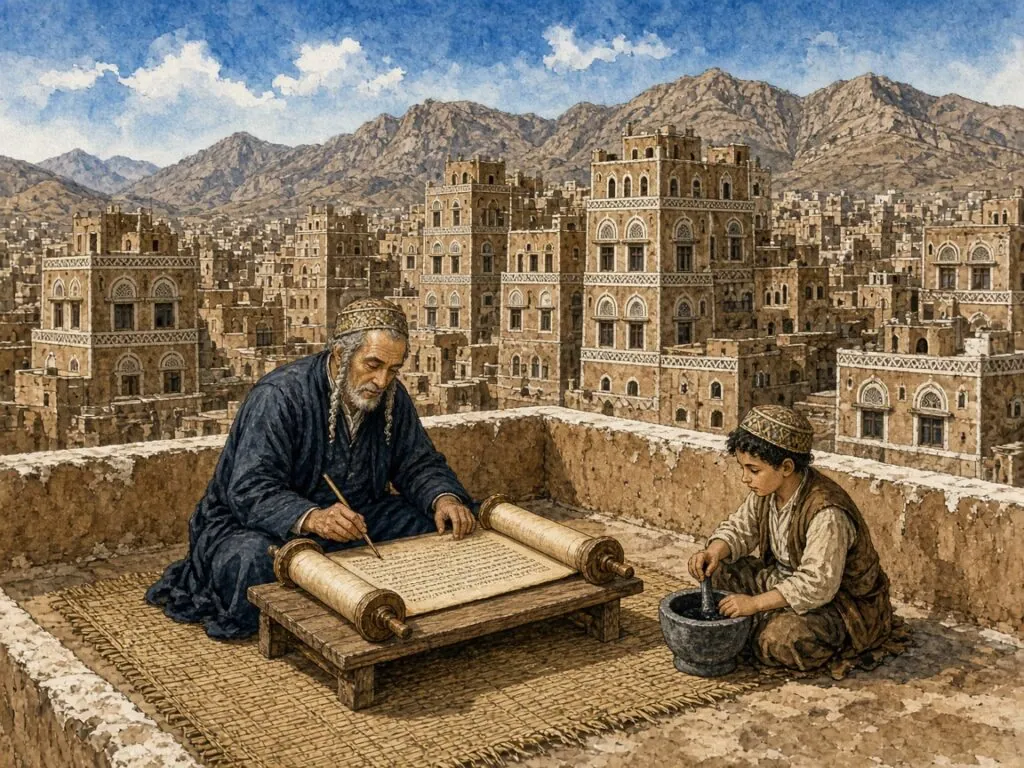
Yemenite scribes also preserved the ancient reading traditions. The Encyclopaedia Judaica records the custom, described in the medieval Maḥberet ha-Tijan, of marking each accent with a movement of the hand while reading aloud, and notes that “this custom continues among Yemenite Jews to this day”[52]. Yemenite Bibles of the fifteenth century were decorated with floral carpet pages and micrography in geometric forms, such as two manuscripts in the British Library dated 1408 and 1469, though they contain no narrative illustrations[56]. Beit-Arié identifies the Yemenite manuscripts as a separate sub-type by the end of the thirteenth century[10]. The illustration in this chapter imagines a Yemenite scribe on a rooftop in Sana’a, with a boy preparing his ink.
Karaite hands
The Karaites, who rejected the authority of the Oral Law, continued to use the Jewish script, as Birnbaum notes, because they considered themselves to be the true Jews. In their hands, however, it developed distinctively, which is not surprising, he observed, since “there is an intimate connection between religion and script throughout history and in all cultures”[4]. There was no single Karaite script. Different Karaite types grew out of the local Rabbanite hands, a southern type in Egypt and Palestine, a Yevano-Karaite type in Byzantine lands and a Parso-Karaite type in Persia, with dated material from the eleventh century onwards[4].
The Karaites also held strong views about the written text. The Encyclopaedia Judaica quotes Judah Hadassi, writing in 1149, who argued that Torah scrolls should be pointed with vowels and accents, “for without vowels and accents God did not give them”[52]. Rabbanite law insisted that the scroll remain unpointed, and so it has. The dispute shows how a question about the appearance of the page could become a question about the nature of revelation. For the Rabbanites, the bare square letters of the scroll were the written Torah and the vowels belonged to the oral tradition. For the Karaites, everything on the page was given at Sinai.
East meets west
The eastern types did not remain sealed off. Birnbaum noted that the contrast between thick and thin strokes appears in tenth-century Palestine and Egypt and in later Persian writing, “a striking example of how, in spite of geographical separation, new developments spread from group to group”[4]. Merchants carried letters from Aden to Cairo to Sicily; scholars travelled between Baghdad, Kairouan and Córdoba; manuscripts were bought, sold, captured and ransomed. The Aleppo Codex itself moved from Tiberias to Jerusalem to Cairo to Aleppo[54].
Still, the eastern hands kept a family resemblance to the Masoretic codices, and their scribes seem to have kept the reed pen; Birnbaum thought that the Zarphatic and Italkian hands of Europe were written with a quill, while the earlier types he surveyed were produced with a reed[4]. When the Jews of Yemen and of the Middle East emigrated to Israel in the twentieth century, they brought their own scribal traditions with them, and the variety of eastern hands is now visible side by side in the synagogues and scribal workshops of Jerusalem.
12. Hands of the West
The square script entered Europe by two doors. One opened in the south-east, through the Greek-speaking Jewish communities of southern Italy and the Balkans. The other opened in the south-west, through North Africa and Spain. From these beginnings grew the great European families of Hebrew writing, the Sephardic of Iberia, the Italkian of Italy, the Zarphatic of northern France and its offspring the Ashkenazic of the German lands. Each would leave its mark on printing, and one of them would supply the model for the Hebrew type that most of the world still reads. This chapter traces their development from the earliest epitaphs to the great illuminated books of the late Middle Ages.
From the Maghreb to Spain
Birnbaum called the script of north-west Africa Maaravic, from the Hebrew word for the west. It presumably followed the line of Jewish migration westward from Egypt, and the earliest available dated Maaravic Bible manuscript, of 946, “seems to point to a closer relationship with the Palestinian than with the Egyptian and Babylonian types”. Its contrast between thick and thin strokes is clear but not as great as in some eastern hands[4]. Across the strait, the Sephardic script was, in his words, “practically identical” with Maaravic, and he assumed it had been introduced from Africa, although the surviving material is too late to prove it[4].
An epitaph of the sixth century from Spain contains some rather archaic forms, and the oldest pen-written Sephardic manuscript may date from the ninth or tenth century, with a great contrast between thick horizontals and thin downstrokes. By the twelfth century the Sephardic book hand had reached and surpassed the formality of the eastern codices. A biblical manuscript of 1207 shows forms “harmonious and regular without being rigid”, and Birnbaum observed that the next three centuries saw “hardly any change at all”[4]. Beit-Arié’s research shows how far the Sefardic codicological type extended, beyond the Iberian peninsula to North Africa, Sicily, Provence and Languedoc[10].
The Sephardic model
The Sephardic square script has a special place in this history because of what happened to it later. When printing was introduced, Birnbaum explains, the Sephardic typeface was designed on the basis of contemporary manuscript forms, and “through a historical accident only this typeface has survived to the present day, while the two other early typefaces disappeared”[4]. The letters of almost every printed Hebrew book from the sixteenth century to the twentieth are, at their root, Sephardic letters. Birnbaum added, a little sadly, that over the centuries the printed form “deteriorated very much aesthetically”, as anyone can see by comparing the Bible of 1207 with later printed books[4].
The Sephardic hand also travelled. It was used in Provence, Languedoc and the Comtat Venaissin, and after the expulsion of the Jews from Spain in 1492 it went with the exiles to North Africa, Italy, the Netherlands and above all the Ottoman Empire. “The form used in the largest and most important of these”, Birnbaum wrote, “that in Turkey – is the main representative of the Sephardic type”[4]. The Sephardi scribal script used today for tefillin and mezuzot, the Velish script discussed in an earlier chapter, belongs to this family[46].
The great Spanish Bibles
Medieval Spain produced some of the most beautiful Hebrew books ever made. The Encyclopaedia Judaica’s survey of Hebrew illumination names several of their makers. Joseph ha-Tzarfati was the artist of the Cervera Bible, completed in 1300. Joshua ben Abraham ibn Gaon, a masorete and illuminator, specialised in adding illuminated calendars and carpet pages to Bibles. A contract from Palma de Mallorca in 1335 records Asher Bonnim Maymo undertaking to copy and illuminate a Bible and two books by Maimonides[56]. In Oriental and Spanish Bibles the Masorah was often written in micrography to form decorated carpet pages[56].
The last great Spanish Bible is the Kennicott Bible, now in the Bodleian Library at Oxford. It was commissioned by Isaac, son of Don Solomon de Braga, “almost twenty years before the expulsion of the Jews from Spain”, written by the famous scribe Moses ibn Zabara and illuminated by Joseph ibn Hayyim “in an abstract style influenced by Muslim artistic tradition”[59]. Completed in 1476, it contains the whole Hebrew Bible together with David Kimhi’s grammatical treatise Sefer Mikhlol[59][56]. Its square letters show the Sephardic book hand at its height, only sixteen years before the community that produced it was driven out.
Italy between east and west
The south-eastern door into Europe opened earlier. The oldest Jewish writing in Europe, Birnbaum noted, comes from Magna Graecia, the Greek-speaking south of Italy, and the documents of the Italkian type, inscriptions, begin around 300[4]. The earliest square manuscript from Italy, a biblical one of 979, is “the oldest from Europe that is dated”, and its style is quite unlike that of the contemporary eastern or Sephardic hands, though “the corresponding letters are constructed identically”[4]. Beit-Arié notes that Hebrew book production before the thirteenth century was concentrated in southern Italy, especially Puglia, whose Jewish communities and academies flourished from the ninth century until their destruction in the 1290s[10].
In the fifteenth century, Birnbaum observed, the Italian hand took the thick and thin contrast to an extreme, “perhaps under Ashkenazic influence”, so that a manuscript of 1466 looks as if it consists only of horizontals. When Italian Jews began printing a little later, this script was not chosen as a model for type[4]. Italy was also the great meeting point of Jewish scribal cultures. Beit-Arié’s figures show that almost half of the dated manuscripts produced in Italy before 1540 were written in Sefardic or Ashkenazic hands brought by immigrants[10]. This mixture would be important when Italy became the birthplace of Hebrew printing.
Zarphatic and Ashkenazic
In northern and central France, the region Jews called Tzarfat, a different script developed. Birnbaum called it Zarphatic and noted that no manuscript in it survives from before the twelfth century. It had a strongly marked contrast between thick and thin and did not long survive the expulsion of the Jews from France in 1394. It also included the script of medieval England, which came to an end with the expulsion of 1290[4]. Its true heir was the Ashkenazic script of Germany. The earliest Ashkenazic specimens “show identity of script with Zarphatic”, confirming the tradition that German Jewry descended from the Jews of France, and corroborating the Romance element in Yiddish[4].
The Ashkenazic record begins with gravestones. Birnbaum found epitaphs from the first half of the eleventh century, the first dated in 1034, and noted that the early epitaphs show “well-proportioned, pleasing lettering” with no difference between the thickness of horizontals and verticals, as in one of 1082. The first dated Ashkenazic manuscript in square script is from 1236 and already has the thick and thin contrast. By 1432 “the domination of the horizontal strokes had reached its climax”. Letters became wider, leaned more strongly to the left and grew “slightly rigid”, and thick horizontals were taken over for inscriptions in the thirteenth century[4]. This is the hand that Fontef describes as influenced by Latin blackletter[48].
The Worms Mahzor
The greatest monument of the Ashkenazi square hand is the Worms Mahzor, a festival prayer book now in the National Library of Israel. The library describes it as a prayer book of the Ashkenazi rite for the use of cantors in the synagogue, in two volumes of different origin, written on parchment “in beautiful Ashkenazi calligraphy”, with illumination and decoration[60]. An inscription records that it was completed on 28 Tevet 5032, 2 January 1272, in Würzburg, by Simhah ben Judah for his uncle Barukh ben Isaac[61]. It was used by the Jewish community of Worms for centuries, until the rise of Nazism. Its pages include, written in red inside the large letters of the first word of the Prayer for Dew, a short rhyming blessing on the person who carries the book to the synagogue, the earliest known sentence written in Yiddish[61].
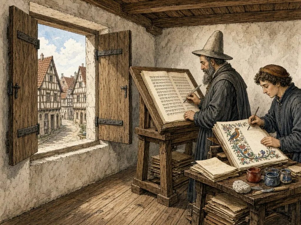
The Worms Mahzor shows the Ashkenazi square script at monumental scale, with initial words in huge letters filled with ornament and the text in a large, dark, compressed hand. Beit-Arié describes its script as “a large square Ashkenazic, reminiscent of the Gothic style”[10]. Its decoration includes bird-headed human figures, a convention of Ashkenazi art[61]. The curator Yoel Finkelman has noted that a book of this size cost “a flock of sheep and a year’s worth of scribal work and decoration”[61]. The illustration in this chapter imagines a scribe at work on such a book, with a young artist painting a bird in the margin.
The rabbinic hand
Not every western book was written in square letters. Alongside the formal book hand, Birnbaum explains, cursive was sometimes used for books when more care was taken. This did not bring it closer to the square, but led “to elaboration and ornamentality of a different kind”, producing a new style he called mashait, “incorrectly designated rabbinic”[4]. In Spain, Italy and the Ashkenazi lands, these semi-cursive book hands became the normal scripts for commentaries, legal works and philosophy. One of them, the Sephardic semi-cursive, would become the first Hebrew typeface ever printed, the so-called Rashi script, as the next chapter shows.
By the end of the Middle Ages, then, a Jewish reader in Venice or Constantinople might be familiar with several kinds of square letters and several semi-cursives, each associated with a community, a function and a level of formality. The arrival of printing would sort these forms into a much smaller set. Some would be cast in metal and survive; others would be confined to the scribe’s desk. The choice made by the first Hebrew printers, partly by design and partly by chance, shaped the appearance of Hebrew for the next five centuries.
13. The First Printers
Some time around 1444, according to the Encyclopaedia Judaica, a Jew in Avignon named Davin de Caderousse studied the new craft of printing, before Gutenberg’s Bible had appeared[62]. Three decades later, in 1475, the first dated Hebrew books came off the press. Within half a century Hebrew printing had moved from small workshops in Calabria and the Veneto to the great presses of Venice, and the square script had been translated from the scribe’s pen into cast metal. This chapter tells that story, and explains how decisions made by a few printers in Italy fixed the appearance of the Hebrew page for centuries.
A divine craft
Jews greeted printing with enthusiasm. The Encyclopaedia Judaica records that the new invention was called “the crown of all science”, and that its practice was described, like the writing of sacred books, as melekhet shamayim, “a divine craft”, or melekhet ha-kodesh, “a sacred craft”. It was seen as a way to fulfil Isaiah’s prophecy that “the earth shall be full of the knowledge of the Lord”[62]. There was also opposition, from copyists who feared for their livelihood, and the new technique raised questions of law, among them whether printed books deserved the respect due to handwritten sacred books and whether Torah scrolls, tefillin, mezuzot and bills of divorce could be printed[62]. The answer to the last question was no. To this day, those objects must be written by hand.
The language of printing reveals how Jews understood it. In 1477 the word defus, a talmudic term for a frame or mould, was used for printing, echoing the Latin typus. The printer was called meḥokek, an engraver, and some early books describe printing as “writing with many pens” or “writing without a pen”[62]. The Hebrew book was still imagined as a kind of writing. By the sixteenth century the derivatives of defus, hidpis for to print and madpis for printer, were in common use[62]. They remain the normal Hebrew words today.
Reggio and Piove di Sacco
Hebrew printing began, according to Maurice Spitzer’s article on typography in the Encyclopaedia Judaica, about 1475, with two books, one at Reggio di Calabria and one at Piove di Sacco near Venice[11]. The Reggio book was Rashi’s commentary on the Pentateuch. The other dated book of 1475 was Jacob ben Asher’s legal code, the Arba’ah Turim[62]. A year later, in 1476, a press at Guadalajara in Spain issued the first of some fifteen books printed there over the next six years, and presses soon followed at Mantua, Bologna, Ferrara and Híjar[11]. Since every early printer had to provide his own type, a remarkable variety of alphabets appeared at once.
The first Hebrew printers made two fundamentally different choices. The books printed in Spain and at Reggio “display the reed-born alphabets (square and cursive, a sort of italics) customary in the manuscripts of the Jews centered in Spain”, distinguished “by a great elegance in their curves and in the modeling of their strokes”. At Piove di Sacco, where the printer was of German origin, “as were most of the early Hebrew printers in Italy”, the alphabets were developments of “the quill-shaped Ashkenazi (German) manuscript letter, angular and based on heavy contrast between bold and fine strokes”[11]. From the very beginning, Hebrew printing carried both the Sephardi and the Ashkenazi traditions.
The Rashi letter
The Reggio edition introduced a typeface that still appears in nearly every traditional Jewish book. Spitzer notes that “the cursive Sephardi letter is already used as text letter in the first book printed in Reggio di Calabria, Rashi’s commentary on the Pentateuch (hence its later name ‘Rashi-letter’)”, and that this happened “26 years before a (non-Hebrew) cursive letter was used for the first time by the Venetian printer Aldus Manutius in 1501”[11]. The so-called Rashi script, in other words, has nothing to do with Rashi’s own handwriting. It is a Sephardi semi-cursive book hand, cast in type for a book by Rashi, and the name stuck.
The cutter of the Guadalajara type is known by name. Spitzer records that “the artist who cut the ones used in Guadalajara was mentioned by name, Piedro de Guadalajara, and was ostensibly a gentile”[11]. The first named designer of Hebrew type was thus probably not a Jew, an early sign of the collaboration between Jewish scholars and Christian craftsmen that would shape Hebrew printing. In Mantua, by contrast, the physician and scribe Abraham Conat had an alphabet cut on the model of his own Italian-German cursive hand, with a square letter of the Ashkenazi type[11]. The scribe became, for a moment, the type designer.
The Bologna page
In 1482 Abraham ben Ḥayyim, known as the Dyer, of Pesaro printed at Bologna an edition of the Pentateuch with Rashi’s commentary. Spitzer describes its text as set in “a pleasantly large and elegantly light Sephardi new square letter” and its commentary in a much smaller cursive letter of the Italian type, and he concludes that “this edition fixed the layout for biblical texts with commentaries for all following editions”[11]. The arrangement of square text and cursive commentary, inherited from the hierarchy of scripts in medieval manuscripts, became the printed form of Jewish learning.
That page is still recognisable in any Jewish house of study. The large square letters of the biblical text sit at the top or centre of the page, while commentaries in Rashi type surround them in smaller blocks. The two scripts express two levels of authority, the revealed text and its interpretation. The square letter, which had once been the script of Persian administrators and then of Torah scribes, now became the typographic sign of the canonical text, while the semi-cursive Rashi letter became the sign of commentary.
The house of Soncino
The decisive turn came with the Soncino family. According to the Encyclopaedia Judaica, the family originated in Germany and took its name from the small town of Soncino near Cremona, where two brothers obtained permission to settle in 1454[63]. Joshua Solomon Soncino set up a Hebrew press that in 1484 produced its first book, the Talmud tractate Berakhot, “with commentaries in the arrangement which became standard”, followed in 1488 by a complete vocalised Hebrew Bible[63]. His nephew Gershom ben Moses Soncino became “one of the most successful and prolific printers of his time – and one of the finest of all times”, printing from 1489 to 1534 in Hebrew, Latin, Greek and Italian[63].
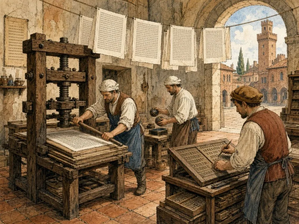
Spitzer credits the Soncinos with stabilising “the style of letters used in Hebrew printing, employing an alphabet based on the Sephardi type and well adapted to the mechanical exigencies of printing”, which “served as a base for later printers”[11]. Gershom Soncino employed as letter cutter Francesco Griffo of Bologna, the punchcutter of Aldus Manutius’s italic, whom Spitzer calls “the most accomplished letter artist of his time, and possibly of all time”[11][63]. Gershom was also the first to use woodcut illustrations in a Hebrew book, and in the decade from 1494 to 1504, with an interval, he was “the world’s only Hebrew printer”[63]. The illustration in this chapter imagines a Soncino workshop, with ink balls, a screw press and sheets hung up to dry.
Wandering printers
Gershom Soncino’s life shows the precarious position of Jewish printers. He moved from town to town, printing at Brescia, Barco, Fano, Pesaro, Ortona, Rimini, Ancona and Cesena, his wanderings caused, as the Encyclopaedia Judaica puts it, “as much to the chicaneries of the local overlords as to fierce and perhaps unfair competition”[63]. Eventually he left Italy for the Ottoman Empire, printing at Salonika from 1527 and Istanbul from 1530, and the last known Soncino printer worked in Cairo in 1557[63]. Hebrew printing came to Constantinople in 1493 and to Salonika in 1513 with exiles from Spain and Portugal, and Iberian refugees also printed at Fez with Lisbon type between 1516 and 1522[62].
The Soncinos and their contemporaries also introduced the apparatus of the modern book. The signature, the letter printed at the foot of a sheet to guide the binder, was introduced by Joshua Soncino in 1483, and the Soncinos introduced woodcut initials and border ornaments[62]. Numbered folios came later; the first Hebrew book with them was Maimonides’ Mishneh Torah, printed in Constantinople in 1509[62]. Each of these devices made the Hebrew book more like the Latin book, and the square letter learned to live with page numbers, running heads and title pages.
Bomberg in Venice
The greatest Hebrew printer of the sixteenth century was a Christian. Daniel Bomberg, from Antwerp, settled in Venice as a young man and, on the advice of the convert Felix Pratensis, set up a Hebrew press that produced nearly 200 Hebrew books, many for the first time[65]. He was the first to publish the Rabbinic Bible, Mikra’ot Gedolot, in four volumes in 1517–18, with Pratensis as editor, combining the Hebrew text with the Targum and standard commentaries[65]. With the approval of Pope Leo X he published the first complete editions of both Talmuds, and the pagination of his Talmud “has become standard ever since”[65]. His second Rabbinic Bible, of 1524–25, edited by Jacob ben Ḥayyim ibn Adonijah, “has served as a model for all subsequent editions of the Bible”[65].

Bomberg’s press depended on Jewish skill. He had to obtain a special dispensation for his Jewish typesetters and proofreaders from wearing the yellow hat that Venetian law required of Jews[65]. His editors included Jacob ben Ḥayyim, the Adelkind brothers and Elijah Levita. Spitzer describes all the products of the Bomberg press as “distinguished by faultless composition and layout, improved typefaces, and high-quality paper”, and notes that his typefaces, “based on the shapes pioneered by the Soncinos”, became dominant[11]. Later printers advertised on their title pages that they used “Bomberg type”[65]. The illustration in this chapter imagines his proofreaders at work beside a Venetian canal.
The standard page
Bomberg’s Talmud created a page that still governs Jewish learning. The Encyclopaedia Judaica notes that printing made the study of the Talmud easier and far more widespread, and that printing the commentaries of Rashi and the Tosafot alongside the text gave talmudic learning a new direction[62]. A reference to a folio and side, such as Berakhot 2a, is still a reference to the layout of Bomberg’s edition, five centuries later. The Encyclopaedia Judaica also notes that printing standardised the order of the books of the Bible and the chapter divisions, and that printed prayer books eliminated minor rites in favour of the major ones[62].
The Bomberg Talmud is now among the most valuable printed books in existence. In 2015 a complete set, kept for centuries in the library of Westminster Abbey and later in the Valmadonna Trust Library, sold at Sotheby’s in New York for $9.3 million, a record for Judaica at the time. The Jewish Telegraphic Agency reported that only fourteen complete sixteenth-century Bomberg sets are believed to exist[67]. The square letters cut for Bomberg, refined from Soncino’s Sephardi models, were the direct ancestors of the Hebrew type in which most of the world’s Hebrew books would be printed for the next four hundred years.
14. From Prague to Vilna
The Italian presses fixed the basic forms of Hebrew type, but they did not hold the field alone for long. In the sixteenth century Hebrew printing spread north of the Alps, to Prague, Basel, Cracow and Lublin, and west to Paris and Antwerp. In the seventeenth, Amsterdam became the capital of the Hebrew book, exporting type and printed books across Europe and the Ottoman world. In the nineteenth, the centre of gravity moved east, to the great presses of Vilna and Warsaw. Throughout these centuries the square letter kept its essential structure while its printed forms changed with the fashions of European typography. This chapter follows that journey.
The Prague Haggadah
While the Spanish-Italian branch of Hebrew printing developed square and cursive typefaces on the Sephardi tradition, Spitzer explains, another centre arose in the second decade of the sixteenth century in Prague, “whose lettering was based decidedly on the Ashkenazi letter shapes”[11]. Hebrew printing began there in 1512, and from 1514 Gershom Kohen was the central figure of the enterprise, which his family continued well into the seventeenth century[11]. The Encyclopaedia Judaica notes that the Prague press may have been founded by members of the Soncino family[63].
In 1526 the Kohen press published one of the masterpieces of Hebrew printing, a Passover Haggadah in large quarto with many woodcuts. Its text, Spitzer writes, was “set in a superb large-size Ashkenazi typeface, which was probably cut in wood and displays to the best advantage all the beauty in this late Gothic style of Hebrew lettering”[11]. Its initial words, larger still, were probably cut as whole words in wood. The Prague Haggadah was reprinted the same year and closely copied at Mantua in 1560[11]. Prague typefaces travelled with printers to Oels, Augsburg, Ichenhausen and Lublin, and the Halicz brothers in Cracow used mostly Prague type[11].
Christian Hebraists
The sixteenth century also saw the rise of Christian interest in Hebrew, and Christian printers became important patrons of Hebrew type. Spitzer names Johannes Froben of Basel, who used the Ashkenazi type “to great advantage”, including the Ashkenazi cursive for texts in Judeo-German, and who printed Hebrew books in cooperation with Sebastian Münster and the two Buxtorfs. In a Hebrew grammar by Münster published in 1534, the biblical cantillation was rendered in musical notes for the first time[11]. In Paris, Robert Estienne, known as Stephanus, printed the Hebrew Bible twice “in beautiful letters of the Sephardi type, cut specially for these editions”[11].
These were not marginal ventures. Christian scholars needed Hebrew to read the Old Testament in the original and to engage with Jewish commentaries, and the Reformation in particular made the Hebrew Bible a central object of Christian scholarship. Polyglot Bibles placed Hebrew alongside Greek, Latin, Aramaic and Syriac in parallel columns. The square letter thus entered the libraries of Christian Europe as one of the three sacred languages of the humanists, and Christian type founders had to learn its forms.
Le Bé and Plantin
The single figure who did most to shape the later printed Hebrew alphabet, according to Spitzer, was Guillaume Le Bé. A native of Troyes and a product of Stephanus’s printing house, he was employed in 1545 by the Venetian humanist Marco Antonio Giustiniani, who founded a Hebrew press in Venice that year. Le Bé was then twenty-one. He specialised from then on in designing and cutting Hebrew letters, until 1550 in Venice and later in Paris. “He carefully studied the Hebrew letter shapes, collected what he considered the best samples from everywhere, and continued cutting Hebrew founts to the end of his long life”, and almost twenty Hebrew founts are credited to him[11].
His influence was immense. Giustiniani and the Jewish printer Meir Parenzo depended on his types, which were copied in Italy until the nineteenth century, and the Nebiolo foundry in Turin was still producing a later rendering of them in 1970[11]. More important still, Le Bé supplied Christopher Plantin of Antwerp with the Hebrew type for his Polyglot Bible of 1569–72[11]. The New Catholic Encyclopedia describes that Polyglot as an eight-volume Bible in Aramaic, Greek, Hebrew, Latin and Syriac, with texts in parallel columns, printed in 1,200 paper copies and 13 more on parchment for its patron, Philip II of Spain[68]. From Plantin, Spitzer writes, Le Bé’s letter style passed to Christian printers in Germany and to Holland[11].
Amsterdam type
The Dutch Republic, which tolerated the Jews who had fled the Iberian Inquisition, became the great centre of Hebrew printing in the seventeenth and eighteenth centuries. The first Hebrew printer in Holland was Manasseh ben Israel, “who had his letters cut from models prepared by the chief Hebrew scribe of Amsterdam, Michael Judah”. His first publication, a prayer book of the Sephardi rite, appeared in 1627[11]. Once again a scribe’s hand served as the model for type. The Jewish printers of Amsterdam, Spitzer writes, “ordered their letters from the most accomplished punch cutters of their time”, among them Christoffel van Dijck and Johann Michael Fleischmann of Nuremberg[11].
Hebrew books became an important export for the Amsterdam economy, and all its major type foundries produced Hebrew founts. These were used everywhere, and printers advertised “Amsterdam type” on their title pages “rather than the places and names of the printers”[11]. The phrase became a mark of quality, much as “Bomberg type” had been a century earlier. The Amsterdam letter became the model for Hebrew printing in Germany, England, Eastern Europe and even the Near East[11]. When most people today picture a traditional printed Hebrew page, they are picturing something close to the Amsterdam style.
Athias and Proops
Two Amsterdam houses stand out. Spitzer calls the press of the Athias family “typographically outstanding”, producing among other works “the famous Hebrew Bible (1661) and the beautiful edition of Maimonides’ Mishneh Torah (1702–03)”[11]. The Athias family, as Cecil Roth describes it, was a Sephardi family of Marrano origin spread across many communities, with members in Amsterdam, London, Leghorn, Bordeaux and later America[69]. The Proops family, booksellers and printers, set up their own Hebrew press in 1704 under Solomon ben Joseph Proops, producing liturgy, law, Kabbalah, ethics and history[70].
The Proops firm also pioneered the business of the Hebrew book. From 1715 its books carried advertisements for others it had published, and in 1730 it issued Appiryon Shelomo, “the first such Hebrew publication” of a sales catalogue[70]. In 1761 the Proops sons bought the typographical material of the Athias press[70]. Through such purchases the same type could travel through several printing houses and generations. The firm, under various names and partners, continued to print in Amsterdam until the nineteenth century[70]. Amsterdam type also crossed the Atlantic in a sense; some Hebrew type was used in the Bay Psalm Book of 1640, the first book printed in North America[11].
Roedelheim and the modern prayer book
The nineteenth century brought new demands. In Roedelheim near Frankfurt, Wolf Heidenheim and B. Baschwitz published a new mahzor in nine volumes in 1800 with “newly cut letters – square and cursive Sephardi for the commentary, and cursive Ashkenazi for the German translations”[11]. The press continued in the same style throughout the century, and its products were reprinted from stereotypes until the Holocaust and even after the Second World War in Basel[11]. The Encyclopaedia Judaica’s article on printing calls Heidenheim’s Roedelheim press “of special importance” for its Pentateuch, mahzor and liturgical texts[62].
Large European foundries also produced new Hebrew letters “on traditional lines”, which were used for Bibles printed by the British and Foreign Bible Society and the Württemberg Bible Institute[11]. At the same time a secular Hebrew literature arose, with newspapers and periodicals in Hebrew, Yiddish and Ladino, making new demands on type[11]. The square letter now had to serve not only prayer and study but journalism, fiction, advertising and politics. The traditional Amsterdam-style faces, heavy and ornate, were not always suited to these new tasks, and the search for a modern Hebrew letter began.
The Vilna Shas
The most famous Hebrew book of nineteenth-century Eastern Europe is the Babylonian Talmud printed by the house of Romm in Vilna. The Romm family, according to the Encyclopaedia Judaica, received permission to establish a press in Grodno in 1789 and opened a second plant in Vilna in 1799. When the Russian government closed all but two Jewish printing houses in 1836, the Romm press was the only one left in Lithuania and Belorussia[71]. After the deaths of Joseph Reuben Romm and his son David, David’s widow Deborah headed the firm with her two brothers-in-law, which is why it became known as “The Press of the Widow and Romm Brothers”[71].
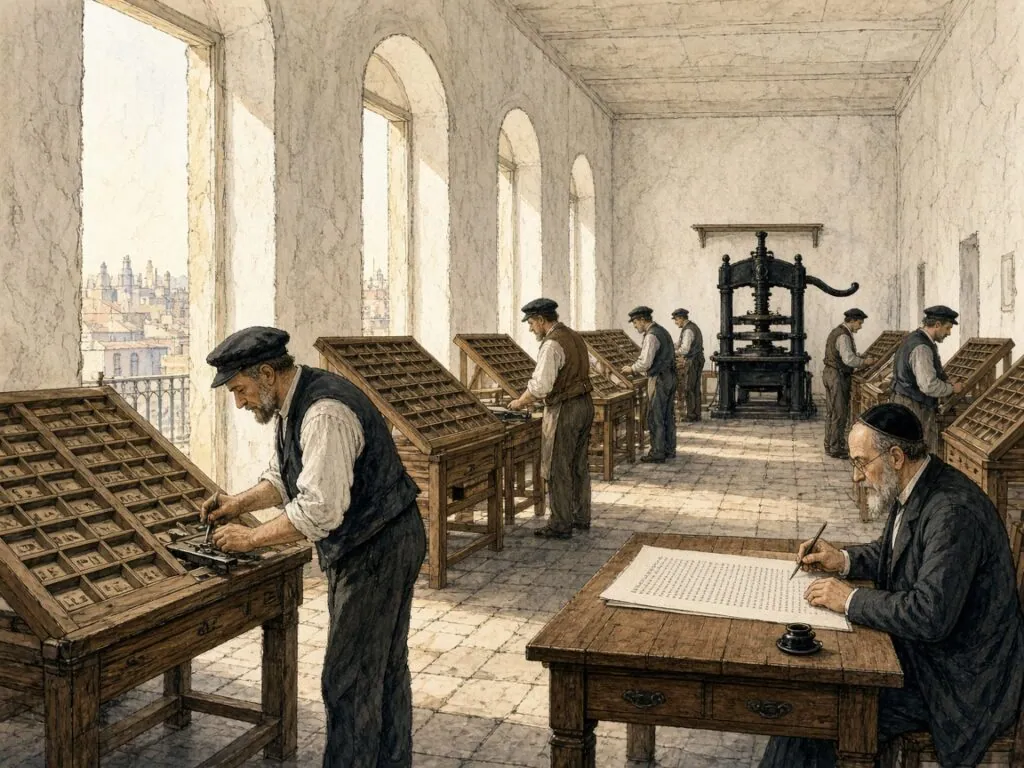
Under its literary director, the Hebrew writer Samuel Shraga Feiginsohn, the firm installed modern presses and published religious works in editions of tens of thousands of copies[71]. Its Babylonian Talmud “with over a hundred commentaries and addenda”, first published in 1880–86, became the standard edition[71]. Spitzer calls it “the most important typographical production” of Eastern Europe in that era[11]. Its layout follows Bomberg’s pagination, with the square text in the centre surrounded by commentaries in Rashi type. The illustration in this chapter imagines a composing room of the Vilna press. The Romm press continued in Vilna until 1940, when the Soviet authorities confiscated it[71].
15. The Square Letter Made New
At the beginning of the twentieth century Hebrew was becoming a spoken language again. Newspapers, novels, school textbooks and political pamphlets were being printed in Hebrew in Warsaw, Odessa, Berlin, Jaffa and New York, and the typefaces available to their printers had been designed for prayer books and the Talmud. Readers needed a new kind of square letter, one that could carry modern prose without the weight of the study house. This final chapter tells how designers in Leipzig, Jerusalem and Tel Aviv answered that need, how their letters became part of Israeli identity, and how the letters of the Torah scroll entered the digital age.
A cantor in Leipzig
The man who supplied the answer was a cantor. Rafael Frank was born on 11 March 1867 in Ichenhausen in Bavaria, the son of an antique dealer; in 1903 he moved to Leipzig as chief cantor of its Jewish community. Trained as a scribe, he also worked in calligraphy and type design[72]. In 1908, according to Dedi Cohen’s account, he was commissioned to design a Hebrew typeface for secular texts, and within about two years he completed a set of letters in one weight, which was cut around 1910 at the small Leipzig foundry of C. F. Rühl[72][48]. Spitzer’s article in the Encyclopaedia Judaica describes the result as a collaboration between “the Leipzig cantor and scribe Raphael Frank and the graphic artist Ruehl”[11].
Frank had firm views about what a Hebrew typeface should be. “Unlike non-Hebrew letters whose design does not depend on any external factor,” he wrote, “the design of a Hebrew letter must take into account the Code of Jewish Law”[72]. As a certified scribe he knew the halakhic rules for the parts of each letter. He wanted “quiet, continuous letters” that would allow fast reading of long texts with or without vowel points, and he removed what he called the curvature, the lugs and “the jellyfish shape” of the older printed letters[72]. His letter drew on the Sephardi tradition of moderate serifs and on the Bomberg lineage, filtered through the Art Nouveau taste of his time[72][48].
The national letter
Frank Rühl owed its spread to a larger firm. Dan Sarid of the Fontef foundry explains that C. F. Rühl was too small to distribute it widely, but that the great Berthold foundry adopted it as its Hebrew text face and included it in the catalogue of its Oriental department in 1924. Thanks to Berthold’s international network, it “quickly became the most widely available typeface in the world for typesetting Hebrew texts”[48]. Once incorporated into Linotype, Monotype and Intertype machines, Spitzer adds, it “held a near monopoly for quite a long period, in spite of its being an expression of the Art Nouveau style”[11].
For the Zionist movement Frank Rühl had a particular appeal. The older Hebrew faces, Sarid notes, were associated with sacred texts and “carried the scent of exile”, while Frank Rühl looked “young, bright and delicate in comparison”, and a generation of native Hebrew speakers grew up for whom it “became the very appearance of Hebrew itself”[48]. Cohen tells how the Maariv newspaper tried in the late 1980s to replace it with Narkis and had to revert after readers objected[72]. More than a century after it was drawn, Frank Rühl is still the default face of Hebrew books, newspapers and official documents. Its letters are not the scribe’s letters, but they preserve the scribe’s skeleton.
Sans serif Hebrew
Between the world wars, the influence of German Expressionism and the Bauhaus’s New Typography produced a demand for Hebrew letters stripped of serifs. Spitzer records that the first sans serif Hebrew faces were a letter called Haim by Jacob Levit in Warsaw and a face by the Tel Aviv artist Aharoni, published under his name in Germany. “Both these typefaces were widely used for display and gave Hebrew printing an entirely new look”[11]. At the same time, he observed with regret, the cursive Rashi letter was abandoned in secular literature, “a deplorable impoverishment of typographical possibilities”[11].
The sans serif experiment raised a question that had never troubled the scribes. Was it possible to remove the heads, crowns and contrasts from the square letter and still have a Hebrew letter? The answer, in practice, was yes, because the halakhic skeleton of the letters remained. A sans serif alef still has its diagonal and two arms; a sans serif shin still has three heads. But the effect on the page was dramatic. Hebrew posters, magazines and advertisements of the 1930s look utterly different from any earlier Hebrew writing, and announce a new, secular and urban culture.
The designers of Israel
After the founding of the State of Israel, a group of designers set out to create Hebrew text faces for a modern country. Spitzer names Ismar David’s David Hebrew, “built on somewhat similar principles but more cursive”, which allowed “a very light look of the page in contrast to the heavy look traditional in Hebrew printing”; Henri Friedlaender’s Hadassah, “a modern renewal of the Ashkenazi letter”; Franziska Baruch’s Schocken Hebrew; Zvi Narkiss’s Narkis Hebrew; and Z. Korngold’s Koren, “a traditional letter useful for traditional literature”[11]. Sarid dates David to 1952, Hadassah to 1958 and the Narkiss Linotype face to 1965[48]. Before the war, Baruch had designed the Stam letter for Berthold, an Ashkenazi square face for ceremonial printing[11].
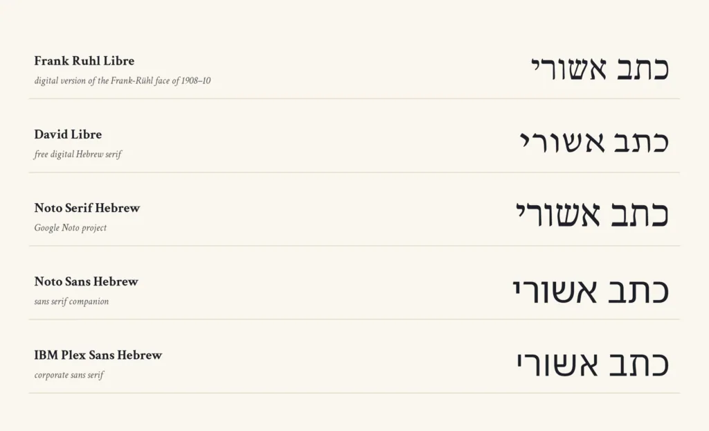
Korngold, who became Eliyahu Koren, devoted two decades to a Bible. His publisher records that he consulted experts on medieval manuscripts, grammarians, copy editors and even opticians in order to develop the most accurate and legible design, and that the Koren Tanakh, published in 1962, was the first Tanakh published in the new State of Israel and, by the publisher’s account, the first Hebrew Bible produced entirely by Jews in five hundred years[75]. Koren’s letters, drawn with the Masoretic codices in mind, were an attempt to bring the scribal tradition back into print. They remain among the most admired Hebrew faces for sacred texts.
The problem of legibility
Every Hebrew type designer faces the same problem that Maimonides identified when he praised ashurit for its distinct characters. Yael Segal Hermoni, writing for the Design Museum Holon, points out that Hebrew letters are not easy to tell apart. Only lamed rises above the line and only qof and the final letters descend below it, so that the reader “sees a cluster of squares that are difficult to distinguish from one another”. About two thirds of the letters have “sister letters”, such as he and ḥet, bet and kaf, dalet and resh, gimel and nun, vav and zayin, and samekh and final mem[76]. She cites a study at the University of Haifa that found English letters easier to identify because their forms are more varied[76].
The success of a Hebrew typeface, she concludes, depends considerably on the designer’s ability to distinguish the letters[76]. This is exactly the concern that shaped the scribal rules described in earlier chapters, the corner of the dalet, the heel of the bet and the gap of the he. Frank Rühl’s success, according to Sarid, came partly from its reduction of contrast and its better differentiation between letters, which made it suitable for small text sizes[48]. The modern type designer and the medieval scribe were solving the same problem with different tools.
Letters on screens
Until the late 1970s, Sarid writes, most Israeli printing used metal type made in Europe; then phototypesetting arrived, and in the 1990s the first digital Hebrew fonts, including digital versions of Frank Rühl, which by then was in the public domain[48]. Today a reader is as likely to meet the square script on a phone as on paper. Free digital families such as Noto Serif Hebrew, part of Google’s Noto project, and Frank Ruhl Libre, a revival distributed through Google Fonts, make well-made Hebrew letters available to anyone[74][73]. Fontef’s own 2026 Frank Rühl Variable, revived from scans of the 1924 Berthold catalogue, adds an optical size axis to recover the way metal type was adjusted for small and large sizes[48].
The scribe’s desk has not disappeared. Torah scrolls, tefillin and mezuzot are still written by hand on parchment with quill and ink, following rules recorded in the Talmud, and no printed or digital letter can replace them. A child learning to read in Tel Aviv today meets the same twenty-two letters, with the same five final forms, that a scribe at Qumran would have recognised.
The upright script
The square script began as the handwriting of Persian clerks and became the script of Ezra, the Masoretes, the printers of Venice and Amsterdam and the newspapers of Tel Aviv. Along the way it was called Assyrian, square, upright and Jewish, and it was claimed by sages as a gift from Sinai and by scholars as an inheritance from imperial Aramaic. Both stories tell us something true. The letters came from outside, but Jews made them their own so completely that the old national script survived mainly among the Samaritans, on coins and in a handful of scrolls.
The rabbis said that the Torah was first given in the Hebrew script and the holy tongue, then given again in the days of Ezra in the Assyrian script and the Aramaic language, and that Israel chose the Assyrian script and the holy tongue and left the Hebrew script and Aramaic to the commoners[1]. Whatever the history behind that tradition, the choice has lasted for more than two thousand years. Every Torah scroll in every synagogue, every printed Talmud and every Israeli newspaper bears witness to it.
Timeline
This timeline gathers 20 dated moments in the history of the square script, from the Gezer calendar to the digital fonts of today. Select an entry to read a short note and its source.
A seven-line limestone tablet lists the farming year in the old Hebrew letters, dated by its script to the tenth century[8].
Miners in Hezekiah’s water tunnel carve a six-line record of the moment their two crews met[14].
Two tiny silver plaques carry a version of the Priestly Benediction, the oldest known text close to a biblical verse[15].
The Persian empire adopts Aramaic and its script as the common written language of its western administration[4].
The Jewish garrison on the Nile island leaves deeds, letters and petitions in the Aramaic chancery hand[25].
Prominent citizens of Samaria carry legal deeds into a cave of the Wadi ed-Daliyeh, where they are found in 1962[27].
A single sheet with the Ten Commandments and the Shema is written in a Hasmonean hand and later found in Egypt[35].
Refugees in the Judaean desert caves leave contracts and letters in square and cursive hands[18].
A small biblical codex is copied in Iran, of which seven damaged leaves survive in the Genizah[10].
Simhah ben Judah completes a great festival prayer book in Würzburg, with the earliest known sentence written in Yiddish[61].
Rashi’s commentary on the Torah is printed at Reggio di Calabria in a cursive Sephardi letter[11].
The last great illuminated Spanish Bible is completed, with David Kimhi’s grammar bound in[59].
Joshua Solomon Soncino prints the first Talmud tractate, with its commentaries in the arrangement that became standard[63].
Daniel Bomberg publishes in Venice the first complete Babylonian Talmud[65].
The first Hebrew press of Amsterdam issues a Sephardi prayer book[11].
The Widow and Romm Brothers publish the Talmud that becomes the standard edition[71].
Rafael Frank’s Hebrew type is cut in Leipzig and becomes the most common Hebrew book face[72].
Eliyahu Koren’s Jerusalem Bible appears in a typeface designed for it[75].
Glossary of terms
The following 16 terms recur in the chapters above. Each definition gives the sense in which the word is used in this essay.
- codex
- A book of folded leaves sewn into quires, which Jews adopted for most books while keeping the scroll for the Torah read in the synagogue[10].
- final letters
- The five letters kaf, mem, nun, pe and tsadi, which take a different form at the end of a word[31].
- Genizah
- A storeroom for worn sacred writings, above all the one in the Ben Ezra synagogue of Fustat[57][58].
- gevil
- Whole hide prepared with salt, flour and resin, which Maimonides names as the proper material for a Torah scroll[3].
- Imperial Aramaic
- The Aramaic language and script of the Persian chancery, written from Egypt to Iran and parent of the square letters[4].
- kelaf
- The thinner hair-side layer of a split hide, used for tefillin and in practice for most modern scrolls[3].
- Ktav Ashuri
- The square Jewish script, literally the Assyrian writing, used for Torah scrolls and for almost all Hebrew printing[1].
- Ktav Ivri
- The old Hebrew script of the First Temple period, called Paleo-Hebrew by modern scholars and kept in altered form by the Samaritans[1][4].
- Masorah
- The body of notes on spelling, vocalisation and accents written in the margins of medieval Bible codices[52].
- Masoretes
- The scholars, above all in Tiberias, who fixed the vowels, accents and notes of the biblical text in the early Middle Ages[52].
- micrography
- Decoration drawn in tiny letters, usually the words of the Masorah, shaped into borders and carpet pages[56].
- Rashi script
- The name printers gave to the semi-cursive Sephardi letter first used for Rashi’s commentary at Reggio in 1475[11].
- sirtut
- The ruling of guide lines with a stylus or reed, which presses a groove without leaving a mark[42].
- STaM
- An acronym of sefer Torah, tefillin and mezuzah, the three sacred texts a scribe writes, and the name for their script[46].
- tagin
- The crowns of three small strokes placed on the upper left of seven letters, shin, ayin, tet, nun, zayin, gimel and tsadi[49].
- tikkun
- A guide for scribes with the Torah text laid out in scroll format, together with the rules for crowns and spacing[50][42].
References
- Babylonian Talmud, Sanhedrin 21b (William Davidson Talmud, Koren Noé edition with Steinsaltz commentary), Sefaria *
- Babylonian Talmud, Sanhedrin 22a (William Davidson Talmud, Koren Noé edition with Steinsaltz commentary), Sefaria *
- Moses Maimonides, Mishneh Torah, Laws of Tefillin, Mezuzah and the Torah Scroll, chapter 1, trans. Eliyahu Touger (Moznaim), Sefaria *
- Joseph Naveh, Solomon Asher Birnbaum and others, “Alphabet, Hebrew”, Encyclopaedia Judaica, 2nd edn (Macmillan Reference USA, 2007), via Encyclopedia.com *
- “Languages and Scripts”, The Leon Levy Dead Sea Scrolls Digital Library, Israel Antiquities Authority *
- Mishnah Yadayim 4.5, trans. Joshua Kulp (Mishnah Yomit), Sefaria *
- Mishnah Megillah 1.8 and Babylonian Talmud, Megillah 8b (William Davidson Talmud, Koren Noé edition with Steinsaltz commentary), Sefaria *
- “Gezer Calendar”, Encyclopaedia Judaica, 2nd edn (Macmillan Reference USA, 2007), via Encyclopedia.com *
- “Dead Sea Scrolls”, New Catholic Encyclopedia (Gale, 2003), via Encyclopedia.com *
- Malachi Beit-Arié, Hebrew Codicology, Historical and Comparative Typology of Medieval Hebrew Codices, English version by Ilana Goldberg, ed. Nurit Pasternak (Israel Academy of Sciences and Humanities and Universität Hamburg, 2022), open access *
- Maurice Moshe Spitzer, “Typography”, Encyclopaedia Judaica, 2nd edn (Macmillan Reference USA, 2007), via Encyclopedia.com *
- “Arad”, Encyclopaedia Judaica, 2nd edn (Macmillan Reference USA, 2007), via Encyclopedia.com *
- “Lachish Ostraca”, Encyclopaedia Judaica, 2nd edn (Macmillan Reference USA, 2007), via Encyclopedia.com *
- “Siloam Inscription”, New Catholic Encyclopedia (Gale, 2003), via Encyclopedia.com *
- “Priestly Benediction on amulets”, Ketef Hinnom, Israel Museum, Jerusalem *
- Mark Lidzbarski, “Alphabet, the Hebrew”, Jewish Encyclopedia (Funk and Wagnalls, 1901 - 1906) *
- “Coins and Currency”, Encyclopaedia Judaica, 2nd edn (Macmillan Reference USA, 2007), via Encyclopedia.com *
- “Bar Kokhba”, Encyclopaedia Judaica, 2nd edn (Macmillan Reference USA, 2007), via Encyclopedia.com *
- “Persepolis Administrative Archives i. Persepolis Fortification Archive”, Encyclopaedia Iranica *
- “Localizing 4000 Years of Cultural History, Texts and Scripts from Elephantine Island”, Ägyptisches Museum und Papyrussammlung, Staatliche Museen zu Berlin *
- “Yemen”, Encyclopaedia Judaica, 2nd edn (Macmillan Reference USA, 2007), via Encyclopedia.com *
- Ezra 4.7, The JPS Tanakh (Jewish Publication Society), Sefaria *
- Esther 8.9, The JPS Tanakh (Jewish Publication Society), Sefaria *
- “Elephantine”, Encyclopaedia Judaica, 2nd edn (Macmillan Reference USA, 2007), via Encyclopedia.com *
- “Manuscripts, Hebrew”, Encyclopaedia Judaica, 2nd edn (Macmillan Reference USA, 2007), via Encyclopedia.com *
- Frank Moore Cross, “A Report on the Samaria Papyri”, in Congress Volume Jerusalem 1986 (Brill, 1988) *
- “The Samaria Papyri, c. 375 BCE”, Center for Online Judaic Studies *
- Jerusalem Talmud, Megillah 1.9, trans. Heinrich W. Guggenheimer (De Gruyter, 1999 - 2015), Sefaria *
- Nehemiah 8, The JPS Tanakh (Jewish Publication Society), Sefaria *
- “Soferim”, Encyclopaedia Judaica, 2nd edn (Macmillan Reference USA, 2007), via Encyclopedia.com *
- Babylonian Talmud, Shabbat 104a (William Davidson Talmud, Koren Noé edition with Steinsaltz commentary), Sefaria *
- Babylonian Talmud, Shabbat 103b (William Davidson Talmud, Koren Noé edition with Steinsaltz commentary), Sefaria *
- Babylonian Talmud, Megillah 9a (William Davidson Talmud, Koren Noé edition with Steinsaltz commentary), Sefaria *
- “Featured Scrolls”, The Leon Levy Dead Sea Scrolls Digital Library, Israel Antiquities Authority *
- “Nash Papyrus”, MS Or.233, Cambridge Digital Library, Cambridge University Library *
- “Nash Papyrus”, Encyclopaedia Judaica, 2nd edn (Macmillan Reference USA, 2007), via Encyclopedia.com *
- “11Q paleoLeviticus”, The Leon Levy Dead Sea Scrolls Digital Library, Israel Antiquities Authority *
- Emanuel Tov, “Divine Names. Different Approaches and Writing Procedures in the Qumran Scrolls”, Studia Biblica Slovaca (2024) *
- Antony Perrot and Matthieu Richelle, “The Dead Sea Scrolls’ Paleo-Hebrew Script, Its Roots in Hebrew Scribal Tradition”, in The Hebrew Bible Manuscripts, A Millennium (Brill, 2022) *
- “Masada”, Encyclopaedia Judaica, 2nd edn (Macmillan Reference USA, 2007), via Encyclopedia.com *
- Joseph Karo, Shulchan Arukh, Orach Chayim 32 (Sefaria Community Translation), Sefaria *
- Louis Isaac Rabinowitz, Aaron Rothkoff and others, “Sefer Torah”, Encyclopaedia Judaica, 2nd edn (Macmillan Reference USA, 2007), via Encyclopedia.com *
- Moses Maimonides, Mishneh Torah, Laws of Tefillin, Mezuzah and the Torah Scroll, chapter 7, trans. Eliyahu Touger (Moznaim), Sefaria *
- Babylonian Talmud, Menachot 29a (William Davidson Talmud, Koren Noé edition with Steinsaltz commentary), Sefaria *
- Babylonian Talmud, Menachot 29b (William Davidson Talmud, Koren Noé edition with Steinsaltz commentary), Sefaria *
- “The different styles of script used in Stam today, Kesav Beis Yosef, Arizal, Vallish”, Shulchan Aruch HaRav *
- Emil G. Hirsch and Wilhelm Nowack, “Ink”, Jewish Encyclopedia (Funk and Wagnalls, 1901 - 1906) *
- Dan Sarid, “Frank Rühl Very Able, From the 1924 Berthold Catalogue to the 2026 Fontef Catalogue”, Fontef *
- “Tagin”, Encyclopaedia Judaica, 2nd edn (Macmillan Reference USA, 2007), via Encyclopedia.com *
- “Scribe”, Encyclopaedia Judaica, 2nd edn (Macmillan Reference USA, 2007), via Encyclopedia.com *
- Tractate Soferim, chapter 1, in The Minor Tractates of the Talmud, trans. A. Cohen (Soncino Press, 1965), Sefaria *
- Aron Dotan and others, “Masorah”, Encyclopaedia Judaica, 2nd edn (Macmillan Reference USA, 2007), via Encyclopedia.com *
- “Ben-Asher, Aaron ben Moses”, Encyclopaedia Judaica, 2nd edn (Macmillan Reference USA, 2007), via Encyclopedia.com *
- “The Aleppo Codex”, Yad Izhak Ben-Zvi research databases *
- Moses Maimonides, Mishneh Torah, Laws of Tefillin, Mezuzah and the Torah Scroll, chapter 8, trans. Eliyahu Touger (Moznaim), Sefaria *
- “Illuminated Manuscripts, Hebrew”, Encyclopaedia Judaica, 2nd edn (Macmillan Reference USA, 2007), via Encyclopedia.com *
- M. J. Stiassny, “Geniza”, New Catholic Encyclopedia (Gale, 2003), via Encyclopedia.com *
- Taylor-Schechter Genizah Research Unit, Cambridge University Library *
- “The Kennicott Bible”, Illustrating the Hebrew Bible, exhibition, Duke University Libraries (2010) *
- “The Worms Mahzor”, National Library of Israel *
- Ilan Ben Zion, “Behold the Worms Mahzor, the Oldest Yiddish Manuscript”, The Forward, 6 September 2018 *
- “Printing, Hebrew”, Encyclopaedia Judaica, 2nd edn (Macmillan Reference USA, 2007), via Encyclopedia.com *
- “Soncino”, Encyclopaedia Judaica, 2nd edn (Macmillan Reference USA, 2007), via Encyclopedia.com *
- M. Seligsohn and Joseph Jacobs, “Soncino”, Jewish Encyclopedia (Funk and Wagnalls, 1901 - 1906) *
- “Bomberg, Daniel”, Encyclopaedia Judaica, 2nd edn (Macmillan Reference USA, 2007), via Encyclopedia.com *
- “Bomberg, Daniel”, Jewish Encyclopedia (Funk and Wagnalls, 1901 - 1906) *
- “16th-century Talmud sells for record $9.3 million”, Jewish Telegraphic Agency, 23 December 2015 *
- E. P. Willging, “Plantin, Christophe”, New Catholic Encyclopedia (Gale, 2003), via Encyclopedia.com *
- Cecil Roth, “At(h)ias”, Encyclopaedia Judaica, 2nd edn (Macmillan Reference USA, 2007), via Encyclopedia.com *
- “Proops”, Encyclopaedia Judaica, 2nd edn (Macmillan Reference USA, 2007), via Encyclopedia.com *
- Yehuda Slutsky, “Romm”, Encyclopaedia Judaica, 2nd edn (Macmillan Reference USA, 2007), via Encyclopedia.com *
- Dedi Cohen, “Rafael Frank, the Designer of the Most Common Hebrew Font in Print”, AlefAlefAlef *
- “Frank Ruhl Libre”, Google Fonts *
- “Noto Serif Hebrew”, Google Fonts *
- “Meet Mr. Jerusalem, The story of Eliyahu Koren and his flagship publication, the Koren Tanakh”, Koren Publishers *
- Yael Segal Hermoni, “Letters, Type(face)s with Character”, Design Museum Holon magazine, 3 January 2016 *
Select bibliography
- Malachi Beit-Arié, Hebrew Codicology. Historical and Comparative Typology of Medieval Hebrew Codices Based on the Documentation of the Extant Dated Manuscripts Using a Quantitative Approach, English version by Ilana Goldberg, ed. Nurit Pasternak (Israel Academy of Sciences and Humanities and Universität Hamburg, 2022)
- Solomon A. Birnbaum, The Hebrew Scripts, 2 volumes (Palaeographia and Brill, 1954–1971)
- Marvin J. Heller, The Sixteenth Century Hebrew Book. An Abridged Thesaurus, 2 volumes (Brill, 2004)
- Joseph Naveh, Early History of the Alphabet. An Introduction to West Semitic Epigraphy and Palaeography (Magnes Press, 1982)
- Emanuel Tov, Scribal Practices and Approaches Reflected in the Texts Found in the Judean Desert (Brill, 2004)
- Ada Yardeni, The Book of Hebrew Script. History, Palaeography, Script Styles, Calligraphy and Design (British Library and Oak Knoll Press, 2002)
- The Leon Levy Dead Sea Scrolls Digital Library, Israel Antiquities Authority
- Taylor-Schechter Genizah Research Unit, Cambridge University Library