Why Chinese Websites Look So Retro
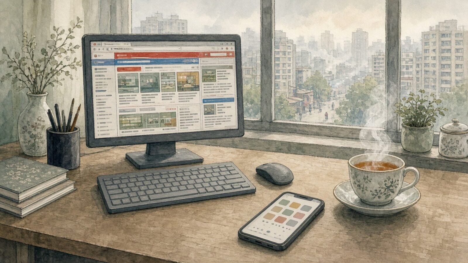
There is a fascinating contradiction at the heart of the modern Chinese internet. China is one of the most technologically advanced societies in the world. It has built enormous digital payment networks, sophisticated ecommerce platforms, globally significant technology companies, highly developed artificial intelligence systems, extensive high speed rail infrastructure, advanced telecommunications networks, and some of the most integrated mobile services anywhere on earth. Chinese consumers can order almost anything from their phones, pay for goods without cash, summon transportation, communicate, shop, watch entertainment, manage finances and access an extraordinary range of services through highly sophisticated digital ecosystems. Yet when someone accustomed to the clean visual language of contemporary Western technology visits certain Chinese websites, the immediate impression can be surprisingly different. The page may be packed with tiny text, numerous links, colourful banners, several columns, advertising, promotional boxes, menus, icons, photographs and information competing for attention. Instead of looking like the minimalist websites of Apple, Google, Airbnb or many modern European and American technology companies, the page can sometimes resemble the internet of the late 1990s or early 2000s. There is something almost surreal about the contrast. A country capable of producing advanced artificial intelligence, sophisticated smartphones, enormous cloud computing systems and some of the world’s most efficient digital commerce infrastructure can still have websites that appear, at first glance, as though they have barely escaped the era of Internet Explorer. The temptation is therefore to conclude that Chinese web design is simply behind the West. However, that explanation is far too simple. The appearance of Chinese websites is the result of a very different history of internet development, different commercial incentives, different expectations among users, the characteristics of the Chinese language, the enormous scale of the Chinese online market and a different understanding of what a website is supposed to accomplish.
The first and most important point is that visual modernity and technological sophistication are not the same thing. This is easy to forget because contemporary technology companies have taught us to associate beautiful design with advanced technology. A clean interface, elegant typography, generous empty space and carefully controlled colours have become visual symbols of sophistication. When people see a minimalist website, they often instinctively assume that the company behind it must be technologically sophisticated. When they see a cluttered page filled with text and advertisements, they tend to make the opposite assumption. Yet there is no necessary connection between the two. A website can look extraordinarily simple while being technologically basic, and another website can look chaotic while being supported by an extremely sophisticated technological infrastructure. In China, this distinction is particularly important. A page that appears visually old fashioned may be connected to enormous databases, artificial intelligence systems, real time logistics, sophisticated recommendation engines, payment infrastructure, advertising systems and cloud computing platforms operating at extraordinary scale. The visual layer is simply what the user sees. Beneath it may exist an enormous technological machine that has little resemblance to the appearance of the page itself. This is one of the reasons the Chinese internet can initially seem so contradictory to outsiders. The interface may look old, while the infrastructure behind the interface is anything but old.
To understand why this happened, it is necessary to look at the history of the internet in China rather than judging Chinese websites exclusively by contemporary Western design standards. The internet did not develop in exactly the same way in every country. Different societies encountered the technology at different moments, and different companies developed different ideas about what the internet should be used for. In the United States and much of Western Europe, the internet passed through several highly visible design revolutions. Early personal websites gave way to portals, portals gave way to Web 2.0 services, and eventually companies began embracing responsive design, mobile first interfaces and minimalist design systems. At the same time, a relatively small number of enormously influential Western technology companies established design conventions that spread throughout the global technology industry. Google demonstrated the power of extreme simplicity. Apple turned visual restraint into a fundamental part of its corporate identity. Facebook established a relatively clean social media interface. Later companies such as Airbnb, Stripe and countless software companies adopted a design philosophy based around simplicity, whitespace, large typography and carefully controlled information. Eventually, this visual language became so dominant that many people began to regard it as the natural appearance of modern technology itself. China, however, developed a much more independent internet ecosystem, and many of its most important companies emerged during a period when the portal model remained extremely powerful.
The portal model is one of the keys to understanding the apparent retro appearance of many Chinese websites. A portal is essentially a digital destination that attempts to provide a huge amount of information in one place. Instead of asking the user to visit several different websites for news, finance, entertainment, sport, weather, shopping and other information, the portal attempts to provide all of these things simultaneously. The result is naturally dense. A traditional Chinese portal homepage can look almost like a newspaper, magazine, shopping centre and television guide compressed into one screen. There may be dozens of headlines, several categories, financial information, photographs, advertisements, links to entertainment, special promotions, sports results and additional navigation. To a visitor accustomed to minimalist design, this can appear chaotic. However, from another perspective, it is simply an extremely information rich interface. The designer is not necessarily asking how to make the page as visually calm as possible. The designer may instead be asking how much useful information can be placed in front of the user without requiring unnecessary clicks. These are fundamentally different design philosophies. One prioritises visual simplicity. The other prioritises information availability.
This difference becomes particularly obvious when comparing Chinese ecommerce with Western ecommerce. A modern Western shopping website often attempts to make the purchasing process relatively calm and focused. A customer might see a large product photograph, a product name, a price, a description, a small number of options and a prominent purchase button. The philosophy is often to remove distractions and make the decision process straightforward. Chinese ecommerce can operate according to a considerably more aggressive and information dense model. A product page can contain the product itself, multiple sellers, coupons, discounts, special promotions, limited time offers, customer reviews, recommended products, livestreams, loyalty programmes, shipping information, merchant ratings and numerous other commercial opportunities. The page can feel like a digital marketplace rather than a carefully designed catalogue. Yet that density reflects the competitive environment in which these companies operate. Every piece of information can potentially help generate another transaction. Every recommendation can lead to another purchase. Every promotion can encourage the user to remain on the platform. What looks to an outsider like unnecessary clutter may therefore be performing a very specific economic function.
There is also an important cultural dimension to this. Physical marketplaces in China have historically been visually and commercially dense environments. Anyone who has visited a busy Chinese shopping district can recognise the basic principle. Shops compete for attention through signs, colours, promotions, displays, products and advertisements. There is often a tremendous amount of information available simultaneously. The digital marketplace can reproduce this atmosphere. Rather than treating the website as a quiet showroom, the website becomes a bustling commercial environment in which the user is encouraged to browse, compare, discover and purchase. This is quite different from the restrained visual language associated with luxury Western branding, where the absence of information can itself communicate prestige. A luxury company may deliberately show one product against an enormous amount of empty space because the product is supposed to appear important and exclusive. A large Chinese ecommerce platform may do almost the opposite because its objective is to communicate abundance, choice and opportunity. The interface is effectively saying that there is always something else to discover.
Advertising has also played a significant role in shaping the visual character of the Chinese web. Whenever a website generates revenue from advertising, recommendations and promotional placements, there is an economic incentive to use available space. Empty space may look beautiful, but from a commercial perspective it can also represent an opportunity that has not been used. This is not uniquely Chinese. Older American internet portals, newspaper websites and search portals were also famously crowded with advertisements, banners and commercial links. The difference is that the information rich and advertising heavy portal model remained particularly influential in parts of the Chinese internet ecosystem. As platforms became increasingly commercialised, more and more features accumulated on their pages. A promotion was added because it increased sales. A recommendation box was added because users clicked it. Another category was introduced because merchants wanted visibility. Another advertising position appeared because it generated revenue. Over time, a page can become a historical record of every commercial feature that has proved useful. The result may look visually dated, but the underlying reason for its existence is often thoroughly modern: competition for user attention and commercial value.
The Chinese language itself also has an interesting relationship with information density. Chinese writing is visually different from alphabetic languages such as English. Chinese characters generally occupy a relatively compact square shaped space, while English uses combinations of letters with varying widths. This means that Chinese text can often be arranged in highly compact blocks of information. A short Chinese headline can communicate a considerable amount of information without occupying a large horizontal area. This does not mean that the Chinese language causes cluttered web design, because it clearly does not. There are countless examples of elegant and minimalist Chinese websites. Nevertheless, the structure of Chinese writing can make dense information displays practical and visually coherent in ways that may feel different to someone accustomed to alphabetic interfaces. When combined with the portal tradition, this creates an environment in which large amounts of textual information can be displayed simultaneously without necessarily making the page unusable for native readers.
Perhaps the biggest transformation in Chinese digital life, however, has taken place through mobile technology. China did not simply reproduce the desktop internet of the United States and Europe. It developed an enormous mobile ecosystem in which smartphones became central to everyday life. This produced a different type of digital environment. Rather than simply creating websites that perform one function, Chinese technology companies increasingly developed platforms capable of connecting numerous aspects of daily life. Messaging, payments, shopping, entertainment, transportation, food delivery, financial services and other activities can become interconnected within enormous digital ecosystems. This helps explain another apparent contradiction. China can simultaneously have websites that look visually old fashioned and mobile applications that are extremely sophisticated. The two developments are not necessarily connected. The desktop web contains historical layers that may remain because users still rely upon them, while mobile platforms have been designed around a much newer model of digital behaviour.
The rise of the super app is particularly important in understanding this difference. The traditional Western internet often developed around specialised applications. One company provided search. Another provided messaging. Another provided payments. Another provided shopping. Another provided transportation. Another provided food delivery. In China, companies developed powerful incentives to combine multiple services into integrated ecosystems. Instead of asking the user to leave one application and open another, a platform can attempt to keep the user inside its own environment. This creates tremendous convenience, but it also creates complexity. A platform capable of doing dozens of things is naturally more complicated than a platform designed to do one thing. This is an important reminder that technological sophistication does not necessarily produce simplicity. In some circumstances, technological sophistication produces more functionality, and more functionality produces more complexity. The interface may therefore appear crowded precisely because the underlying system is capable of doing so much.
There is another reason that older looking interfaces survive, and that is familiarity. Redesigning a successful website is much more difficult than designing a new website from scratch. When millions of people use a service every day, the interface becomes part of their habits. People know where buttons are located. They know which menus contain particular information. They recognise familiar symbols and navigation structures. If a company suddenly replaces the entire interface with a minimalist design, designers may consider the result beautiful while users become confused or frustrated. This creates a powerful incentive for large platforms to evolve gradually. A successful website accumulates layers of history. Features are added, modified and rearranged rather than completely replaced. Over many years, the result can look visually inconsistent or old fashioned because it represents several generations of design simultaneously. What appears to be poor design may therefore actually be the consequence of successful continuity.
This phenomenon is not unique to China. Government websites throughout the world frequently look considerably older than the technology of the countries in which they operate. Banks have historically maintained interfaces that prioritise functionality over fashion. University websites can look as though they have not been redesigned in a decade. Large newspapers often carry visual traditions from previous eras. The same principle applies to China, although the enormous size of the Chinese digital economy means that the effect can be particularly visible. When a country has hundreds of millions of internet users and enormous numbers of institutions, companies and government agencies operating online, there will inevitably be a vast number of websites built according to different generations of technology and design.
Government websites are especially interesting because their purpose is fundamentally different from that of a luxury brand or technology startup. A government website is primarily an information and administrative system. It may need to provide announcements, regulations, forms, contact information, public notices, services and links to other departments. Its designers may have little incentive to make the website look fashionable. The important question may be whether citizens can find the required document or complete the required procedure. This can result in pages that appear visually dated but are nevertheless functional. The same principle can be found in many countries. The appearance of an administrative website often tells us more about institutional priorities than about the technological capabilities of the society that produced it.
There is also a deeper philosophical difference between the Western minimalist tradition and the information dense tradition that can be found in parts of the Chinese web. Minimalism is not simply a visual preference. It represents an assumption about how information should be presented. The minimalist philosophy argues that users should be presented with a small number of carefully selected choices. Complexity should be hidden behind layers of interaction. The information dense philosophy is more comfortable with displaying many choices simultaneously. Instead of hiding complexity, it exposes it. One approach says that a good interface should protect the user from information overload. The other can assume that users benefit from seeing a large amount of information and choosing what interests them. These philosophies produce radically different visual results even when the underlying technology is equally advanced.
This is why it is dangerous to judge technological development simply by looking at a screenshot. A screenshot shows the surface. It does not show the databases, algorithms, servers, payment systems, logistics networks, cybersecurity systems or artificial intelligence operating behind that surface. Some of the most technologically sophisticated systems in the world are visually unremarkable. The software controlling an industrial system does not need to look like a futuristic science fiction film. A system processing millions of financial transactions does not need a beautiful homepage. A logistics network coordinating enormous numbers of deliveries does not become more sophisticated because its interface has more whitespace. Technology increasingly disappears beneath the surface. The more mature a technological system becomes, the less of its complexity the ordinary user may actually see.
This makes the apparent contradiction of Chinese websites particularly interesting. China has developed an approach to technology that often places extraordinary emphasis on scale, integration and functionality. Western technology culture has frequently placed greater emphasis on simplicity, elegance and visual restraint. These are not mutually exclusive values, but they can produce very different interfaces. One culture can produce a beautiful website that does relatively little. Another can produce a visually overwhelming website that connects the user to an enormous ecosystem of services. Judging the two purely by appearance can therefore lead to misleading conclusions.
It is also important to recognise that the stereotype of the retro Chinese website is becoming less accurate over time. China has some exceptionally sophisticated digital design. Major technology companies employ large design teams, conduct extensive user research and develop highly polished applications. Chinese gaming interfaces can be extraordinarily elaborate. Financial applications can be extremely refined. Luxury brands operating in China often use global design conventions. Artificial intelligence platforms increasingly use interfaces that would look perfectly familiar to users in London, New York, Tokyo or San Francisco. The Chinese technology industry is not trapped in the past. Rather, several different generations of digital design coexist within the same ecosystem. A highly polished mobile application can exist alongside a government portal that looks as though it was designed twenty years earlier, and both can be completely normal parts of the same technological environment.
Perhaps the most interesting conclusion is therefore that the Chinese internet challenges a particularly Western assumption about what modern technology is supposed to look like. Over the past two decades, the global technology industry has become increasingly convinced that simplicity is the visual language of progress. Clean typography, white backgrounds, empty space, subtle animations and carefully organised menus have become associated with intelligence and sophistication. China demonstrates that there are other possibilities. A technology ecosystem can be extraordinarily advanced while remaining visually dense. It can prioritise functionality over elegance, abundance over restraint and integration over simplicity. It can look chaotic while functioning with remarkable precision.
The apparent contradiction between Chinese technological sophistication and retro looking websites therefore disappears once the different layers of the system are considered. The infrastructure can be modern while the interface remains historical. The commercial model can be highly advanced while the visual design preserves conventions from an earlier era. Users can have extraordinarily sophisticated mobile services while continuing to visit information dense desktop websites. Successful platforms can preserve familiar layouts because changing them would inconvenience millions of people. Advertising can fill spaces that Western designers might deliberately leave empty. Cultural expectations can make information density feel useful rather than overwhelming. And the enormous scale of the Chinese digital market can encourage platforms to provide more functionality rather than less.
Perhaps the better question is not why Chinese websites sometimes look old. The more interesting question is why we assume that advanced technology has to look minimalist in the first place. That assumption is itself the product of a particular technological culture, one heavily influenced by Silicon Valley and by companies that discovered enormous commercial value in making technology appear simple. China developed along a somewhat different path. Its digital environment often emphasises scale, abundance, integration and constant commercial interaction. The result can look strange to outsiders because it does not conform to the visual language that has come to dominate international technology.
A Chinese website may therefore present a curious visual illusion. On the surface, it may resemble the internet of twenty years ago, with tiny text, crowded menus, colourful banners and seemingly endless links. Underneath that surface, however, there may be artificial intelligence, cloud computing, real time logistics, enormous databases, advanced payment systems, sophisticated recommendation algorithms and infrastructure capable of handling hundreds of millions of users. The website is not necessarily a window into the technological age of the system. It is simply the interface that history, economics, culture and user behaviour have produced.
In that sense, the retro appearance of parts of the Chinese internet is not really evidence of technological backwardness. It is evidence of a different technological history. It is a reminder that the internet did not evolve along a single universal path, and that there is no natural relationship between a clean interface and an advanced society. Sometimes the most sophisticated machine in the room is hidden behind the least sophisticated looking screen.
That may be the most fascinating thing about the Chinese internet. The surface and the system can appear to belong to two completely different eras. The page can look like 2003 while the technology underneath it belongs firmly to the present. What looks old may simply be a different definition of what the internet is supposed to accomplish. And perhaps, rather than asking why China has not made all of its websites look like the latest Western technology startups, we should ask what those websites reveal about the different assumptions societies make about information, commerce, convenience and technology itself.